Search Results: highlow (67)

Data Visualization
Sanjay Matange 4
Stock chart

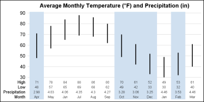
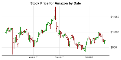
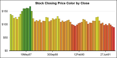
In the previous article on Getting Started with Vertical HighLow Plot, I described how we can use the HighLow plot to display the stock price by date.  The HighLow plot is specifically designed for such use cases as shown below. The data is downloaded from the Nasdaq web site, and

Data Visualization
Sanjay Matange 2
Image backgrounds

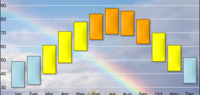
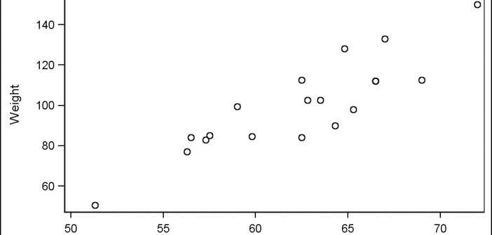
As many of the regular readers of this blog know, SGPLOT and GTL, provide extensive tools to build complex graphs by layering plot statements together.  These plots work with axes, legends and attribute maps to create graphs that can scale easily to different data. There are, however, many instances where

Data Visualization
Sanjay Matange 5
Scatter with mean value

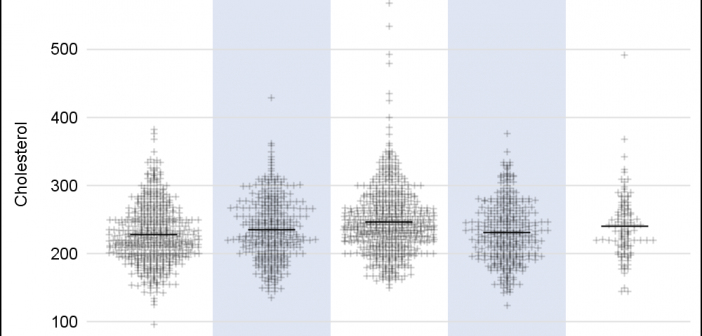
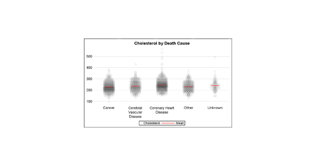
A frequently requested statistical graph is the scatter plot by with discrete categories along with mean value for each category.  Searching for a "Scatter with Mean" will return a lot of requests for such a graph in SAS, Stata, R and other statistical software. Such a graph is very easy

Data Visualization
Sanjay Matange 9
Funnel Graphs

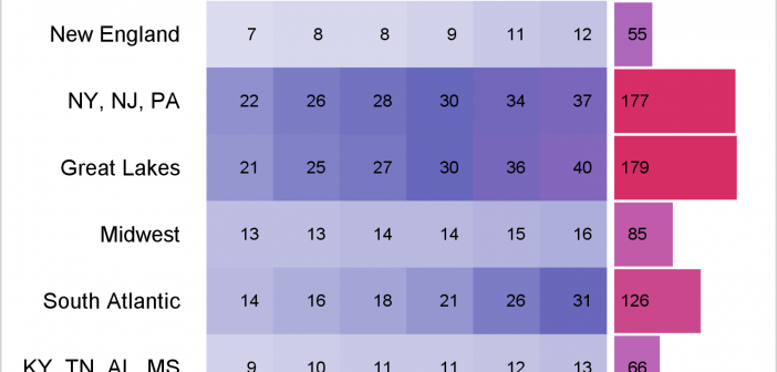
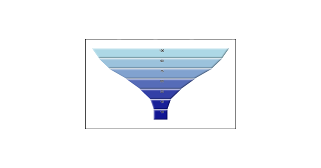
Funnel graphs are useful to track the number of visitors passing through various pages of a website or the number of patients in a study.  The graph shows visually the retention of users or subjects in a study across levels of a marketing cycle or the study. One common representation

1 2 3 4 7