MicroMaps are a powerful way to display data where the display includes small, lightweight maps to provide geographical information regarding the data. This geographical information gives clues to the relationship between the data that could lead to more insight.
The SAS SG Procedures and GTL do not currently have built-in features to create a micro map type display, however, you can still create one using the current feature set with some effort. Let us examine how this can be done.
 First of all, how do you create a map using SG or GTL? While you can use SGPLOT to create a map display, I will use GTL as we will progress towards making a micromap. With SAS 9.40M1 the PolygonPlot statement was introduced in GTL. A similar Polygon statement is available in SGPlot. The Polygon Plot statement is a versatile tool to create custom displays using GTL or SG. If you can think of a display type you want, you can do it using polygon plot.
Clearly, the purpose of this statement is to plot general polygonal shapes in your graph. Well, a map is a special form of polygonal data, so we can use the MAPS.States data set directly to create a map using the PolygonPlot statement.
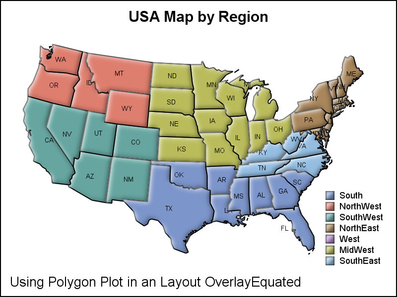
Retaining the aspect ratio of the data space is important for plotting a map. So, the best way to create a map is to use the GTL Layout OverlayEquated. GTL code for the map is shown below. Click on map for higher resolution image. Some data processing is required to for states that have multiple polygons and to project the map data. See link below for the full code.
proc template; define statgraph Map; dynamic _skin _color; begingraph / designwidth=6in designheight=6in subpixel=on; entrytitle 'USA Map by Region'; layout overlayEquated / walldisplay=none xaxisopts=(display=none) yaxisopts=(display=none); polygonPlot x=x y=y id=pid / group=region display=(fill outline) outlineattrs=(color=black) dataskin=_skin labelattrs=(color=black size=5) label=statecode; discretelegend 'map' / location=inside across=1 halign=right valign=bottom valueattrs=(size=7) border=false; endlayout; entryfootnote halign=left 'Using Polygon Plot in an Layout OverlayEquated'; endgraph; end; run; proc sgrender data=usapb template=Map; dynamic _skin="sheen" _color='Black'; run; |
Notable items in the code above are:
- Using LAYOUT OVERLAYEQUATED container. This ensures the aspect of the data is retained regardless of the dimensions of the graph container.
- Wall, X andY axes are suppressed.
- Using PolygonPlot to draw the polygons of the map. We have used GROUP=Region, so polygons in each region are colored the same. We could use GROUP=State to color each state differently.
- The polygon plot can draw the label in various locations. Here they are drawn in the center of the bounding box. It is possible we could add an option to draw the label at the weighted center of the polygon.
- Usage of a skin gives the embossed effect for each state.
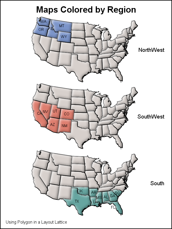 Now, let us take the next step to draw a column of micro maps as shown on the right. Click on the graph for a higher resolution image. What we have done here is created three rows of the same map, but each map highlights the states in on of three regions - NorthWest, SouthWest and South. The GTL template now has more code to address the three cells in a LAYOUT LATTICE.
While the code below looks long, you will see that it is highly structured, and once you understand how one cell (Row) is defined, the other rows are similar.
We use a LAYOUT LATTICE with one column. The 3 rows result from the fact that we have added three cells, each defined by the LAYOUT OVERLAY - ENDLAYOUT block.
We have colored a set of states by the region they belong in. Other states have the missing color. We have displayed the state names for only the states in the region.
To color the regions, we have defined a Discrete Attributes Map, which defines the color by the name of the region. To display state names only for the region, we have used an expression that returns a state label only if the region is the one specified. This is a powerful way to subset the data in the template.
label=eval(ifc(region='NorthWest',statecode,''));
proc template; define statgraph MicroMaps; dynamic _skin _color; begingraph / designwidth=4in designheight=6in subpixel=on; entrytitle 'Revenues by Region and Product'; discreteattrmap name="states" / ignorecase=true; value "NorthWest" / fillattrs=graphdata1; value "SouthWest" / fillattrs=graphdata2; value "South" / fillattrs=graphdata3; enddiscreteattrmap; discreteattrvar attrvar=southfill var=south attrmap="states"; discreteattrvar attrvar=northwestfill var=northwest attrmap="states"; discreteattrvar attrvar=southwestfill var=southwest attrmap="states"; layout lattice / columns=1; layout overlayEquated / walldisplay=none xaxisopts=(display=none) yaxisopts=(display=none); polygonPlot x=x y=y id=pid / group=northwestfill display=(fill outline) outlineattrs=(color=black) dataskin=_skin labelattrs=(color=black size=5) label=eval(ifc(region='NorthWest',statecode,'')); entry halign=right 'NorthWest' / textattrs=(size=7); endlayout; layout overlayEquated / walldisplay=none xaxisopts=(display=none) yaxisopts=(display=none); polygonPlot x=x y=y id=pid / group=southwestfill display=(fill outline) outlineattrs=(color=black) dataskin=_skin labelattrs=(color=black size=5) label=eval(ifc(region='SouthWest',statecode,'')); entry halign=right 'SouthWest' / textattrs=(size=7); endlayout; layout overlayEquated / walldisplay=none xaxisopts=(display=none) yaxisopts=(display=none); polygonPlot x=x y=y id=pid / group=southfill display=(fill outline) outlineattrs=(color=black) dataskin=_skin labelattrs=(color=black size=5) label=eval(ifc(region='South',statecode,'')); entry halign=right 'South' / textattrs=(size=7); endlayout; endlayout; entryfootnote halign=left 'Using Polygon in a Layout Lattice' / textattrs=(size=6); endgraph; end; run; |
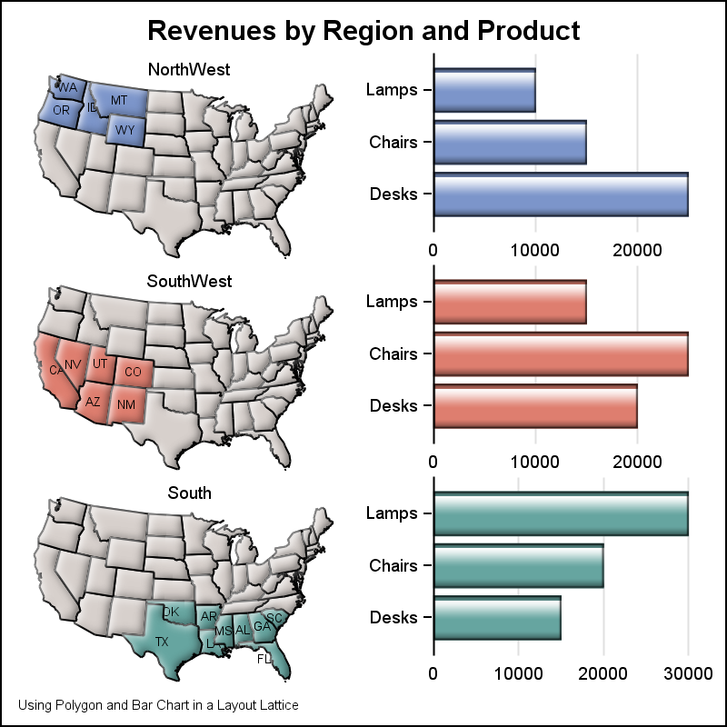 Finally, We will combine some other relevant data to the display. Here I have shown a Horizontal Bar of Revenues by Product in each region. Clearly, this can be used to show different species of animals, local trees, or health data by region.
The graph can be any graph that can be placed in a Layout Overlay, such as scatter, series, histogram, etc. The possibilities are endless. Here I have added only one cell in addition to the map, but you can have any number of cells in a row.
Clearly, this requires us to create a data set that is a combination of the map and the data needed for the bar chart or any other plot. Some creative coding is needed to get all the data in one data set such that the different items are still clearly accessible to the plot statements.
Just like we did with AXISTABLE, once we have a better understanding of the different ways you could use this type of a graph, we could develop a statement or features to make this process easier. We would love to hear from you on how you might use such a graph. Please feel free to chime in.
Full SAS 9.40M2 program: MicroMaps


2 Comments
A use case I have is to plot points with markers on a map and to show for each group of points some more information in another graph, such as a bar graph. This is different from your example in that the selection of points would define the map to display. I could not hard-code a specific country or region. The map part is easy to achieve with Open Street Map, for example.
Pingback: Create a map with PROC SGPLOT - The DO Loop