Programming Tips

Strengthen your programming skills with tips and techniques from the experts
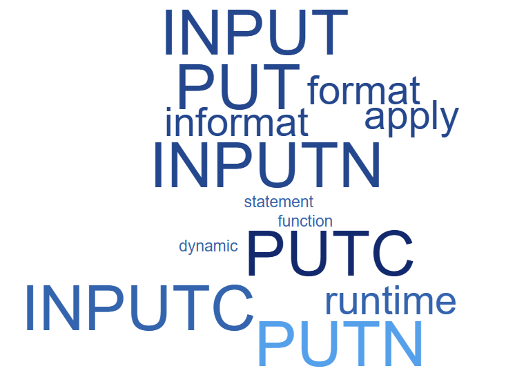
Data Visualization | Learn SAS | Programming Tips
Sanjay Matange 0
New Features in SAS 9.40M5 - Gradient fills

ODS Graphics procedures primarily strive towards the following goal:  "Make simple graphs easy and complex graphs possible".   SGPLOT procedure allows you create simple graphs with a single plot statement, and create complex graphs by layering together or combining multiple plot statements.  Generally, the appearance follows the guidelines set by industry

Programming Tips
Rick Wicklin 0
Order correlations by magnitude

Correlations between variables are typically displayed in a matrix. Because the correlation matrix is determined by the order of the variables, it is difficult to find the largest and smallest correlations, which is why analysts sometimes use colors to visualize the correlation matrix. Another visualization option is the pairwise correlation

Data Visualization | Learn SAS | Programming Tips
Sanjay Matange 0
New features with SAS 9.40 M5

SAS 9.4 maintenance release 5 was released on Sept 19, 2017.  This release includes many new items including integration with SAS Viya and SAS Studio, a web application for SAS development.  Also Included with this release are some cool new features in the graphics domain, some of which were requested

Analytics | Data Visualization | Learn SAS | Programming Tips
Sanjay Matange 0
Getting started with SGPLOT - Part 8 - Horizontal HighLow Plot

On a recent visit to an In-House Users Group meeting at a Pharmaceutical company, I presented a 1/2 day seminar on creating Clinical Graphs using SG Procedures.  Polling the audience for their experience with these procedures indicated that many SAS users are not familiar with these new ways to create graphs. So,

Learn SAS | Programming Tips
Rick Wicklin 0
Data-driven simulation

In a large simulation study, it can be convenient to have a "control file" that contains the parameters for the study. My recent article about how to simulate multivariate normal clusters demonstrates a simple example of this technique. The simulation in that article uses an input data set that contains

Analytics | Programming Tips
Rick Wicklin 0
Symbolic derivatives in SAS

Did you know that you can get SAS to compute symbolic (analytical) derivatives of simple functions, including applying the product rule, quotient rule, and chain rule? SAS can form the symbolic derivatives of single-variable functions and partial derivatives of multivariable functions. Furthermore, the derivatives are output in a form that

Advanced Analytics | Programming Tips
Makoto Unemi (畝見 真) 0
SAS Viyaで線形回帰

SAS Viyaで線形回帰を行う方法を紹介します。 言語はPythonを使います。 SAS Viyaで線形回帰を行う方法には大きく以下の手法が用意されています。 多項回帰: simpleアクションセットで提供。 一般化線形回帰または一般線形回帰: regressionアクションセットで提供。 機械学習で回帰: 各種機械学習用のアクションセットで提供。 今回は単純なサインカーブを利用して、上記3種類の回帰モデルを作ってみます。   【サインカーブ】 -4≦x<4の範囲でサインカーブを作ります。 普通に $$y = sin(x) $$を算出しても面白みがないので、乱数を加減して以下のようなデータを作りました。これをトレーニングデータとします。 青い点線が $$y=sin(x)$$ の曲線、グレーの円は $$y=sin(x)$$ に乱数を加減したプロットです。 グレーのプロットの中心を青い点線が通っていることがわかります。 今回はグレーのプロットをトレーニングデータとして線形回帰を行います。グレーのプロットはだいぶ散らばって見えますが、回帰モデルとしては青い点線のように中心を通った曲線が描けるはずです。 トレーニングデータのデータセット名は "sinx" とします。説明変数は "x"、ターゲット変数は "y" になります。 各手法で生成したモデルで回帰を行うため、-4≦x<4 の範囲で0.01刻みで"x" の値をとった "rangex" というデータセットも用意します。 まずはCASセッションを生成し、それぞれのデータをCASにアップロードします。 import swat host = "localhost" port = 5570 user = "cas" password = "p@ssw0rd"

Data Visualization | Programming Tips
Warren F. Kuhfeld 0
Advanced ODS Graphics: Examining and processing templates

This post shows a variety of techniques including how to use PROC TEMPLATE and the SOURCE statement, PROC SGPLOT with multiple Y-axis tables, create comparable axes in two side-by-side graphs, create a broken axis, write and use a table template that wraps text, and find and display examples of certain statements in graph templates and fonts in style templates.

1 36 37 38 39 40 65

Back to Top