Data Visualization

Get the right information, with visual impact, to the people who need it
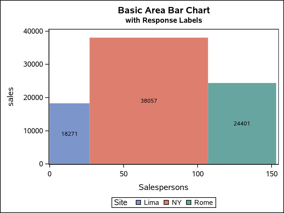
Data Visualization
Sanjay Matange 0
Row Lattice Headers

The SGPANEL procedure makes it easy to create graph panels that are classified by one or more classifiers.  The "Panel" layout is the default and it places the classifier values in cell headers at the top of each cell. When using LAYOUT=Latice or RowLattice, the row headers are placed at

Data Visualization
Cornelius Kimmer 0
Telematikdemo mit SAS ESP und Visual Analytics

Die Herausforderung ist, Daten als Stream in SAS Visual Analytics darstellen zu können. Für Streaminglösungen eignen sich in erster Linie Sensordaten aus technischen Anlagen wie Kompressoren und Produktionsanlagen, Wetterdaten, geologische Daten wie Daten aus Seizmographen, Daten aus energieproduzierenden Anlagen wie Wind- und Wasserkraftanlagen und Telematikdaten aus Fahrzeugen. Letztere sind für

Data Visualization
Sanjay Matange 0
Bubble Plots

Bubble Plots provide additional ways to visualize your data.  The plot supports display of multiple response characteristics of the data in one graph.  Bubble plots were introduced with SAS 9.3 in GTL and SG Procedures. A bubble is drawn at each (x, y) point in the graph, and each bubble is

Data Visualization
Sanjay Matange 0
Is that Annotate?

The SGPLOT procedures includes features to add annotations to your graph in many different ways.  Annotations provide you a flexible way to add features to your graph that are not available through the standard plot statements. Recently, I saw this graph on the web that caught my attention.  Clearly, this looks like

1 38 39 40 41 42 60

Back to Top