Get the right information, with visual impact, to the people who need it
Tukey's ladder of variable transformations

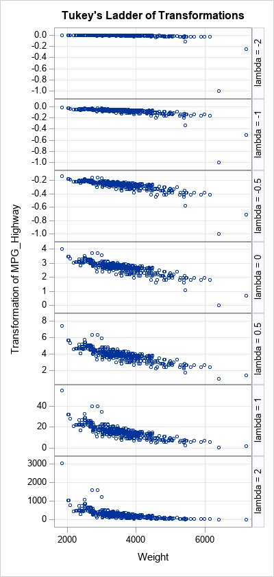
John Tukey was an influential statistician who proposed many statistical concepts. In the 1960s and 70s, he was fundamental in the discovery and exposition of robust statistical methods, and he was an ardent proponent of exploratory data analysis (EDA). In his 1977 book, Exploratory Data Analysis, he discussed a small