Get the right information, with visual impact, to the people who need it
Create and compare ROC curves for any predictive model

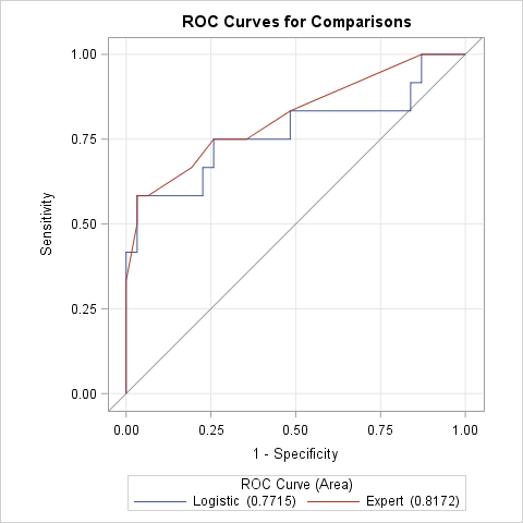
An ROC curve graphically summarizes the tradeoff between true positives and true negatives for a rule or model that predicts a binary response variable. An ROC curve is a parametric curve that is constructed by varying the cutpoint value at which estimated probabilities are considered to predict the binary event.

