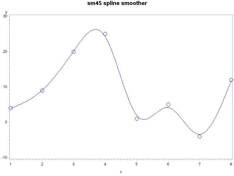
Tag: Statistical Graphics

Rick Wicklin 0
Visualize a matrix in SAS by using a discrete heat map

A heat map is a graphical representation of a matrix that uses colors to represent values in the matrix cells. Heat maps often reveal the structure of a matrix. There are three common applications of visualizing matrices with heat maps: Visualizing a correlation or covariance matrix reveals relationships between variables.

Rick Wicklin 0
How to specify mosaic plot colors in SAS

The mosaic plot is a graphical visualization of a frequency table. In a previous post, I showed how to use the FREQ procedure to create a mosaic plot. This article shows how to create a mosaic plot by using the MOSAICPARM statement in the graph template language (GTL). (The MOSAICPARM

Rick Wicklin 0
Create mosaic plots in SAS by using PROC FREQ

Mosaic plots (Hartigan and Kleiner, 1981; Friendly, 1994, JASA) are used for exploratory data analysis of categorical data. Mosaic plots have been available for decades in SAS products such as JMP, SAS/INSIGHT, and SAS/IML Studio. However, not all SAS customers have access to these specialized products, so I am pleased

1 85 86 87 88 89 104