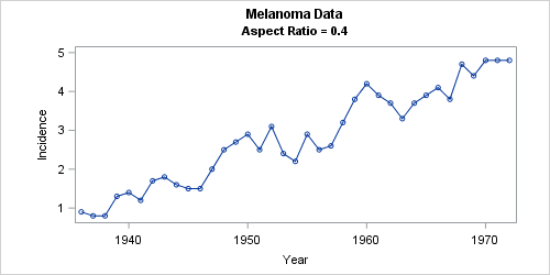
Tag: Statistical Graphics

Rick Wicklin 0
Overlay categories on a histogram

Recently Sanjay Matange blogged about how to color the bars of a histogram according to a gradient color ramp. Using the fact that bar charts and histograms look similar, he showed how to use PROC SGPLOT in SAS to plot a bar chart in which each bar is colored according

Rick Wicklin 0
Create a map with PROC SGPLOT

Did you know that you can use the POLYGON statement in PROC SGPLOT to draw a map? The graph at the left shows the 48 contiguous states of the US, overlaid with markers that indicate the locations of major cities. The plot was created by using the POLYGON statement, which

1 70 71 72 73 74 102