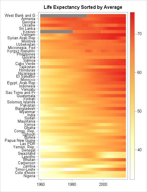
Lasagna plots in SAS: When spaghetti plots don't suffice

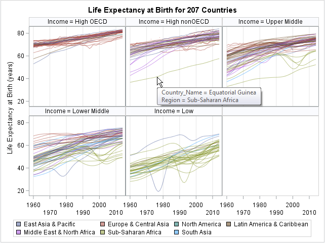
Last week I discussed how to create spaghetti plots in SAS. A spaghetti plot is a type of line plot that contains many lines. Spaghetti plots are used in longitudinal studies to show trends among individual subjects, which can be patients, hospitals, companies, states, or countries. I showed ways to