Creating bar charts with log response axis has come up a few times in the past few days. Before we look into how we could do this, it would be worth pointing out the considerable opinion in the blogosphere against use of log response axes for bar charts. See BizIntelGuru and
Tag: SGPLOT procedure
Here is the second installment of sample graphs from the SG Procedures book - The Adverse Event Timeline. This is a graph commonly used in patient profiles for clinical trials where we track the progress of a patient through a hospitalization event, tracking the dates and severity of the adverse events. The
Recently a user posted a question on the SAS/GRAPH and ODS Graphics Communities page on how to plot the normal density curves for two classification levels in the same graph. We have often seen examples of a distribution plot of one variable using a histogram with normal and kernel density curves. Here is a simple example: Code Snippet:
I'm about to give you the single-most valuable piece of advice for getting the most out of your experience at SAS Global Forum 2012.
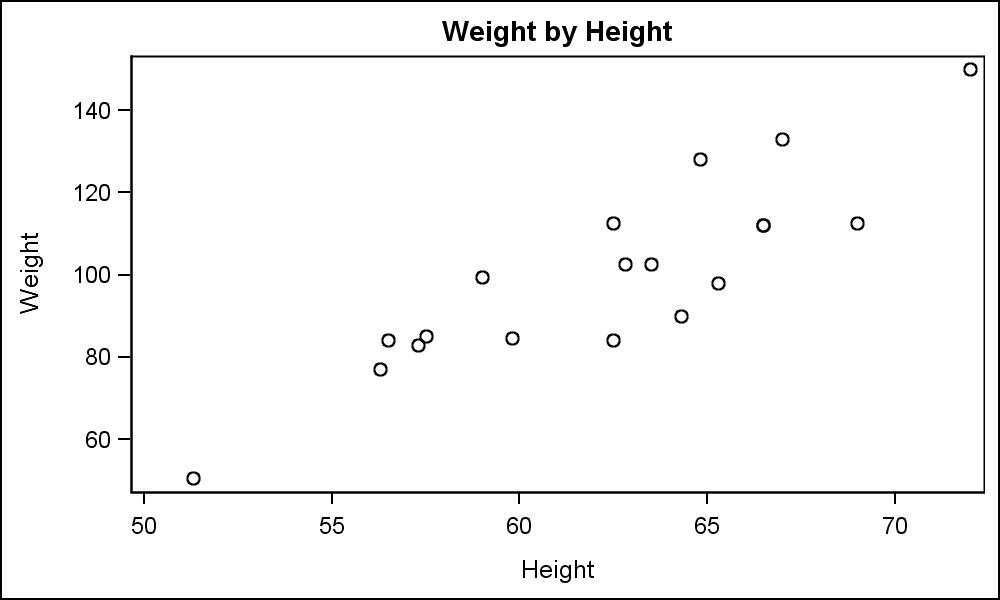
In this blog we will discuss many aspects of the SG Procedures. This article will cover some basic features and workings of the SGPLOT procedure to establish a baseline. The single-cell graph is the work horse for data visualization. From the simple bar chart to the complex patient profiles for clinical