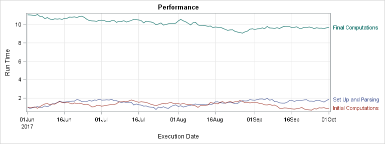
Tag: SGPLOT procedure

Data Visualization
Sanjay Matange 0
Graphs at WUSS - Part 1

It is always a pleasure to attend SAS user conferences, regional conferences and in-house events.  In addition to presenting papers, seminars and super demos to the attendees myself, my favorite activity is to attend presentations by users that include graphical data visualization.  These include using SG procedures, GTL, Designer or SAS/GRAPH.  This year

Data Visualization
Sanjay Matange 0
R U Graphing with SAS?

In recent conversations with many SAS users at NESUG, SESUG and WUSS, a pattern emerges on the question of creating graphs with SAS or R.  Many SAS users are aware of the new graph features in SAS that create high quality graphs with minimum fuss.  But, many have not actually used

Data Visualization
Sanjay Matange 0
Comparative Histograms

In reference to a previous article on Violin Plots, a reader asked about creating comparative mirrored histograms to compare propensity scores.  While I had my own understanding of "Mirrored Histograms", I also looked this up on the web.  Google showed many cases of two histograms back to back, either horizontally or vertically. 

Data Visualization
Sanjay Matange 0
Healthcare.gov numbers

Working at SAS, I consider myself fortunate to have the best employee benefits in the industry.  That is one of the factors placing SAS as one of the best companies to work for worldwide, and often THE best company to work for in USA. Given that, I was curious to know the kind

Data Visualization
Sanjay Matange 0
Schedule Chart

Last week Bruno asked about creating a Schedule Chart using SG Procedures.  To me, such projects are very interesting and challenging...How much mileage can we get out of the current set of SGPLOT procedure features to create a visual that was not part of the original requirements? The clear choice for

Data Visualization
Sanjay Matange 0
Graphics with SAS Web Editor

Recently, SAS released SAS Solutions OnDemand for academics.  An academic user who is signed up for this can use the SAS Web Editor application to do all their data analysis over the web using a hosted server at SAS.  This frees up the user from having to install the software on their own computers,

Data Visualization
Sanjay Matange 0
BarLine Graphs

A Bar Line graph is commonly used in many domains.  The SGPLOT procedure makes it easy to create bar line graphs where the user can customize it in many different ways.  This post is prompted by a recent question on the communities page on creating such a graph, with one bar and

Data Visualization
Sanjay Matange 0
Clark Error Grid Graph

The SAS Global Forum conference last week was awesome.  From the perspective of graphics, there were more papers from uses on graphics and ODS graphics then in recent times.  I will post a summary shortly. One of the interesting papers was "#113-2013 - Creating Clark Error Grid using SAS/GRAPH and Annotate..."

Data Visualization
Sanjay Matange 0
Percent VBar

Recently a reader chimed in with a question on the Do Loop article by Rick Wicklin on how to create a bar chart with percent statistics.  Rick used SAS 9.3  and the reader wanted to do the same with SAS 9.2. For the basic (non-grouped) bar chart, the process is the

Data Visualization
Sanjay Matange 0
AE Timeline by Name

In my previous article on Adverse Event Timeline Graph, I wrote about how to create the AE timeline using SAS 9.2 code, using VECTOR plot and the MARKERCHAR option in SCATTER plot.  I  described a better way to place the labels at the lower end of the vectors. SAS 9.3 provides an easier way

Data Visualization
Sanjay Matange 0
A Better AE Timeline

Back in February, I posted an article on creating Adverse Event Timeline Graph.  In the SAS 9.2 version (first one), one item that was less than ideal was the way to position the AE names to the left of the event.  The AE names are displayed using the scatter plot statement

Data Visualization
Sanjay Matange 0
Doing more with nbsp

A few weeks ago I wrote an article on using the non breaking space character to prevent stripping of leading and trailing blanks in a string.   Since then, I have discovered a few more instances where the nbsp can be a useful tool for creating graphs. One such instance came up last week

Data Visualization
Sanjay Matange 0
How about some pie?

Pie charts have been the subject of some criticism when they are used to compare measures across multiple categories.  It is generally accepted that comparison of magnitudes represented as angular measures from varying baselines is not effective. However here are some use cases where a pie chart does quite well. When it comes

Data Visualization
Sanjay Matange 0
Non-breaking space

Forest plots come in many flavors.   An example of a Forest plot using GTL is available on the SAS support web site.  Simple forest plots can also be created using SGPLOT procedure by using the SCATTER statement with MARKERCHAR to display data aligned with the plot by study names. One issue

Data Visualization
Sanjay Matange 0
Extended Bands

In the Clinical Research domain, there is often the need to display lab values by treatment or test and it is often useful to view this data along with reference lines showing the normal ranges.  The obvious way is to use reference lines to denote the normal ranges. SGPLOT Code: proc sgplot data=band; scatter x=x y=y

Data Visualization
Sanjay Matange 0
Butterfly plots

When comparing results by category and group,  putting the items to be compared close together usually leads to a graph that is easier to decode.  Take the case of the data (simulated) shown below. Here we have population by age group and sex.  To compare the population by sex, it is

Data Visualization
Sanjay Matange 0
Spark lines made easy

Spark lines, made popular by Edward Tufte, provide a way to visualize trends in a concise space, often inline with the rest of the narrative or data. Previously, I posted an article on Spark Plots in which I created different plot types, some of which included multiple graphs and data in each row.  For such

Data Visualization
Sanjay Matange 0
Bar chart with response sort

A graph in a recent article in Fortune magazine caught my eye.  The graph shows the cost of hosting the Summer Olympics over the past eight events.  Here is what I termed the "Medal" graph. Now, practitioners of the art of Effective Graphics would likely find some shortcomings in the graph.  Clearly

Data Visualization
Sanjay Matange 0
Axis values and hint

Getting the axis values just right generally requires some work, and the values you want can change from case to case.  One such example was discussed by Dan Heath in his post on custom axis values.  Here Dan shows the usage of non uniform axis values using the VALUES option on