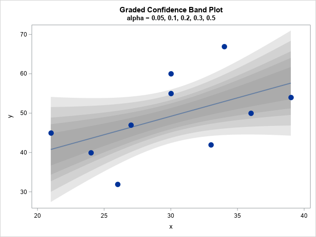
Visualize uncertainty in regression predictions

You've probably seen many graphs that are similar to the one at the right. This plot shows a regression line overlaid on a scatter plot of some data. Given a value for the independent variable (x), the regression line gives the best prediction for the mean of the response variable