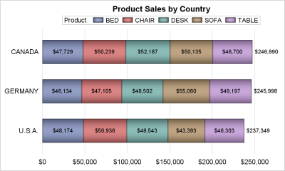
Tag: HBAR

Data Visualization
Sanjay Matange 0
Infographics Bar Chart

Last week I posted an article on creating Infographics using SAS.   The interest shown by the SAS community in this topic came as a surprise.  Also, it so happened by coincidence, a SAS users also  called into Tech Support just about the same time with a query about creating  Infographics type graph

Data Visualization
Sanjay Matange 0
Graph Table

A common scenario is where we have a table of multiple measures over time. Here we have a simple example of Frequency and Response by Day.  The Response is a linear function of the Frequency, as shown in the table on the left below. The  shape of the data is

1 2