The PharmaSUG 2013 conference in Chicago this week was awesome. From the perspective of graphics, there was great interest in using SG Procedures, Designer and GTL for building clinical graphs. It was nice to see many papers by users on how they are using these tools for creating graphs on a daily
Tag: GTL
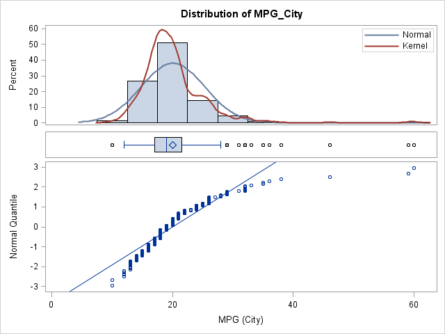
Report from PharmaSUG 2013
A three-panel visualization of a distribution
At a recent conference, I talked with a SAS customer who told me that he was using an R package to create a three-panel visualization of a distribution. Unfortunately, he couldn't remember the name of the package, and he has not returned my e-mails, so the purpose of today's article
How to overlay a custom density curve on a histogram in SAS
I've previously described how to overlay two or more density curves on a single plot. I've also written about how to use PROC SGPLOT to overlay custom curves on a graph. This article describes how to overlay a density curve on a histogram. For common distributions, you can overlay a