Tag: Data Analysis

Rick Wicklin 0
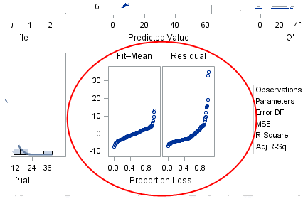
How to interpret a residual-fit spread plot

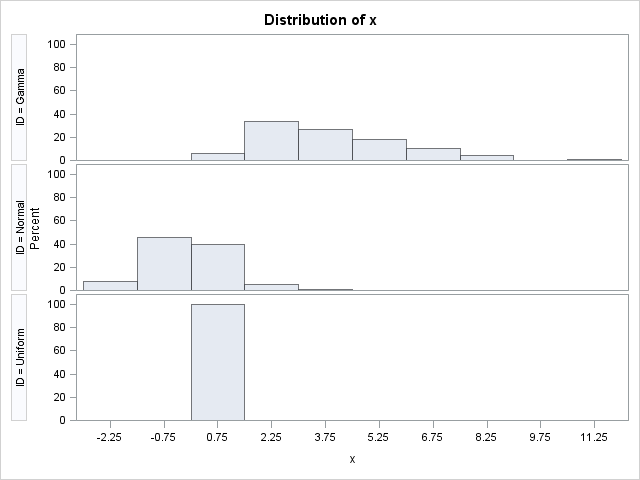
In a previous blog post, I described how to use a spread plot to compare the distributions of several variables. Each spread plot is a graph of centered data values plotted against the estimated cumulative probability. Thus, spread plots are similar to a (rotated) plot of the empirical cumulative distribution

Rick Wicklin 0
New heat maps in the REG procedure

Has anyone noticed that the REG procedure in SAS/STAT 12.1 produces heat maps instead of scatter plots for fit plots and residual plots when the regression involves more than 5,000 observations? I wasn't aware of the change until a colleague informed me, although the change is discussed in the "Details"

1 130 131 132 133 134 170