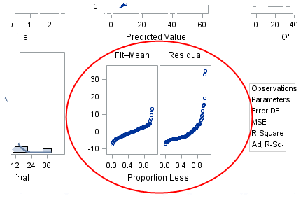
In a previous blog post, I described how to use a spread plot to compare the distributions of several variables. Each spread plot is a graph of centered data values plotted against the estimated cumulative probability. Thus, spread plots are similar to a (rotated) plot of the empirical cumulative distribution function. Users of the SAS regression procedures will recognize the spread plots as one of the plots that are created automatically by procedures such as PROC REG. The spread plots of the fitted and residual values appear in the middle column of the third row of the regression diagnostics panel.
In the SAS documentation, the residual-fit spread plot is also called an "RF plot." This article describes how to interpret the R-F spread plot.
The residual-fit spread plot in SAS output
When I first saw the R-F spread plot in the PROC REG diagnostics panel, there were two things that I found confusing:
- The title of the left plot is "Fit–Mean." I read the title as "fit hyphen mean," and I didn't know what that meant. However, the correct way to read the title is "fit minus mean," which is equivalent to "centered fit."
- The label for the horizontal axis is "Proportion Less." I didn't know what that meant, either. I now know that scatter plot shows empirical quantiles versus their plotting positions. Recall that the pth empirical quantile is the data value that is greater than (or equal to) a proportion p of the data values. Therefore, if a point on the scatter plot has coordinates (pi, qi), it means that the vertical coordinate is the ith quantile, and approximately pi of the other data values are less than that proportion.
History of the residual-fit spread plot
The spread plot is a graph of the centered data versus the corresponding plotting position. Essentially, it is a plot of the sorted data against the corresponding rank, except that using the plotting position instead of ranks makes it possible to compare variables that have different numbers of nonmissing observations. Also, using centered data instead of raw values enables you to compare the spread of variables that have different means.
William S. Cleveland featured the residual-fit spread plot in his book Visualizing Data (1993). He describes how to create a quantile plot on pp. 17–20, and describes quantile plots for fitted and residual values on p. 35–38. Then he says (p. 40):
It is informative to study how influential the [explanatory]variable is in explaining the variation in the [response variable]. The fitted values and the residuals are two sets of values each of which has a distribution. If the spread of the fitted-value distribution is large compared with the spread of the residual distribution, then the [explanatory]variable is influential. If it is small, the [explanatory]variable is not as influential.... Since it is the spreads of the distributions that are of interest, the fitted values minus their overall mean are graphed.... This residual-fit spread plot, or r-f spread plot, shows [whether]the spreads of the residuals and fit values are comparable.
Cleveland goes on to use the R-F spread plot about 20 times in multiple examples.
The residual-fit spread plot as a regression diagnostic
Following Cleveland's examples, the residual-fit spread plot can be used to assess the fit of a regression as follows:
- Compare the spread of the fit to the spread of the residuals. This is the main idea. If the left side of the plot (the centered fitted values) is taller than the right side (the residual values), then you conclude that the spread of the residual values is small relative to the spread of the fitted values.
- Examine the distribution of the residual values. The quantile plot of the residual values contains all of the information that a box plot does—and more. If the distribution does not appear to be normally distributed, the model might not fit the data.
- Are there extreme values for the distribution of the residual values? These indicate outliers: observations for which the observed value is far from the fitted value.
- Are there extreme values for the distribution of the fitted values? These might indicate influential observations that have high leverage in the model. They need to be investigated.
Some examples on simulated data
The best way to practice interpreting the R-F spread plots are to view some examples for which the true model is known. The following DATA step simulates two response variables:
data RegData(drop=i); call streaminit(12345); do i = 1 to 100; x = rand("Normal"); y1 = 2 + 4*x + rand("Normal", 0, 0.25); /* small error */ y2 = 2 + 4*x**2 + rand("Normal", 0, 1); /* not linear in x */ output; end; run; |
For a real regression analysis, I would look at several diagnostic plots, but in the subsequent examples I will only interpret the residual-fit spread plots. I use the DIAGNOSTICS(UNPACK) option on the PLOTS= option to extract the R-F spread plot from the diagnostics panel.
Example 1: Examining the residual variation in a model
The y1 variable has a small error term. The following statements display the R-F spread plot:
title "y = 2 + 4*x + eps, eps ~ N(0,0.25)"; ods select RFPlot; proc reg data = RegData plots=diagnostics(unpack); model y1 = x; quit; |
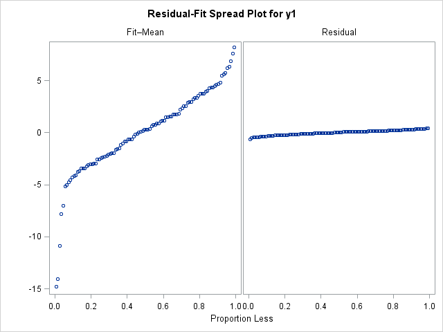
Notice that the left plot (the centered fitted values) is "taller" than the right plot (the residual values), which indicates that the residual values have a smaller spread. In terms of the model, the x variable accounts for a significant portion of the variation in the model, with only a little residual variation.
You can change the standard deviation of the error term to 5 and rerun the program. The new R-F spread plot (not shown), shows that the spread of the residual values is larger than the spread of the fitted values. The interpretation would be that considerable variation remains after accounting for the effect of the x variable.
Example 2: A misspecified model
In the previous example, the model was correctly specified. In this second example, the true model is quadratic in the x variable, but the fitted model is linear in x.
title "y = 2 + 4*x**3 + eps, eps ~ N(0,0.25)"; title2 "Model is y = x"; ods select RFPlot; proc reg data = RegData plots(only)=diagnostics(unpack); model y2 = x; quit; |
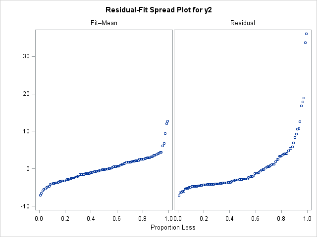
In the R-F spread plot for the (misspecified) model, the right-hand plot is taller than the left-hand plot. This shows that there is a lot of variation that is not explained by the model. Furthermore, the residual distribution does not appear to be normally distributed. The right tail of the residual distribution is long, and the distribution is skewed. If I saw a plot like this in real data, I would look at other plots (such as the plot of residuals versus the predicted values) to see if the residuals exhibit a pattern that can be modeled.
Closing Comments
Several SAS regression procedures produce a regression diagnostics panel automatically. Each graph reveals information about the regression model and whether it fits the data well. This article has described how to interpret a residual-fit plot, which is located in the last row of the diagnostics panel. The residual-fit spread plot, which was featured prominently in Cleveland's book, Visualizing Data, is one tool in the arsenal of regression diagnostic plots.

4 Comments
Pingback: 13 popular articles from 2013 - The DO Loop
Awesome, this certainly clarifies a lot.
Thank you. Very clear explanation!
Pingback: An overview of regression diagnostic plots in SAS - The DO Loop