Tag: Data Analysis

Rick Wicklin 0
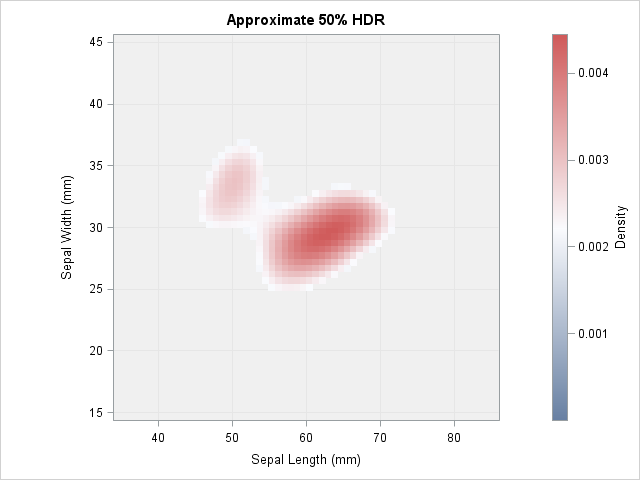
Compute highest density regions in SAS

In a scatter plot, the regions where observations are packed tightly are areas of high density. A contour plot or heat map of a bivariate kernel density estimate (KDE) is one way to visualize regions of high density. A SAS customer asked whether it is possible to use SAS to

Rick Wicklin 0
How much do New Yorkers tip taxi drivers?

When I read Robert Allison's article about the cost of a taxi ride in New York City, I was struck by the scatter plot (shown at right; click to enlarge) that plots the tip amount against the total bill for 12 million taxi rides. The graph clearly reveals diagonal and

Rick Wicklin 0
Visualize missing data in SAS

You can visualize missing data. It sounds like an oxymoron, but it is true. How can you draw graphs of something that is missing? In a previous article, I showed how you can use PROC MI in SAS/STAT software to create a table that shows patterns of missing data in

1 101 102 103 104 105 170