Lately we've been hearing a lot about "record low unemployment" in the news. Being a data guy, I wanted to see it for myself. Follow along as I create some custom unemployment graphs from the official data for California and New York (two of our most populous states). Or, if
Tag: bls
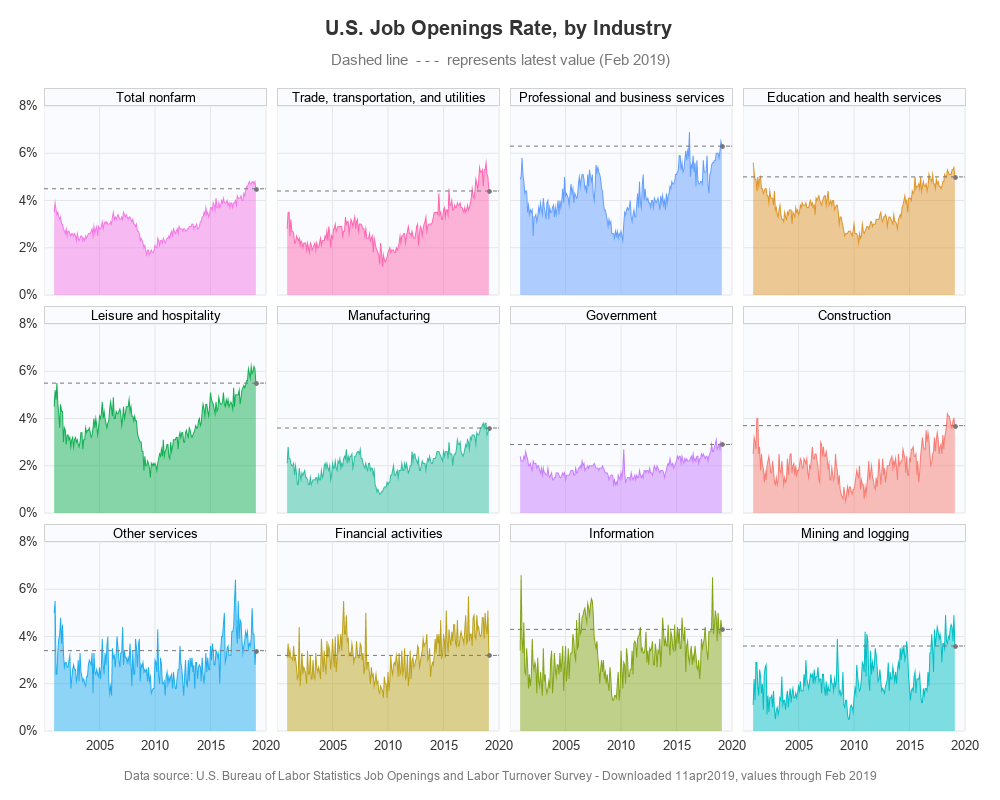
In the past, I created some graphs about our record low unemployment rate (US unemployment, and state-level unemployment), but does low unemployment also mean there are jobs available? Let's have a look at the data!... Existing Graphs I knew I couldn't be the only one interested in this kind of
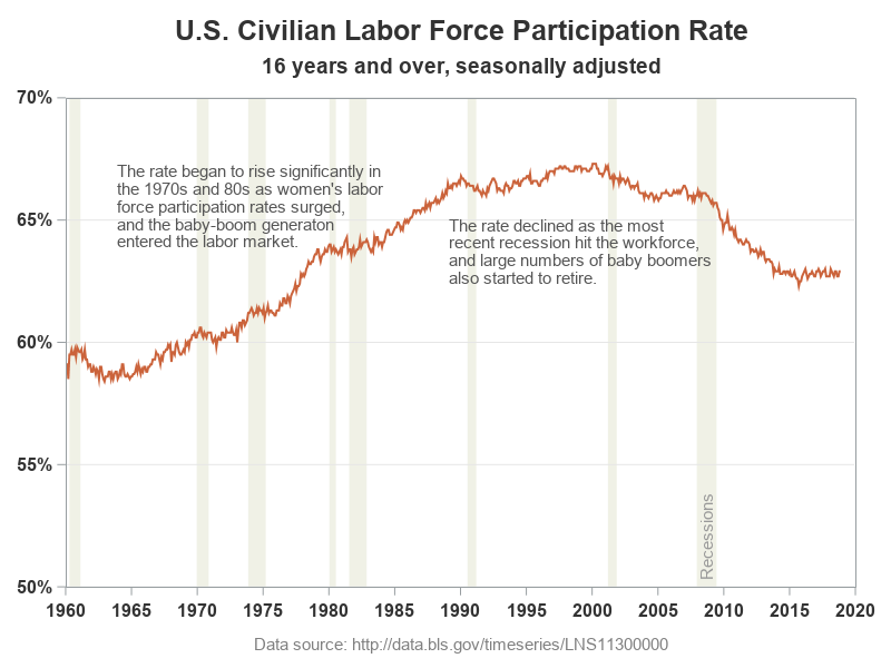
Plotting just your data often helps you gain insight into how it has changed over time. But what if you want to know why it changed? Although correlation does not always imply causation, it is often useful to graph multiple things together, that might logically be related. For example, recessions
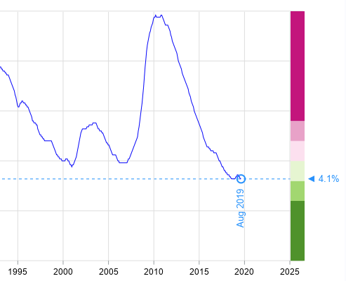
Many areas of the US are experiencing record low unemployment. This is great at the national level, and also great at a personal level (for example, I now have fewer unemployed friends asking to borrow money!) But just how low is the US unemployment rate, and how does it compare
It looks like we've finally recovered from the Great Recession, and there are even claims of record-low unemployment in several U.S. states. Of course claims like that make my data-radar go off, and I wanted to see the numbers for myself. And it's a great excuse for me to create
The US unemployment rate was down to 4.4% in April, which is the lowest we've seen since before the big recession (about 10 years ago). But a single number seldom tells the whole story, so let's look at unemployment data in several different ways, to get a more complete picture...