Get the right information, with visual impact, to the people who need it
Let's learn how to prompt for a date range in a SAS Visual Analytics report using control objects such as sliders, drop-down lists, and text input.
Get the right information, with visual impact, to the people who need it

Let's learn how to prompt for a date range in a SAS Visual Analytics report using control objects such as sliders, drop-down lists, and text input.

With increasing interest in Continuous Integration/Continuous Delivery (CI/CD), many SAS Users want to know what can be done for Visual Analytics reports. In this article, I will explain how to use Python and SAS Viya REST APIs to extract a report from a SAS Viya environment and import it into another environment.
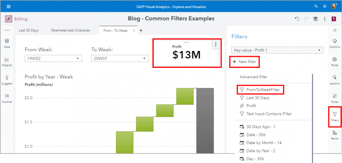
Common filters are filters that can be shared between objects in your reports. Common filter benefits include 1) Easy to assign the same filter conditions to other report objects, 2) When you edit a common filter, it is updated everywhere that the common filter is used, and 3) A common filter is available for the entire report, across pages.
SAS' Kris Stobbe shows how you can predict survival rates of Titanic passengers with a combination of both Python and CAS using SWAT, then see how the models performed.
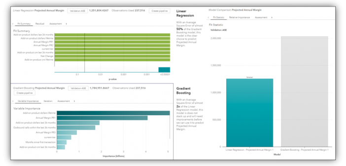
Some business models will segment the worth of their customers into categories that will often give different levels of service to the more “higher worth” customers. The metric most often used for that is called Customer Lifetime Value (CLV). CLV is simply a balance sheet look at the total cost spent versus the total revenue earned over a customer’s projected tenure or “life.”
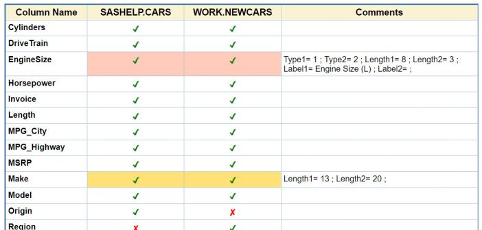
SAS' Leonid Batkhan shows you how to compare SAS data sets that include common and uncommon columns. You'll learn how to check mark commonalities and color-code differences in data tables side-by-side columns and add a comments field to see greater detail.
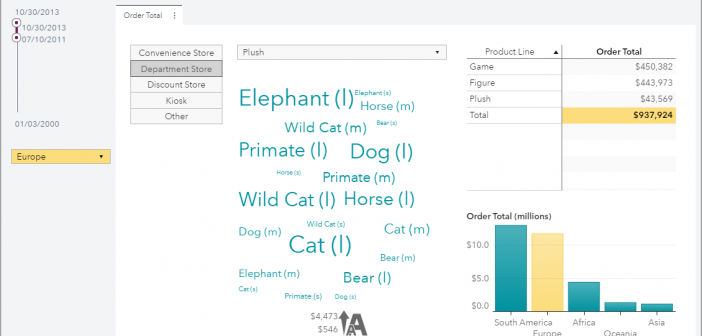
Introduced in the SAS Visual Analytics 8.4 release is the ability to control the layout position of these prompts. Using my example report, let’s change the placement of these prompts.

Leonid Batkhan shows you easy ways to create a checklist table in SAS software.

Importing about 4,400 messages worth of data into SAS Visual Text Analytics to exploring it and create an information extraction model.

Time-series decomposition is an important technique for time series analysis, especially for seasonal adjustment and trend strength measurement. Decomposition deconstructs a time series into several components, with each representing a certain pattern or characteristic. This post shows you how to use SAS® Visual Analytics to visually show the decomposition of