Get the right information, with visual impact, to the people who need it
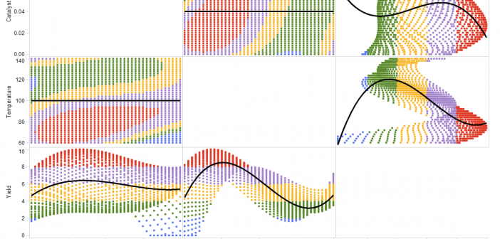
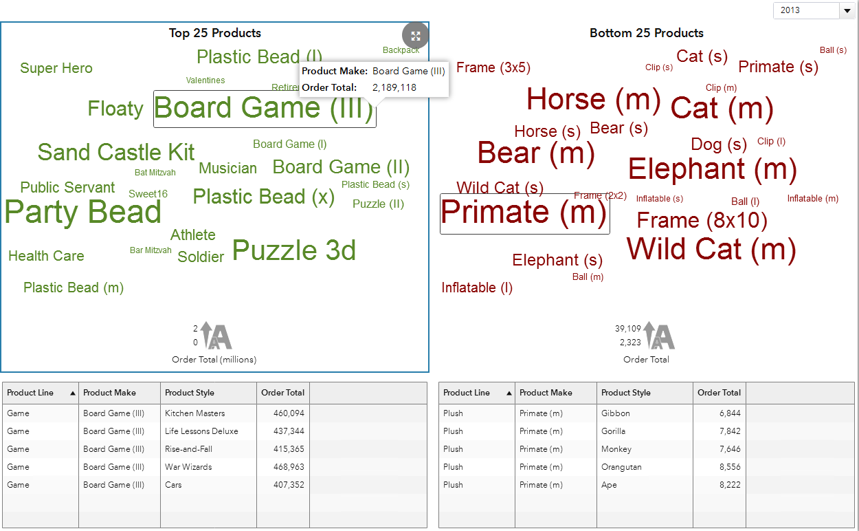
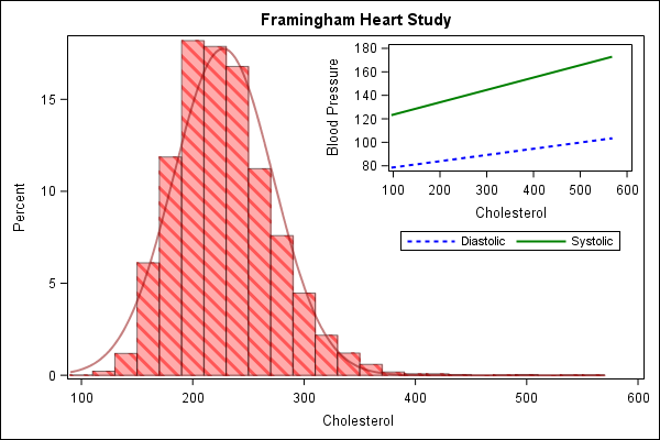
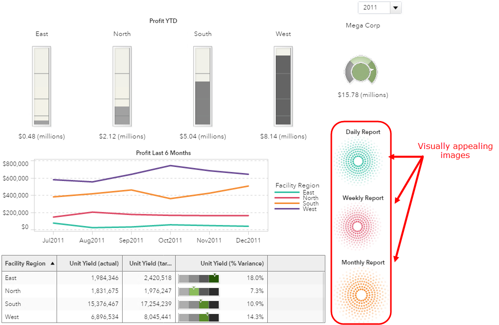
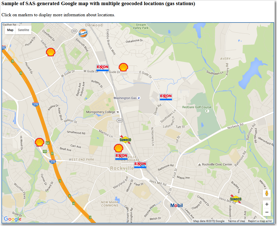
As a practitioner of visual analytics, I read the featured blog of ‘Visualizations: Comparing Tableau, SPSS, R, Excel, Matlab, JS, Python, SAS’ last year with great interest. In the post, the blogger Tim Matteson asked the readers to guess which software was used to create his 18 graphs. My buddy,


