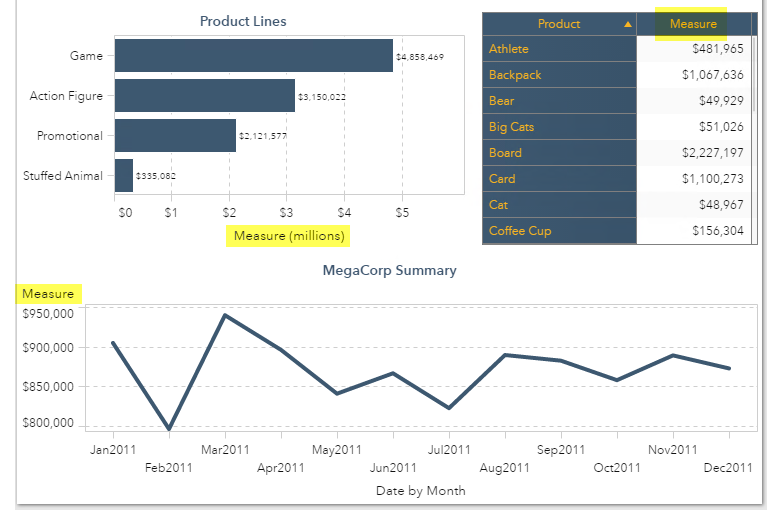
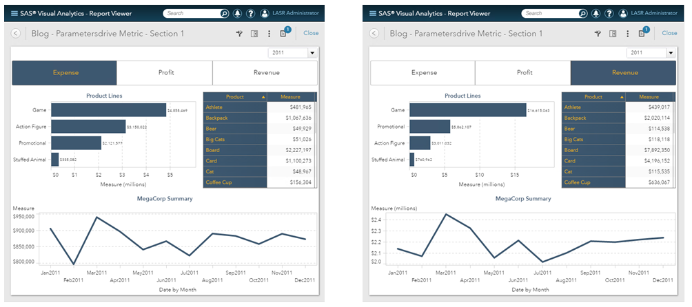
Look at the report below. Imagine being asked to allow your users to select which Measure, highlighted in yellow, they are looking at: Income, Expense or Profit. This is a frequent report requirement and I’m going to outline just one of the ways you can design your report to satisfy this request using parameters.
In a previous blog, I talked about Using parameters in SAS Visual Analytics reports to prompt users to drive either an aggregated measure or calculated item. This example will allow your users to dynamically select which measures they want to see in their visualizations.
Steps
- Create the custom category to drive the button bar
- Create the parameter to hold the button bar’s selection
- Create the calculated data item that will hold the selected measure’s value
- Add report objects and assign roles
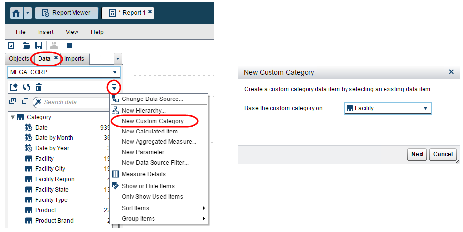
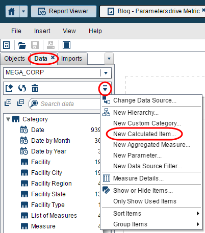
Step 1: Create the custom category to drive the button bar
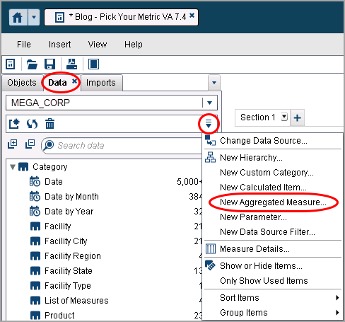
On the Data tab, use the down menu and select New Custom Category….
Next, from the New Custom Category dialogue, select any category that has a cardinality greater than the number of metric choices you want to give your user. In this example, we will allow our report users to select between Revenue, Expense and Profit, so we have 3 options. Therefore, select a category with a cardinality greater than 3, so 4 or more will work.
The next part might seem awkward, but this prevents us from having to load a separate table into LASR. If you have the role and capabilities to load data into LASR then you could load a 3-row table that contains one column with the entries Revenue, Expense and Profit, and you could create your control object from that data source. However, you then create the dependency that both tables must be loaded to LASR for the report to work. The technique outlined in this blog allows us to use just this one data source, but restricts the placement of control object. Using this technique means that you cannot use this control object as a report or section prompt. IF you need to use this control as a report or section prompt then you will need to load a separate table.
Otherwise, follow along.
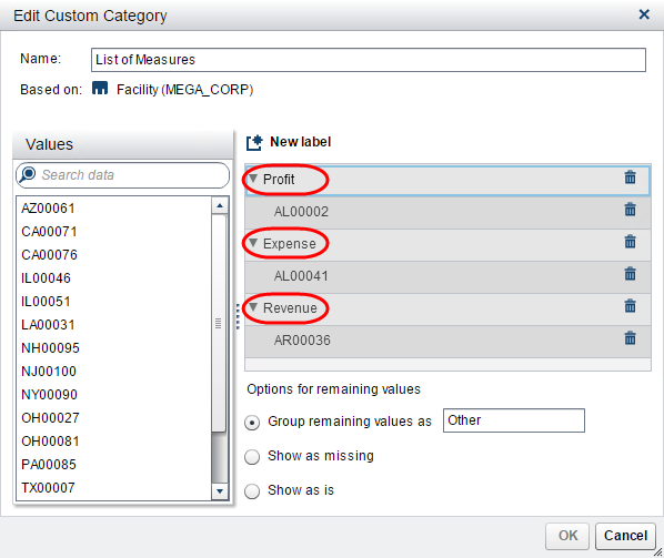
Name your custom category List of Measures. Next, create the labels of the measures you wish your report users to select from. Again, in my example, I want to allow my report users to pick either Revenue, Expense or Profit. Hint: Double click on Label 1 to rename it then use the New label button to add others.
Next, drag and drop at least one value into each custom category label grouping. The custom category data item will only allow you to save it once each category label grouping has a value. You may leave the radio button default Group remaining values as Other selected.
Finally, click OK to save your new custom category.
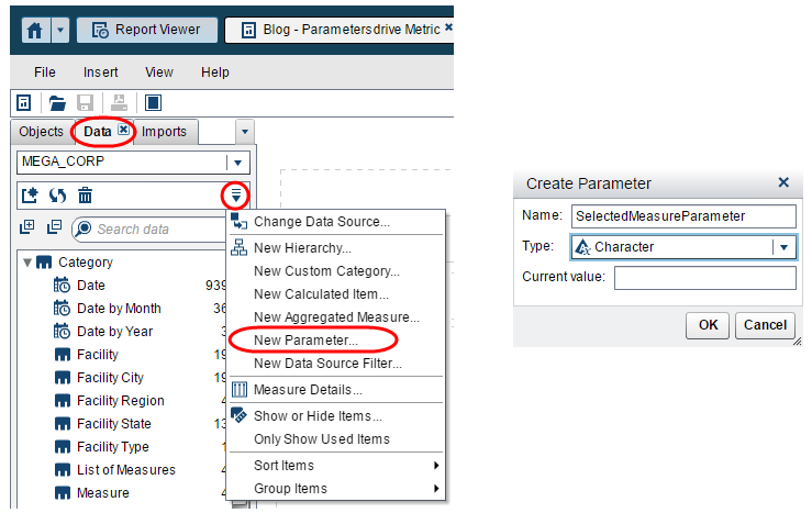
Step 2: Create the parameter to hold the button bar’s selection
Now that we have the custom category to feed the button bar’s values, we need to create a parameter to hold the button bar’s selection. From the Data tab, use the drop down menu and select New Parameter….
Select the Type Character and give your parameter a meaningful name. You can leave the current value, or default value, blank. When we assign the parameter to the button bar the value will be populated upon selection.
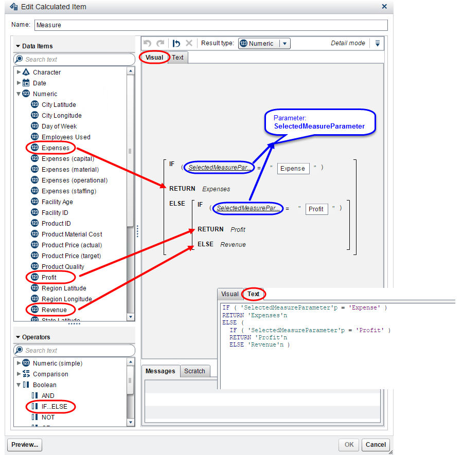
Step 3: Create the calculated data item that will hold the selected measure’s value
Here we need to create a calculated data item that will hold the value of the selected measure. This is the measure we will use in our table and graph objects. In pseudo code, we want to create a new measure that
If user selects "Expense" Return <Expense>
Else, If the user selects "Profit" Return <Profit>
Else Return <Revenue>
From the Data tab, use the drop down menu and select New Calculated Item….
Then use the Visual or Text editor to create a new calculated item named Measure.
Use nested IF…ELSE statements from the Boolean operators and the x = y statement from the Comparison operators.
Step 4: Add report objects and assign roles
Now we can add our report objects to our report. IMPORTANT: With our technique of using an unrelated category as the source of our custom category we cannot put our button bar in the report or section prompt areas. If we put the button bar in either the report or section prompt areas it would automatically filter the data and we would not get the intended results. DO NOT put the button bar in the report or section prompt area.
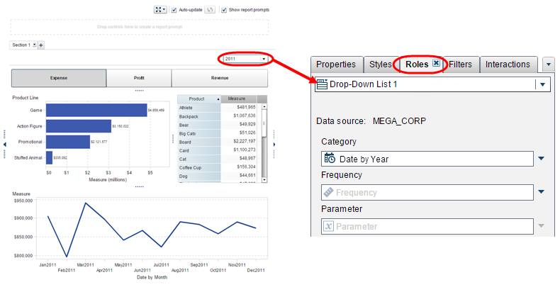
In this sample report, you can see I’ve added the Button Bar Control object, the Bar Chart, Crosstab and Line Chart objects to the report area. I want to narrow this section by year, so I have included a Drop-Down List Control to the section prompt area.
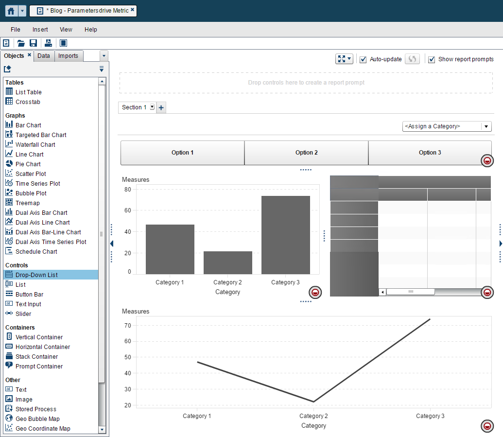
Now let’s look at the role assignments for our various objects. Here is what the report looks like before any style enhancements:
Drop-Down List Control Object
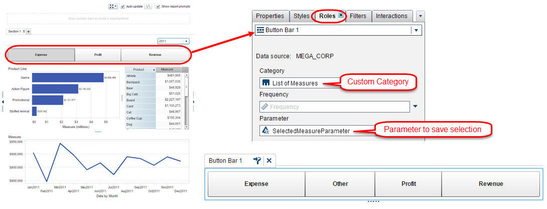
Button Bar Control Object
This is where we want to assign our newly created custom category and save that selection to our parameter. This will give us all the categories of our custom category, including the “Other” category.
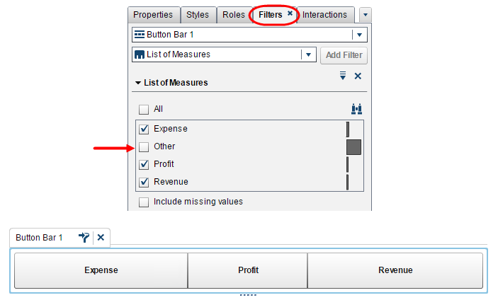
Next, we will need to add a filter on this object to remove the “Other” category. From the Filters tab, add a filter for the List of Measures category and deselect the “Other” category.
Bar Chart, Crosstab and Line Chart
Use our new calculated item as the measure for each of the Bar Chart, Crosstab and Line Chart.
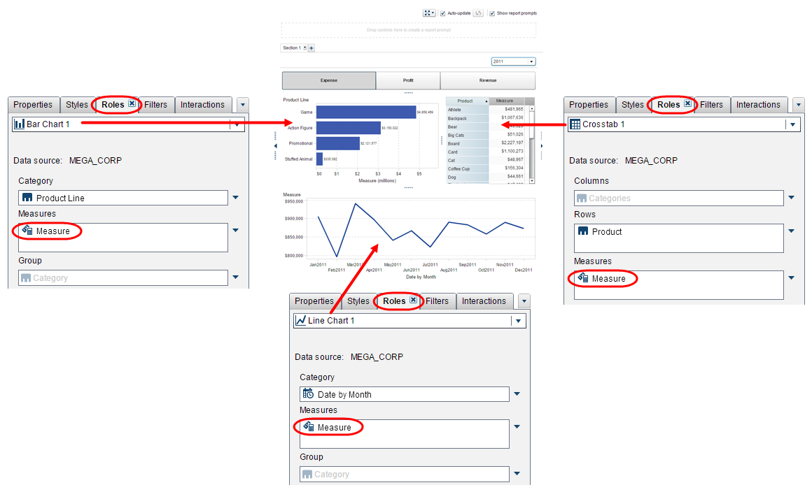
There is one interaction, where the Bar Chart filters the Crosstab.

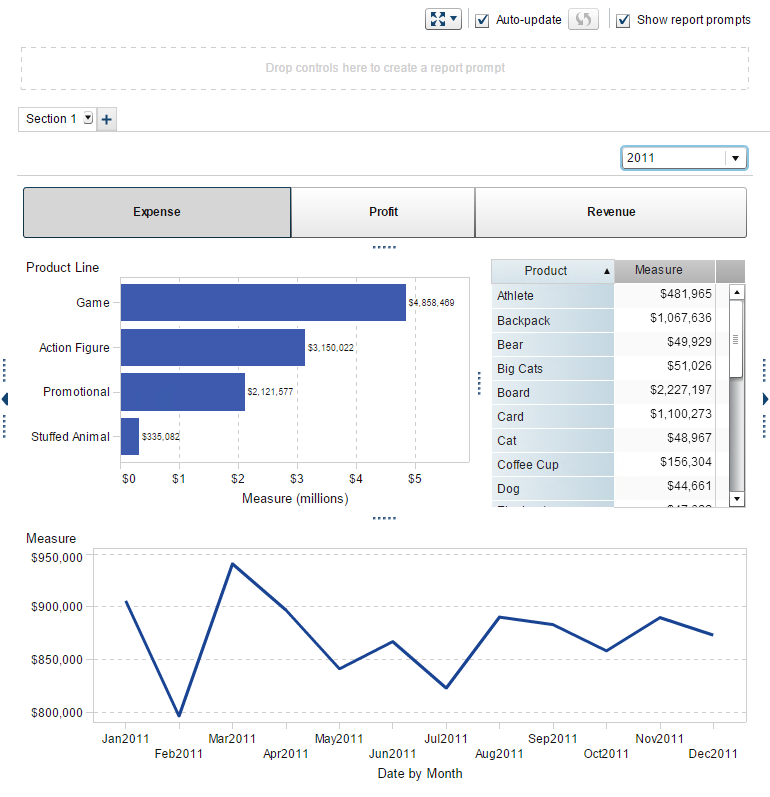
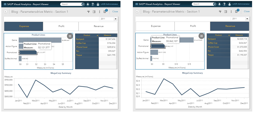
And here is what the report looks like after I’ve altered some of the objects’ styles from the Style tab. I colored the selected bar value to coordinate with the rest of the report objects.
In this screenshot, I’ve selected the Promotional Product Line.
Other Applications
As you can envision, this technique can be used for more than just metrics, you could also use this to allow your users to pick a category to use in your objects! Or both.
Just bear in mind that you are restricted to using the Control Objects that support parameters. This includes:
- Text Input
- Button Bar
- Drop-Down List
- Slider (single-point only)
Limitations and Considerations
In the above example, the three metrics I selected, Expense, Profit and Revenue, all use the same DOLLAR15.2 format and the same SUM aggregation. This may not be the case for everyone’s desired metrics.
If you chose metrics that do not share the same format, there is no way to conditionally format the calculated data item. The recommended format to use, in this case, would be the COMMAx.x or NUMERICx.x format.
If your metrics require different aggregations, then you must use an aggregated measure instead of the calculated data item I outline in Step 3 above. In the aggregated measure expression, use one of the Aggregated operators, either simple or advanced, to drive the type of aggregation for each of the returned metrics.
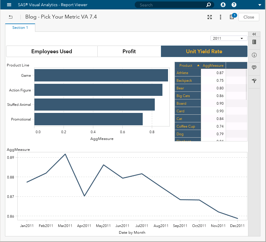
Note: The following screenshots are from VA 7.4 and use a different, but similar, data source while rest of the blog uses VA 7.3.


28 Comments
Is it possible to use a parameter to define which column to be used in the VA report.?
For example:
If (‘Column01’p=’STATUS_202201’)
return ‘STATUS_202201’n
Else ‘STATUS_202202’n
if we define in this way, the columns names have to be fixed to 2 only. But how should we handle if those columns will be dymincally increased (e.g. STATUS_202301, STATUS_202302 ....., STATUS_202401, STATUS_202402 etc).
Hi Daniel,
Unfortunately, you cannot dynamically assign column Roles, yet.
You can, however, use a different report design to meet this requirement. I've shown an example below, using the List Control Object in the report canvas, but you can place the List Control Object in either the Report or Page Prompt areas.
As you can see in the screenshot below, first you add the List Control Object to the report. I created a column that is similar to what you used in your comment. Second, add the Objects to the report and assign Roles. Third, you want to define a Filter Action to any desired report Objects.
Screenshot 1
Note: if you place the List Control Object in either the Report or Page Prompt area then you will not need to complete step three as the Filter Action is automatically applied.
Here are some other screenshots to highlight the advantages of using this type of report design. In this screenshot, I’ve selected the two most recent quarters in the data.
Screenshot 2
And in this last screenshot, I’ve selected all the fourth quarters in the data for comparison.
Screenshot 3
I’m happy to discuss other report design options, just let me know and I can reach out offline.
Thank you,
Teri
Hi,
Can you please provide me with the datasets to develop these report?
Thanks,
Otmaan
Hi Otmaan,
I sent you a link offline.
Thank you,
Teri
Hi Teri,
Excellent Demo, thank you so much for sharing.
Have you been able to make the selection of 2 measures possible using two dropdown lists, two parameters, and two calculated items ?
It looks like it is possible, but i'm getting odd graph behaviour.
https://communities.sas.com/t5/SAS-Visual-Analytics/Using-measures-in-list-or-dropdown-controls/td-p/207643
Many Thanks
MArk
Hi Mark,
Thanks for replying to my email with more information. In the end, remember you do not need to define any Interactions between your Control objects and your graph objects. The parameter will dynamically drive the value used in the graph objects.
Thanks for reaching out,
Teri
hey, I am trying to do something similar, the difference is in my case, I have multiple measures to be displayed.
Example, instead of button bar, need to have list table and in line chart want to show 2 measures at one time.
Hi Teri, this is really helpful. By following those steps, my metrics finally got shown up under control. There is one issue in my case, two metrics are in different format(comma/percentage). How could I conditional format them?
Many thanks!
Hi Yuan,
I'm glad you were able to replicate the steps and get it working! Unfortunately, there is no good way to apply a format based on the measure selection. The only thing you could do is, for your percentage measure, if it requires the * 100 formatting, then when you are creating the Measure calculated item using the IF/THEN/ELSE you could return (percentage measure * 100). But we are not able to selectively assign different formats.
I hope this helps,
Teri
Thank you for your quick response and suggestion. Ideally, it would be nice to have the % with value. The conditional highlight format in display rules is a really cool feature. I am wondering if it's possible to have the format type as an option within the display rules in the future.
Your posts are really helpful. Those tricks always inspire me!
Fantastic article which has earned me brownie points as someone has spent a year looking for a way to do this.
Works great but the only issue / request I have is how can I pass the selected Parameter to my Measure heading in a Cross Tab. So If I select Expenses it Displays Expenses, Profit, Profit etc.
Many thanks
Hi Paul,
Unfortunately, we cannot replace the data item's label with a dynamically driven value. This is why, in my example, I formatted the button bar to use a large font and selected strong colors for the selected value so that it stands out.
If you are using VA 7.4 or VA 8.2 you could use dynamic text to create a custom object title. I just published that article here.
Thank you,
Teri
I made this example and it is working correctly,
but I need to put these object and button in a section prompt.
Anyone have any idea how I can do it, or any source?
Thanks
Thanks a lot Teri, the approach suggested by you really solved my problem. 🙂
Hi Teri,
I'd like to display the date of the dashboard and that it will be refreshed every month when I refresh my data. How do I do that? Is it through the administrator?
Thank you,
Tal.
Hi Teri,
I found this a very nice step by step example. In step 3, you return 'Expense', 'Profit' or 'Revenue' as the selected measure. I am wondering if this solution is applicable to return an aggregated measure too.
Thank you!
Hi Razieh,
I am trying to return aggregated measure based on parameter selection. Please let me know if you have any inputs on the same.
Thank you,
Shruti
Never mind, I don't know where my eyes were yesterday. I see the creation of SelectedMeasureParameter in Step 2.
Does anyone know of a way to display the Selected Measure Parameter?
Using the above example, can you utilize the selected parameter to display on the Y Axis, so instead of "Measure", you would see "Expense" or "Revenue", etc? Or even if it could be displayed in a Text Box? It would be really beneficial to be viewable in a text box in another section of the report, since the user loses sight of which measure (parameter) is chosen when moving to another section.
Hey Robert, did you find a solution or workaround to display selected parameters on the Y-axis instead of just dsiplaying static text. I'm trying to implement similar feature in my report. thanks
Unfortunately I don't know what to use in Step 3 as the Selected Measure Parameter.
Did you create a parameter item called SelectedMeasureParameter before step 1 of this process?
If yes, do you have a link to a tutorial that would help me create that parameter item?
Thanks,
Bonnie
I'm not sure exactly what I'm doing wrong but the first step's Custom Category does in fact matter for my dashboard. I've posted my question here: https://communities.sas.com/t5/SAS-Visual-Analytics/Dynamic-Dimensions-in-VA/m-p/280024
Thank-you
http://support.sas.com/resources/papers/proceedings15/SAS1854-2015.pdf
Well, that was interesting. I'm using your technique for categories - but, since my Category Variable was a Measure that I right clicked and made into a Category variable, the Formula (Calculated IteM) threw an error. Now that I changed the field to character prior to upload to VA, the formula seems to work. Perhaps a bug here.
Great video stepping through the above process Teri! Thanks for putting it together https://www.youtube.com/watch?v=85ZUZd4MVvg
I found this post very helpful! As I attempted to reproduce it myself, I am having problems assigning a parameter to the button bar -- that option is grayed out. I did not assign the button bar to the report or section prompt area. Any ideas why I can't assign the parameter?
Hi Karla,
Let me contact you directly so you can send me a screenshot of your parameter configuration.
Hi Teri Patsilara,
Thanks a lot!
You've made my day after seeing "PARAMETER" example.it's awesome .I've learned very much.
Thanks for sharing again.
Best regards, Kiran