 As the operations director of any organization’s contact center, you’ll want to ensure that your employees have the right tools in their hands to deliver superior customer service ultimately leading to happy customers and improved revenue for your company.
In a previous series on How SAS Visual Analytics’ automated analysis takes customer care to the next level, we saw how automated analysis used machine learning and natural language generation (NLG) to determine which factors were most important in predicting if telecommunications customers would be likely to upgrade to a different mobile plan. We then used this information to create a list of customers our customer care workers could contact to promote our new products.
But what about making on-the-fly decisions about what offer(s) best supports a given customer’s needs? To provide support for this type of analysis, SAS recently introduced the automated prediction feature within SAS Visual Analytics on SAS Viya.
What is automated prediction?
Automated prediction, in less than a minute, runs several analytic models (such as decision trees, gradient boosting, and logistic and linear regression) on a specific variable of your choice. Most of the remaining variables in your dataset are automatically analyzed as factors that might influence your specified variable. They are called underlying factors. SAS then chooses the one model (champion model) that most accurately predicts your target variable. The model prediction and the underlying factors are then displayed. You can adjust the values of the underlying factors to determine how the model prediction changes with each adjustment.
Let’s look at how automated prediction works.
Here we have the same customer table we were working within our previous blog posts. This table contains 121 columns (i.e. variables) containing usage and demographic information from a subset of customers who have contacted our customer care centers. One of these columns is a flag that indicates whether that customer upgraded their plan or not. We’ll use this as our target variable.
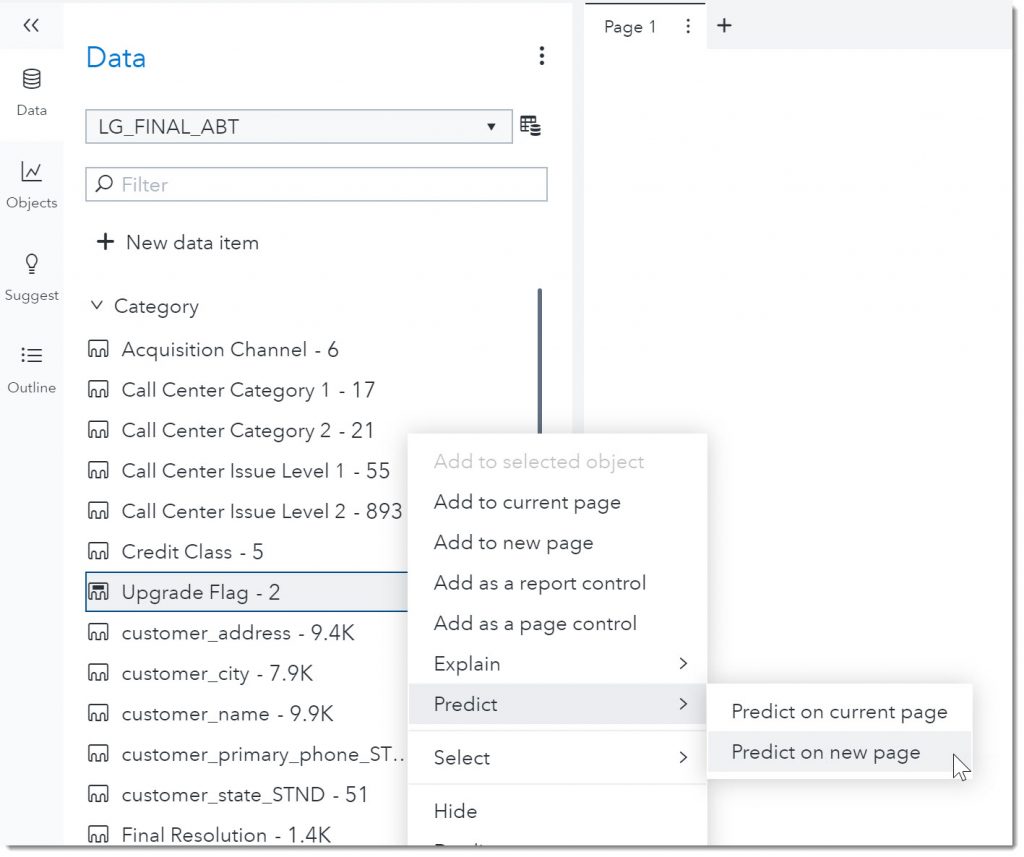
We’ll right-click on the Upgrade Flag variable and choose Predict on a new page in our report (Figure 1 below).
With the automated prediction feature, SAS Visual Analytics created this easy-to-use form in less than a few minutes—by using advanced analytic models and machine learning in the background—that can help predict whether a customer is likely to upgrade (Figure 2 below). SAS analyzed all the other variables in the dataset to determine which ones were most likely to influence our Upgrade Flag. We can modify some of the values in the form and see how it affects the outcome. The factors are listed in order of their relative importance.
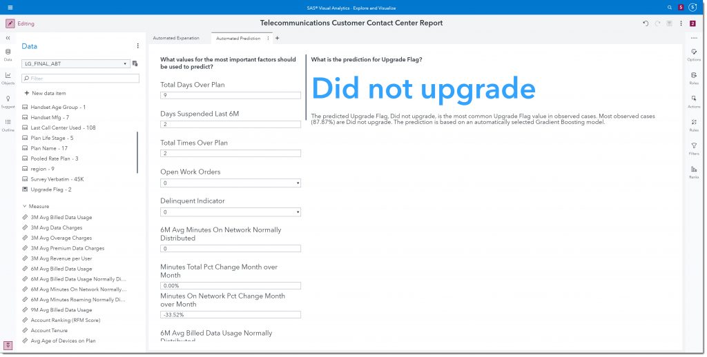
Under the prediction, SAS provides further details using natural language generation (NLG) (Figure 3 below). For example, here we see that the most prevalent value in our data was Did not upgrade with 87.87% of the records having that value. We can also see what type of model was chosen as the champion model; the model that best predicts whether a customer will upgrade. In our current example, the Gradient Boosting model provides the most accurate results.

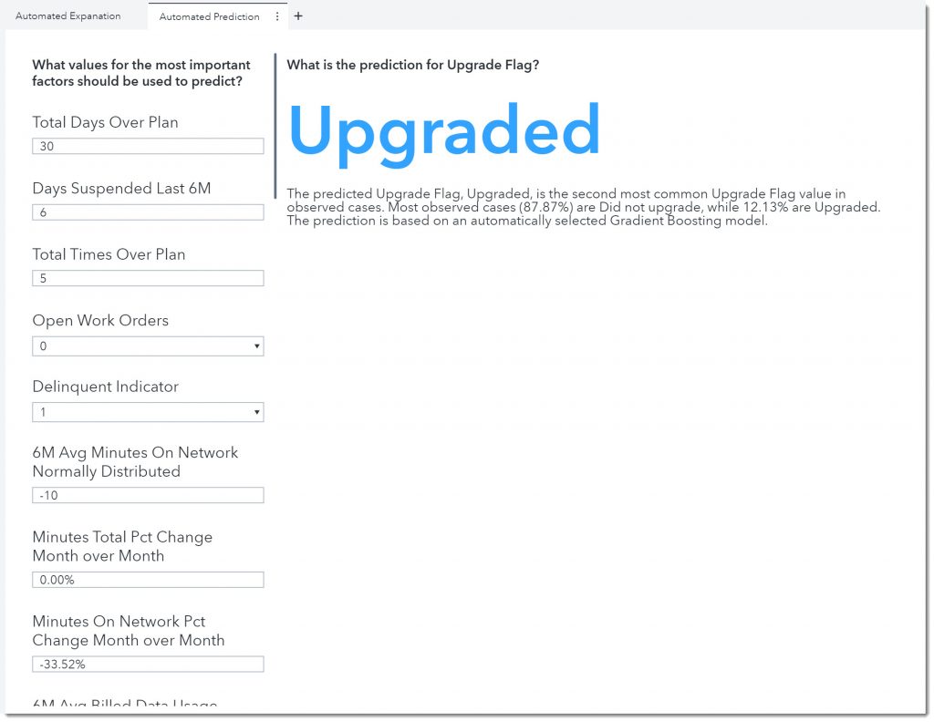
Now, let’s say that a customer calls in. We can fill in the values for each of these parameters listed that are specific to that customer. The analysis is automatically updated using the model previously generated and provides an updated prediction.
Here we see that this customer is likely to upgrade (Figure 4 below). Now we can discuss other mobile plans with this customer.
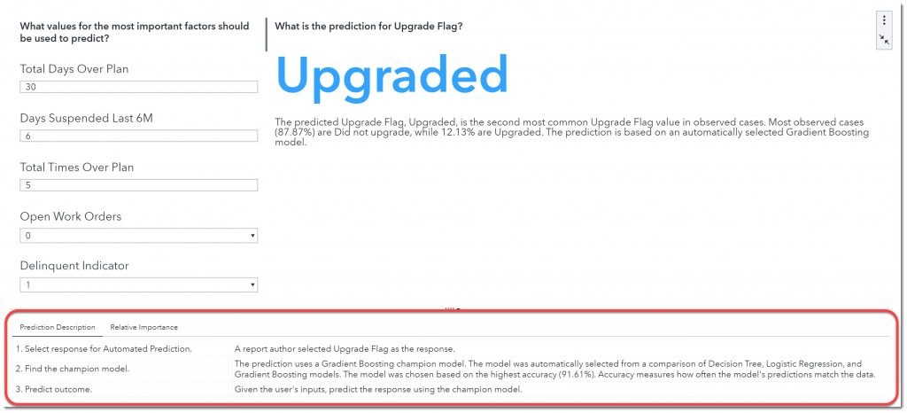
What if we want to learn more about the model behind the prediction and what variables were deemed the most important? We can find that information when we maximize the object (Figure 5 below).

Now we can see at the bottom the steps that were taken to create the champion model (step 2) (Figure 6 below). SAS ran a decision tree, logistic regression, and a gradient boosting model and found that the gradient boosting model provided the greatest accuracy (91.67% accurate in predicting upgrade flag).
If we select the Relative Importance tab, we can see the relative importance of each of the underlying factors (Figure 7 below).
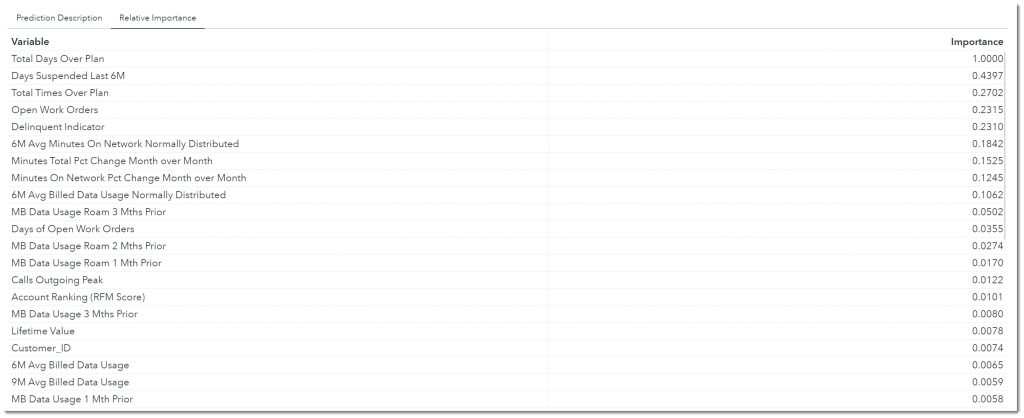
Total Days Over Plan has the greatest influence on our Upgrade Flag variable. Days Suspended Last 6M is the next most important variable whose impact is 43.97% of Total Days Over Plan (Figure 7 above).
Automated Prediction is a fast and easy way to gain an understanding of how variables influence a target and to consider “what if,” by seeing how modifying those underlying factors affects an outcome. Multiple models were run on the data and a champion model was chosen for us using machine learning. We were able to see the accuracy of the champion model and the relative importance of each influencer. All this within a few minutes! This provides a great foundation for moving forward to more advanced modeling techniques.
For those who wish to have more control over the models, SAS Visual Analytics also provides capabilities to build and modify other advanced analytical models such as gradient boosting, linear and logistic regression, and decision trees. Furthermore, as your company’s analytic maturing increases additional products can be easily added on to provide even more model choices (Forest, Neural network, Support vector machine, etc.) and capabilities. SAS’ platform and products support the whole analytical life cycle from data preparation all the way through model deployment, model performance management, and decision intelligence.

4 Comments
Figure 4 and 6, although I think I figured out that they are medians.
Which Figure number are you referring to?
What are the numbers that are populate the boxes? Are they from one individual case or averages or something else?
This feature was nice,This will surely help to business owners.