When we send spacecraft from Earth to Mars, do the Martians consider them to be UFOs? I might not be able to answer that question definitively ... but I do have some really cool graphs showing the data for all those missions to Mars! You might remember a previous blog
English
This post is from SAS Author Sanjay Matange. It's part of our SAS Author Tips series. Do you have a complex multi-cell graph created in ODS Graphics Designer that you’d like to reuse with different data? Ideally, you’d like to change the data without having to change the plots in each cell. The
Editor’s note: This is the first in a series of articles to help current SAS programmers add SAS Viya to their analytics skillset. In this post, SAS instructors Stacey Syphus and Marc Huber introduce you to our new Introduction to SAS Viya Programming for SAS 9 Programmers video library, designed to show SAS programmers how they can
The NC Scholastic Chess Championship is coming up this weekend, and my buddy Michael Thomas asked if I might could create a few graphs to help analyze the event data. How could I pass up an opportunity like that?!?! Read along, and find out what graphs I created, and the
Word on the proverbial technology street is that online learning is ideal for modern learners, and, at SAS, we wholeheartedly agree. In 2016, more than 80,000 SAS users trained in an online or blended learning format. In 2017, we kicked off the year with the announcement of our new SAS
Editor's note: The following post is from Emma Warrillow, Chief DiGGer at Data Insight Group Inc. (DiG). Emma is a featured speaker at SAS Global Forum 2017 and recently named as one of the Top Women in Direct Marketing by Direct Marketing News. Learn more about Emma. “I need
A common request we receive about SAS Global Certification practice exams is to make them as close as possible to the actual exams so that future test takers get a more accurate feel for the overall exam experience. Good news. Our new practice exams come as close to the “real thing”
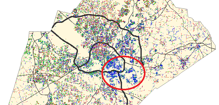
Does your data just look like a bunch of dots? Would you like to bring those dots to life so they can tell their story? This example shows how to make some voter-registration dots a bit more lifelike, so you can see what they're saying. You can apply the same
Editor's note: This series of blogs addresses the questions we are most frequently asked at SAS Press! It worth spending some time on this. Arguably, this is one of the most important parts of the book. The table of contents and outline provide the blue print of your book –
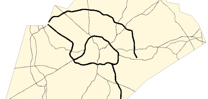
Have you been using the SAS/Graph Gmap procedure to plot your data on maps for years, but never knew you could add roads to your maps?!? Follow along in this blog post, and I'll teach you how... But before we get started, here's a picture of a nice aerial view