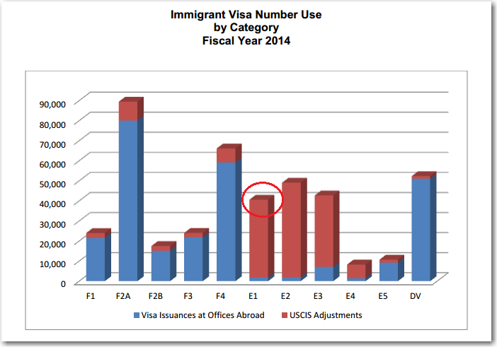
Everyone loves a good conspiracy theory - hopefully you'll enjoy mine about the number of US E1 visas! I was perusing some of the US government charts, and found one on US immigration visas that caught my attention. It was a 3D bar chart, and since I always mistrust 3D
Author
The best graphs are both beautiful and informative - a smooth blend of art and analytics. But more often than not, the two collide rather than blending smoothly... Here is a link to a artistic infographic I recently saw posted by Vendavo on twitter. Their message (80% of your profit is generated
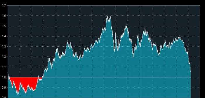
I recently read a Washington Post article about the euro versus the dollar, and I wanted to analyze the data myself to see whether the article was simply stating the facts, or "sensationalizing" things. The washingtonpost.com article started with the headline, "This is historic: The dollar will soon be worth
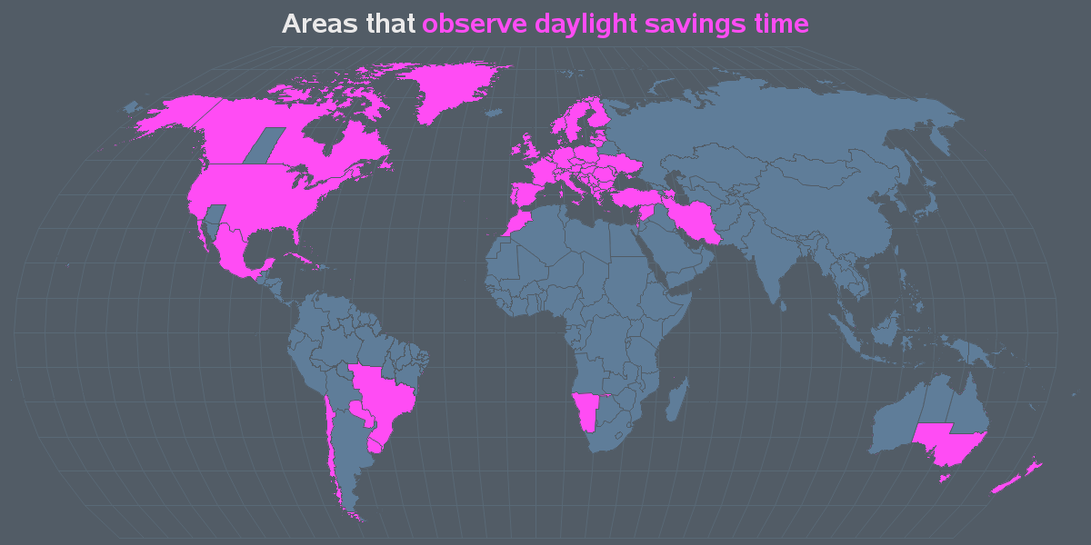
Is daylight saving time the ultimate in efficiency, or is it living a lie? Here are some graphs that might help facilitate a discussion on this topic ... With daylight saving time (DST), a whole geo/political area (such as a country) decides to set their clocks forward an hour during
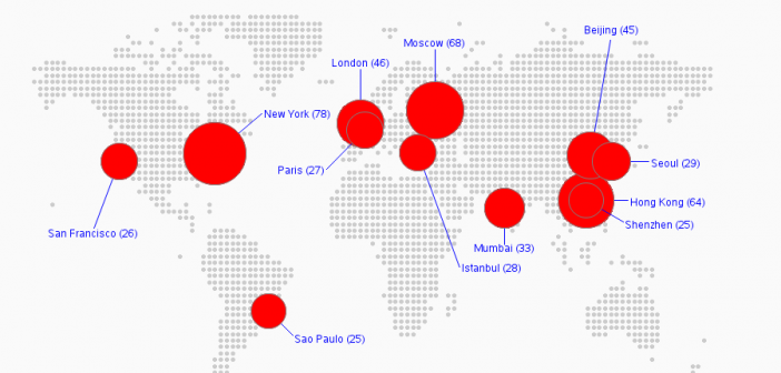
Which is more important - having beautiful graphs, or accurate graphs? Let's explore this question using the locations of the world's richest billionaires... I recently saw a beautiful map on dadaviz.com that purported to show the cities with the most billionaires. Here's a screen-capture of that map: I decided to
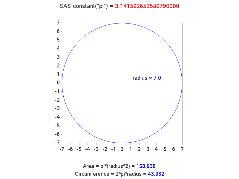
With Pi Day coming up on 3/14, I wanted to make sure all you SAS programmers know how to use the pi constant in your SAS code... All you have to do is use constant("pi") in a data step, and you've got the value of pi out to a good many decimal places
I just found out that Girl Scout cookies haven't changed from when I was a kid. I just moved to a different area, serviced by a different cookie maker! That's what I found out from the cool map in an article on latimes.com! The article explains that there are two different
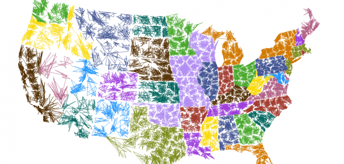
When I saw Robert Kosoro's cool ZIPScribble map, I knew I had to create a SAS version - and of course I had to add a few enhancements along the way.... I was perusing some of the examples on dadaviz.com, and Kosoro's ZIPScribble map caught my attention. It wasn't a particularly useful
You might be surprised at how many movies and TV shows are made in North Carolina - especially within the last few years. This blog provides a SAS graph that will make the list of films even easier to read! A recent story by the Tar Heel Traveler, and an exhibit
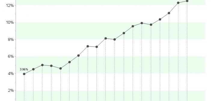
After the legalization of recreational marijuana use in Colorado in 2012, it has been a much more frequent news topic than before - even from a data analysis perspective... I was recently looking for 'interesting' data to analyze with SAS, and I noticed some articles about the increasing potency of marijuana in