Which is more important - having beautiful graphs, or accurate graphs? Let's explore this question using the locations of the world's richest billionaires...
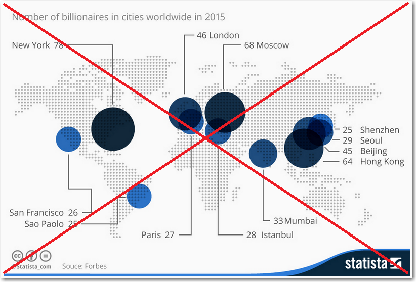
I recently saw a beautiful map on dadaviz.com that purported to show the cities with the most billionaires. Here's a screen-capture of that map:
I decided to try creating a similar map using SAS. I found the data source on the forbes.com website, entered the data into a SAS dataset, programmatically looked up the lat/long of the cities, and plotted them on a map.
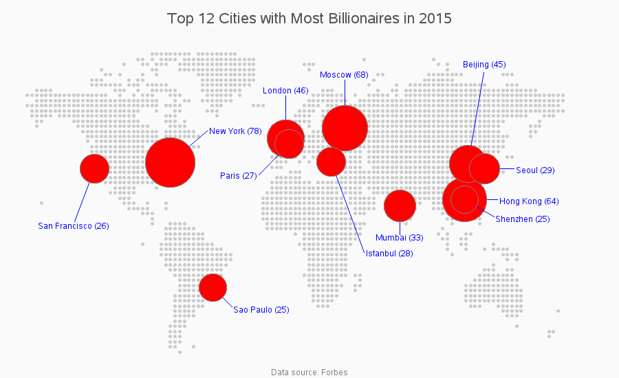
I was happy & satisfied that I had reproduced their map, until I noticed that "one of these things is not like the other..." My Shenzhen city bubble was near Hong Kong, whereas in the dadaviz map it was up north of Seoul and Beijing. I researched this (and even confirmed it with my co-workers in China), and determined that the position of Shenzhen in the SAS map is correct ... and the beautiful map on dadaviz was not accurate!
I'm not sure how the dadaviz map ended up wrong (maybe the bubbles were positioned by hand, or using hard-coded values that contained a typo?) But this is one of the reasons I prefer to use SAS and position my markers in a data driven way - which allows me to create output that is both beautiful and accurate!
Technical Details:
To create the background map, I created a grid of gray dots, across all the possible lat/long locations of the world, and then used Proc Ginside to see which dots fell within a country (and discarded the dots that weren't in a country). I looked up the lat/long positions of all the listed cities in the mapsgfk.world_cities dataset (which ships with SAS/Graph), and created annotated pies at those lat/long positions, with the area of the pie proportional to the number of billionaires. I got a little 'tricky' with annotate pie commands to draw the line from the pie and then write a label at the end of the line. Here's a link to the full SAS code.
If you were a billionaire, which city would you live in, and why?...