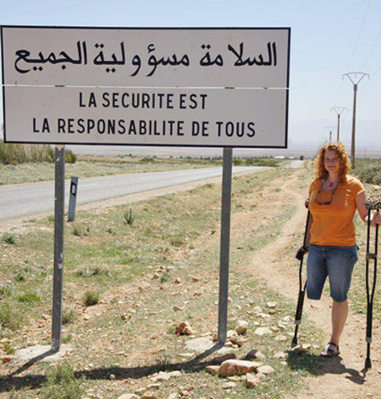
As you travel around the world, do you know where English, French, Spanish, and Arabic are spoken? This blog will help you quickly answer that question, with some cool SAS maps! But first, here's a picture of my friend Joy posing beside an interesting sign during one of her international
Author
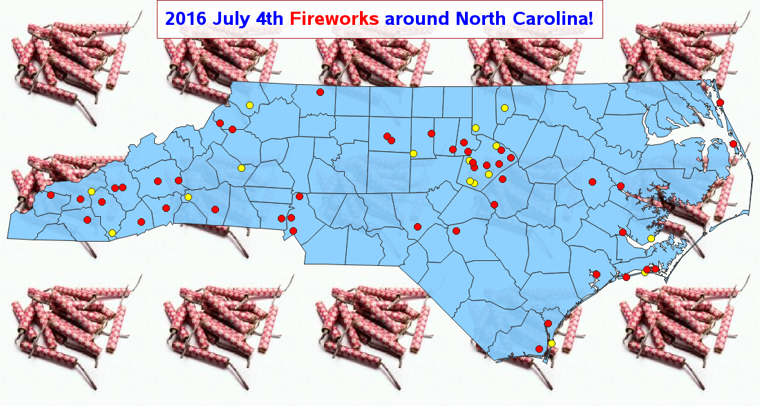
Update: This blog has been updated with the 2016 map. You can use SAS for just about anything - that includes finding a great fireworks show to watch during the US Independence Day holiday! Here's a fireworks-locator map I created using SAS (see technical details below). The red dots represent
What is it that people like so much about motorcycles? The thrill/excitement/freedom of riding them, the 'biker image' portrayed in movies, or great songs such as Little Honda by the Hondells? I'm not a biker per say, but I do have a couple of motorcycles, and am a known associate
Greece has been in the news lately, trying to secure funds to repay 1.5 billion euros to the International Monetary Fund (IMF) by the end of the month. And as luck would have it, there is some data available and some graphs to be created ... I love this job!
Nope - we're not digging up mummies in pyramids and analyzing the gender - this blog is about population pyramid charts and "digging into data"! But since the title might have lured in some pyramid fans, here's a picture of my friend Angela posing beside a pyramid - pretty cool, eh?!?
Discovery Channel's Shark Week starts July 5, 2015 - and I've created a special SAS map & graph of shark attacks in North Carolina to get you in the mood for their week of shark education! But first, to get you in the mood for my blog, here's a picture
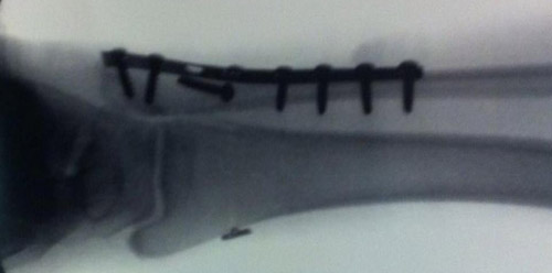
One of my earlier blogs on handling percent (%) values in SAS was very popular (it's been viewed over 34,000 times!), so I thought I'd write a similar blog on handling time (mm:ss.ss) values in SAS ... This past weekend I was in a dragonboat race (that's me in the
What cities have the most and least profitable public transportation services in the US? Perhaps you can find out in this graphical visualization of the data! The US data I'm analyzing here covers things like buses, vans, and rail ... but it might be even more interesting to analyze data from
A recent study by Bai & Anderson has found that some hospitals charge 10x (ie, 1000%) higher than the standard rates set by Medicare. Many news agencies have posted the list of the 50 US hospitals that have the highest markup. But I am more visually oriented, so of course I used SAS
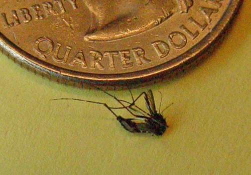
Have you ever been bitten by a mosquito? What are the odds it carried the West Nile virus? ... Perhaps a lot higher than you thought! Here's a picture of a mosquito that kept 'bugging' me around my computer desk at home - good riddance, I say!