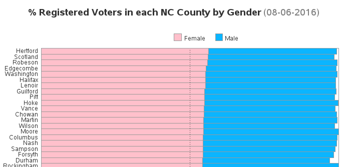
Since this is an election year, I've been scrutinizing the voter registration data. One thing that surprised me is there are more female voters registered in NC than males. I wondered if this was consistent across all 100 counties, and created some charts to help visualize the data... First I went
Author
There's an old expression "if you can't measure it, you can't manage it" - and while that expression probably isn't universally true (as pointed out in this interesting article), I think having a way to quantify your stress could be useful. I recently read an interesting article about the Holmes-Rahe Life
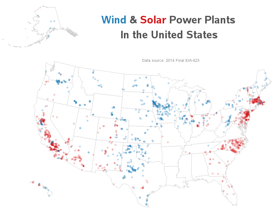
Where is solar and wind power generated in the US? Let's visualize this data on a map... I recently saw the following map on the metricmaps.org website. It caught my attention because it looks like North Carolina has a lot of solar power plants, whereas our neighboring states have very few.
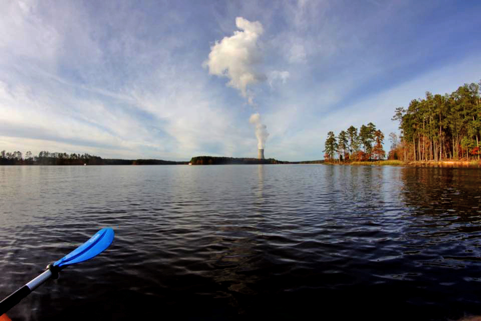
I ran across a map recently that seemed to show a lot of US states are primarily coal-powered. The map was a little difficult to read, so I decided to give it a SAS makeover ... Before we get started, here's a picture my friend David took of the Shearon Harris Nuclear Power
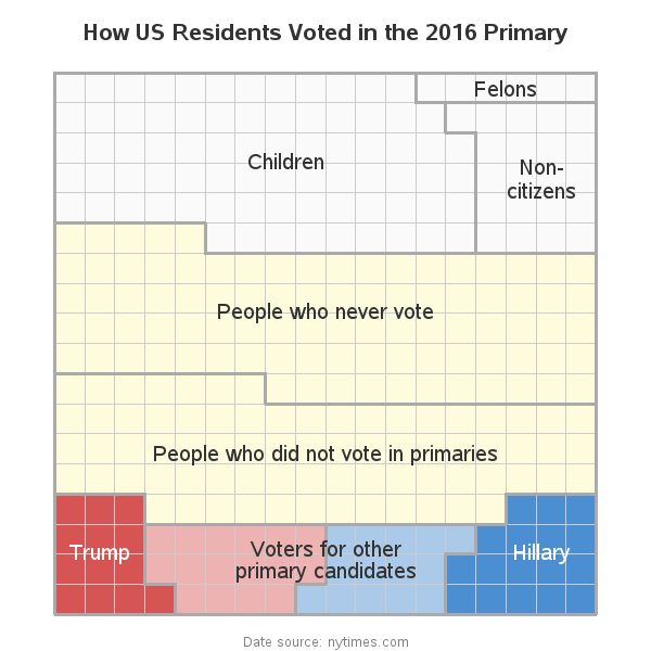
How is it that 91% of the US didn't vote for either Hillary or Trump in the primary, but yet they're still the final two candidates in the presidential election? Let's break it down with a simple graph! I recently saw a really cool slideshow on the nytimes website, that answered
I usually try to avoid political or religious debates ... but as an impartial data analyst, it is possible to analyze data about something, without entering into the debate. In this blog post, I try to walk that fine line, and analyze data about the political leanings of religious groups in the US.
Were you the kid who sat there analyzing the amusement park map before entering the park, planning out how you could visit the most rides in the least amount of time? If so, then this blog's for you, my data analyst kindred spirit! And to get you in the mood,
The way your graph looks can make all the difference ... two people can graph the exact same data in essentially the same way, but one of the two graphs can be perceived as much better than the other. Hopefully reading my blogs will help you create the better graph!
One of my favorite quotes is: "You can't believe everything you read on the Internet" - Abe Lincoln, 1868. And that is especially true when it comes to graphs and statistics. Hardly a day goes by without me seeing a bad graph that misrepresents the data (either intentionally or unintentionally) .
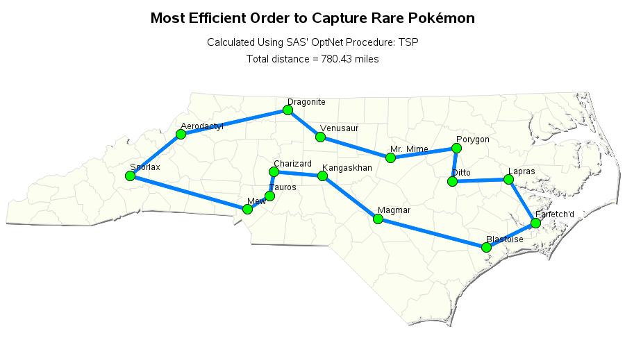
With the Pokémon Go craze sweeping the world, techies and programmers are looking to apply their skills to gain an advantage over the average user. In this blog post, I show how to use some of SAS' geospatial analytics capabilities to capture a Pikachu. Let's say you know of a building that has