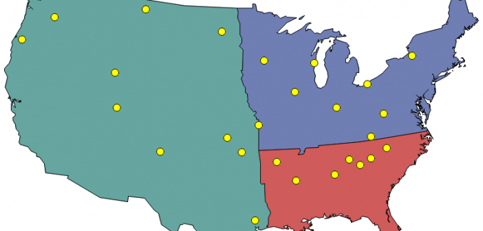
A new prospective customer enters their personal information on your web page, and they want to have a sales rep contact them ... but you need to know which sales region they're in, so you can assign them to a sales team. Now, multiply that by thousands of prospective customers!
Author
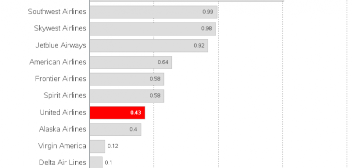
You've probably all seen the images of the passenger being forcibly removed from a United Airlines flight, to make room for airline staff flying on standby. The incident caused quite a bit of negative publicity, and quickly wiped out a quarter billion $ of the airline's market value. But did
SAS provides a map for each country, but there are likely other maps you want to use that SAS does not provide. If you have other maps in the Esri shapefile format, you're in luck - you can import those maps and use them! In this blog post I share
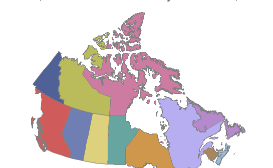
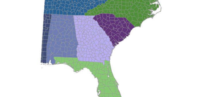
In recent versions of SAS/Graph, we have been shipping new/updated maps of each country, with 2 levels of detail (such as state & county, or province & division). But what if you only want a map showing the higher level of detail? In this blog post I share my third
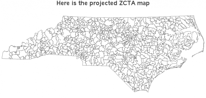
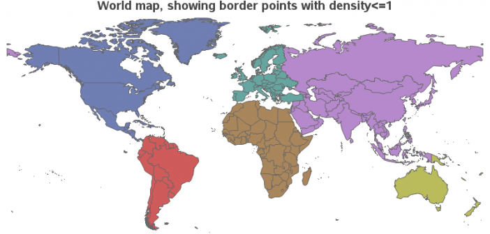
Have you ever seen a map that just didn't look right to you? Perhaps the map area seemed squished or stretched? Perhaps this was because they used a different map projection than you were accustomed to. Or maybe the map coordinates weren't projected at all. In this blog post I
With the advent of things like car GPS & Google Maps, and a steady supply of nice maps from certain news sources (such as the New York Times), people have finally embraced the idea that mapping data can be very useful. And if you are into data visualization, you have
For those of you who don't have SAS/Graph's Proc GMap, I recently showed how to 'fake' a variety of maps using Proc SGplot polygons. So far I've written blogs on creating: pretty maps, gradient shaded choropleth maps, and maps with markers at zip codes. And now (by special request from
If you're into data visualization, here's something that might interest you - a free eBook showing several ways to use SAS to visually analyze your data. (Did I mention it's FREE?!?!) We've picked juicy chapters from several books and upcoming books (and a few other sources), to show you what
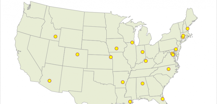
Users frequently ask how to plot their data as markers on a map. There are several ways to do this using SAS software. If you're a Visual Analytics user, you can do it using a point-and-click interface. But if you're a coder, you might need a little help... In this
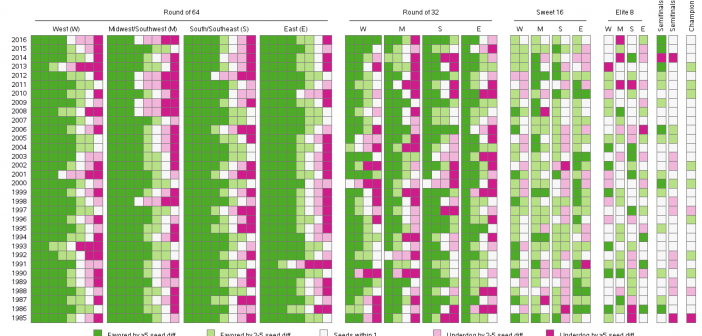
Here in the US, it's the nationwide men's college basketball tournament season! Therefore let's use some data from the previous years' tournaments to sharpen our analytics & visualization skills... But before we get started, I must mention (brag?) that my alma mater, NC State University, won this tournament in 1983.