Infographics are one of the most visual ways to tell stories with data. They are designed to catch the reader’s eye, and they use visuals to provide a lot of information in a small amount of space. However, we’ve learned there are many ways data can mislead a reader, and those same issues often come up when using infographics. Let’s explore some of the special features of infographics that make these representations particularly challenging to interpret correctly.
Over-designing infographics
Infographics are intended to attractively display information and often incorporate several design elements. But sometimes those design elements overpower the data and distract the reader from the underlying information. Common design elements inspire the infographic on the right.
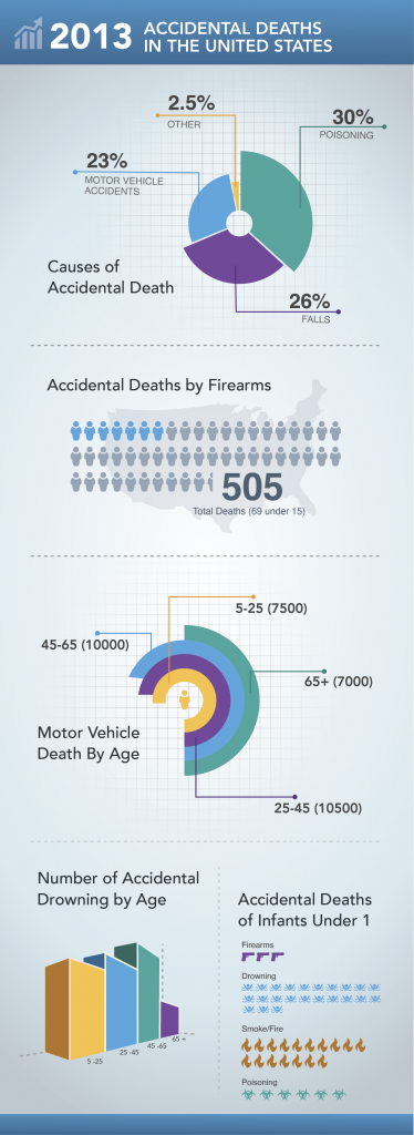
This infographic communicates facts regarding the causes of accidental deaths in the US in 2013. The charts are designed to be visually appealing, and they are. But the data could be communicated in a clearer and more concise manner if the creator used traditional graphs and charts.
Let’s start with the pie chart. It shows the main causes of accidental death. There isn’t much of a difference between the rates of poisoning (30%), falls (26%) and motor vehicle accidents (23%). Yet, the enlarged wedges imply that poisoning deaths far exceed deaths in motor vehicle accidents. This type of design violates the principle of proportional ink.
The next graphic shows a rounded bar chart depicting motor vehicle deaths by age. Here again, this type of display alters the perception of the data. Because the inner circle has a smaller radius, the yellow bar appears to go farther than any other bar. But if you look at the actual data, it should be much smaller than the purple or blue bars. The manipulation of the graphic makes it appear more significant than it is.
Consider size and scale
The use of icons to represent data, as seen in the chart showing accidental deaths of infants, is a common infographic design. However, if the creators aren’t careful, the size and scale of the icons can make the data difficult to accurately interpret. In this graphic, the drowning icon is smaller in scale than the others, hiding how many more deaths are caused by drowning compared to other causes. This graphic would be much easier to interpret correctly if the scale of the icons was equal.
The next bar chart, showing drowning by age, uses a different design treatment — a 3D view. This makes the chart more appealing than a traditional bar chart, but again, the design makes it harder to read. The 3D view doesn’t display axes so the only thing the reader can do is compare the different categories, not make judgments on the total numbers. The perspective on the chart is misleading as well. The scale of the first bar (ages 5-25) looks significantly larger than the last bar that’s further away (65+) but, the actual difference in these values is not substantial (710 and 554 respectively). This is another case where the design treatment of the graph makes it easy to draw incorrect conclusions.
The last graphic, accidental deaths by firearm, uses icons to communicate a statistic, but the graphic isn’t particularly helpful. Here each image icon represents 10 people accidentally killed by firearms, but the use of the graphic doesn’t help the user understand the scale of deaths. It's simply there to add visual display to a statistic.
Prioritizing design
In addition to the design issues above, important information may be left out of an infographic. The creator isn’t intentionally trying to mislead readers in this case, but rather, he or she is prioritizing design because the additional data might detract from the overall product. This can include important features such as axes, labels and other elements that are critical for reading and understanding a chart. Consider the 3D bar chart in our example. Without an axis labeling the value of those bars, it is impossible to interpret the chart accurately.
Context is often one of the most important things infographics can lack. We’ve talked in detail about the importance of asking questions about the data you’re reading, such as “what did the survey ask?” and “where does this data come from?” That information is often present in longer articles able to describe the methodology and sources of data. Infographics may not have this context to help you answer critical questions. A good infographic will provide at least a reference to where the data comes from, or where you can find more information, but this isn’t always the case. You may see infographics with data from a variety of sources, which means it may have been collected using different methodologies or samples, making it challenging to piece together a cohesive picture.
Overall, infographics can be a nice way to engage readers with data and information. However, issues arise when the design of the infographic takes precedence over accurately communicating information. Creators of infographics should carefully focus on readability first, before considering design. And readers should recognize that the issues we have covered about interpreting data in reports, articles and surveys hold true when interpreting infographics, and may be especially challenging in this case.

4 Comments
Great post!
Regarding the first pie chart, not only it is out of proportions, it is out of math as it simply does not add up. Percentages of all causes of accidental death should add up to 100%, but they only add up to 23% (Motor vehicle accidents) + 26% (Falls) + 30% (Poisoning) + 2.5% (Other) = 81.5%. Where are the rest 18.5% ? And why the second chart "Accidental Deaths by Firearms is not included in the first pie chart? And why the second chart provides absolute numbers while the first is lacking them. Total mess.
Indeed!
A very good guide Jen -- thanks for sharing! Last year I dissected and reimagined one of the iconic infographics shared in USA Today. When done well, an infographic can make us curious about a topic and perhaps inspire us to learn more. (Of course, when done poorly an infographic can mislead and point us towards wrong conclusions.)
I agree with Chris. A good guide and a truly important topic. Misinformation is rampant today and I believe people need to learn how to interpret the information they are being bombarded with. You bring up some great points that drive home how important it is to have context to what you're reading. Thank you.