
“The future is already here — it's just not very evenly distributed.” ~ William Gibson, author
The same can be said for climate change – global warming is here, in a big way, but its effects are still an arm's length away for many of us. How is climate change impacting you? Louisiana is losing a football field’s worth of land every 90 minutes to the ocean due to subsidence, erosion and rising sea levels (the topographical boundary with the Gulf doesn’t look much like the outline on the state highway markers).
But I live near Raleigh, North Carolina, where I’ll still be above the water line even if all of Antarctica melts. Since I moved to Raleigh 20 years ago, our gardening hardiness zone north of the city has changed from 7A to 7B, but that’s not why my peach trees and hydrangeas struggle – blame that on the gardener, the soil, the beetles and the deer.
Despite the lack of any immediately discernible impact from climate change, and with the US now exiting the Paris climate accords, I thought I’d exercise my newly acquired SAS Viya skills to examine some climate data first hand and see what I could learn. I worked primarily from a combination of Climate Change Indicator data sets provided by the US Environmental Protection Agency (EPA), including greenhouse gasses, temperatures, precipitation, cyclone activity, and ocean temperature, heat and acidity. Some of the data sets, such as ocean acidity and Arctic ice, go back only a few decades, but most of the data is available from the turn of the last century, and in the case of CO2 concentrations, for the past 800,000 years.
After you’ve done your data cleansing and data prep (often half the work), the SAS Visual Analytics tools were pretty straight forward, even for a business user like myself:
- Import the data.
- Create a project/report.
- Drag an object like a graph or a statistical procedure into the workspace.
- Assign roles for the variables of interest.
- Tidy up your labels and titles.
And there you have it: insights. And what I found was nothing short of astounding. There's something about manipulating the data with your own hands that makes you better appreciate the import of the results.
CO2 and global warming
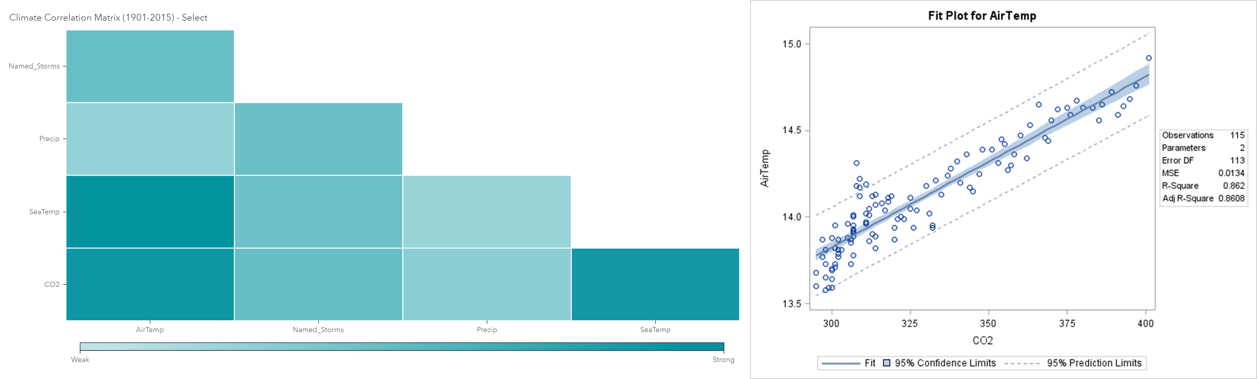
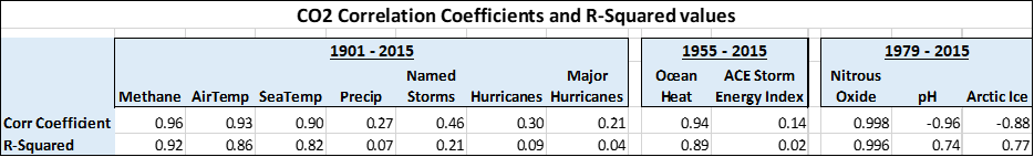
Let’s start with the star of this show: CO2 and global warming. The correlation coefficient, which is a measure of the strength of a relationship, between CO2 concentrations and global air temperatures from the years 1901 to 2015 is 0.93, and with global sea temperatures it’s 0.90 (1.0 would be perfect correlation, zero would be uncorrelated, and -1.0 would be perfect negative correlation). The respective r-squared values, a measure of the variance explained in the temperatures by CO2 concentrations for these two relationships are 0.86 and 0.82 respectively.
Going into this project I knew the relationships were strong, but until I did the work myself I didn’t realize exactly how strong. You never see relationships and values this high in typical business / marketing / finance / economic data. You generally feel lucky to find an r-squared in the 30-50% range, where some primary characteristic, such as gender, or income, or age, can be effectively used to partially explain some customer behavior. Climate change is acting more like a controlled physics or chemistry experiment than a weather forecast.
Are there other explanations for increased CO2 concentrations?
As for the remaining 14%, the EPA website provides additional material showing the other major contributors: methane, N20, chlorofluorocarbons, and aerosols and particulate matter, such as from volcanoes. The first three account for nearly all the remaining variance, and the first two, methane and nitrous oxide, are so highly correlated with CO2 generated by human economic activities (0.96 and 0.998) that simply tracking and measuring CO2 accounts for the impact of all three.
As for the aerosols and particles, the net overall effect is actually one of cooling rather than warming, as the particles reflect more sunlight energy than they absorb. The most recent example of this was the eruption of Mt. Pinatubo in 1991, where a noticeable cooling effect was indeed measured.
Likewise, the most powerful volcanic eruption in recorded human history, that of Mt. Tambora in 1815, gave us the ‘Year without a Summer’ in 1816, which we can thank for the circumstances leading to Mary Shelley’s Frankenstein. The situation for, and impact of, flood basalts (the last large one being the Columbia River flood basalt, 17 to 15 million years ago), is quite different and will be discussed in the next post in this series.
Are we missing anything else? Not much, just typical weather variations such as the El Nino Southern Oscillation (a four to seven year cycle), human land use affecting the albedo, or reflectivity, of the surface, and perhaps the 11-year sunspot cycle. Considering how well funded, organized and influential the Climate Denial industry is, you wonder what data they could possibly be using to defend such an unsupportable conclusion.
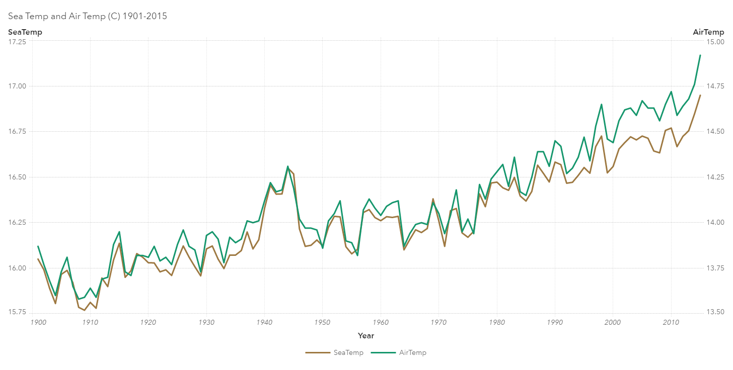
While the full table above (FIG 3) shows the correlation coefficients and r-squared values for the relationship between CO2 concentration and a host of the environmental variables it impacts, there is one relationship not on that list: The relationship between global air and sea temperatures, with a correlation coefficient of 0.99 between them (detailed in the line graph below).
They tried to tell us in high school earth science class that the atmosphere and the ocean are really one, connected system – they just never had or showed the data supporting such a tight coupling, as the graphic below (FIG 4) illustrates.
How unusual are current CO2 levels?
How abnormal is a CO2 concentration of 410 ppm, the latest 2019 measurement? The graphs below show the EPA’s database of ice core-derived CO2 concentrations going back 800,000 years, with the right-hand graph expanding out the last one thousand years.
For nearly the past one million years, CO2 concentrations have averaged around 225 ppm, plus or minus 50 ppm or so, with no readings above 300 ppm. Until 1910. This despite millennia of activity on this planet, including the eruption of the Yellowstone Supervolcano in 630,000 BCE (Volcanoes are one of the usual suspects for the climate denial gang; however, on average, human activities emit 60 times more CO2 than all of the planet’s volcanoes combined).
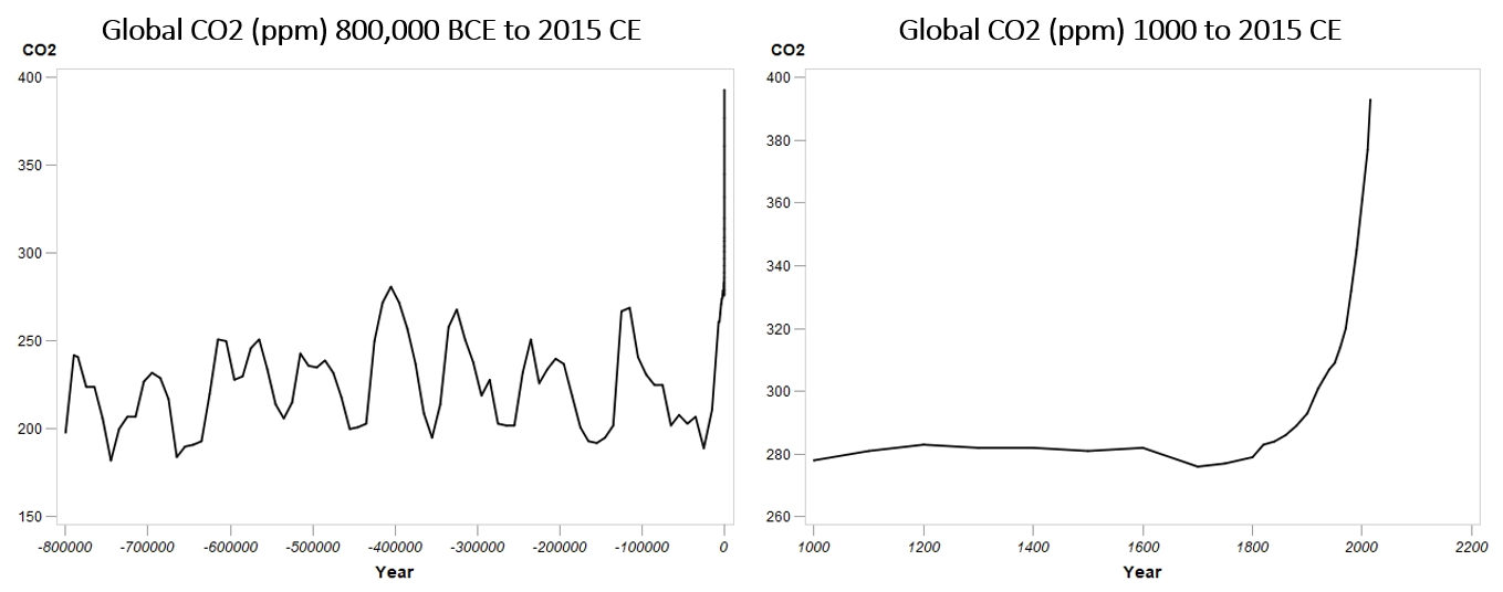
If you think you see a cyclic pattern in the long-term data, you probably do, likely caused by the 41,000 year cycle of changes in the angle of the Earth's axial tilt – it varies over time between 22.1° and 24.5°, with its current tilt at 23.5°, roughly halfway between its extreme values. This, and other related Milankovich orbital cycles, impacts the sunlight reaching Earth’s biosphere and hence the uptake and release of CO2 by plants, algae and plankton. But still, nothing like we’ve seen since the introduction of the coal burning steam engine around 1700.
More to come
In my next post I’ll go deeper into some of the other findings from the correlation table, notably hurricanes and acidity, where I want to test some hypotheses regarding the impact of global warming on cyclonic activity – are we seeing more of them? And if so, are they getting stronger or not? As a cliff-hanging preview, what I found regarding hurricanes was nothing compared to the increase in ocean acidity and its possible impact on marine life.
Until then I leave you with these thoughts: If we simply hold our output of CO2 and other greenhouse gasses at current levels (a dubious assumption at best), we will break the 500 ppm mark within my lifetime, the 600 ppm level in that of my children, and will crash though the 800 ppm mark during that of my grandchildren and many of my current readers. These are levels not seen since the Pliocene, Miocene and Eocene epochs respectively: 3, 20 and 40 million years ago, when palm trees grew in Alaska. Humans may find ways to adapt, but the rest of the biosphere is going to struggle with such rapid change.

4 Comments
Hi Leo,
I read the sentence "There's something about manipulating the data with your own hands that makes you better appreciate the import of the results." and it put a huge smile across my face as I know the feeling and I can imagine many others can relate too. Thanks for exploring this data and sharing your insights. I'm looking forward to your next post. I read recently the pH of the ocean has reduced from 8.2 to 8.1 and as a result some marine life are unable to grow their shells.
I'd also be interested if you have data relating to bushfires - very topical and political at the moment in Australia...
Cheers,
Michelle
"While carbon dioxide is typically painted as the bad boy of greenhouse gases, methane is roughly 30 times more potent as a heat-trapping gas." - https://www.sciencedaily.com/releases/2014/03/140327111724.htm
Understood and agree. Fortunately, so far, it's in low enough concentrations that it only contributes a few percentage points of the total towards overall global warming. As for the human-induced component, about half of it is directly associated with our carbon-extraction, production and combustion activities, and would commensurately decrease if we cut down on those activities (the other half comes from our livestock). However, as we've been hearing, if there are large quantities of methane trapped in the Arctic permafrost to be released as temperatures rise and the permafrost melts, that percentage could increase significantly. The article you reference discusses a natural mechanism, accounting for most of the pre-industrial methane concentration, that I'd not paid much attention to - micro-organisms. Getting ahead of myself here, but my next article discusses the impact of CO2 on ocean acidity - I wonder if the micro-organism process is somewhat self-limiting - increased pH inhibiting micro-organism growth?
A few other points to consider.
The bacterial decomposition of the tundra not only produces CO2/methane but also massive amounts of heat Energy. Municipal compost systems can generate core temperatures between 50 - 70c. Apply this heat release to the acceleration of permafrost thaw and air heating.
The amount of heat generated by fossil fuel consumption ( a gal of octane releases 37 kwh of energy which contributes to the warming environment.