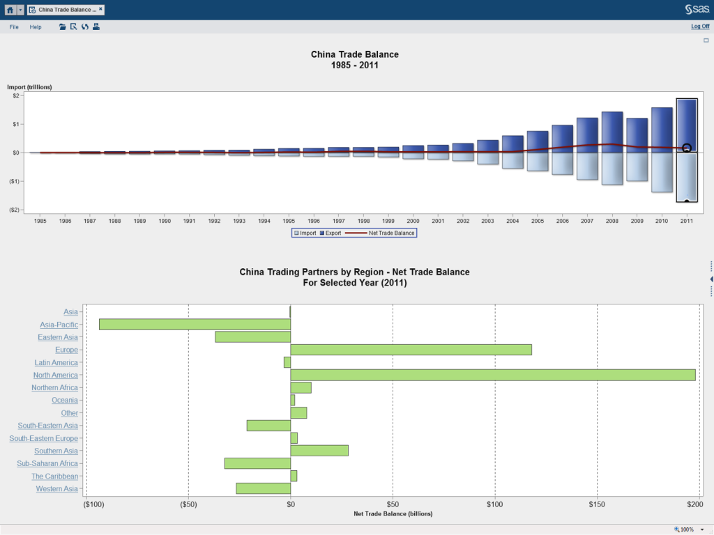
Data visualization tools are a great way to create impactful reports. A well designed report can give users an understanding of their data quickly and easily. And with tools like SAS® Visual Analytics, users can now quickly visualize and understand vast amounts of data. However, with all the visualization options available within these tools, creating a report that quickly and effectively delivers information can be a daunting task. This is especially true for those users new to creating these types of reports.
Recently I was working with a group of SAS Visual Analytics customers who were fairly new to creating reports using visualization tools. While they had been creating reports in other tools, especially Excel, they struggled with how to leverage a data visualization tool. They were excited by the sheer number of visualization options available to them, but they quickly fell into the trap of trying to do too much in a single report.
In order to continue on with their report creation, we had to take a step back and start with some ground rules. This process led to the following list of Do’s and Don’ts. While this is in no way meant to be an exhaustive or all-inclusive list, it is a great foundation to help guide report creation.

Do
- Have a goal in mind.
- This may sound obvious, but by understanding what information you want the visualization to get across, you are more likely to accomplish it.
- Keep it simple.
- If it’s not important to the message you are trying to get across, eliminate it.
- Choose the correct graphic and style.
- For instance, if you are comparing data with similar values, a pie chart may not allow the user to distinguish the difference in values. A bar chart may be a better option.
- Contrasting colors can make your visualization pop.
- Use the full axis to avoid distortion.
- If there is a break in the axis, the comparison among data points can be very deceiving. Your users could reach an incorrect assumption.
- Varsha Chawla recently wrote a blog post where she provided a great example of how removing the full axis can create incorrect assumptions.
- Make sure you include a descriptive title, including the x / y axis.
- Title either what the data is, or what the visual tells.
- Include titles in the x and y axis.
- If the titles are too long (bar chart), rotate so they are not truncated.
- Ask for feedback from others.
- Another set of eyes gives a fresh perspective.
Don’t
- Make it an eye test.
- Make sure you can read everything. This is especially important since some reports will be viewed on a smaller screen, like a tablet.
- Make assumptions about your audience.
- Use industry jargon and acronyms sparingly. Not everyone knows what they are.
- You need to understand who will be viewing the report
- Are they Technical? Operational? Management?
- You want to make sure the users will understand the data and visualization.
- Make a visualization too busy or complex.
- One big, complex visualization may not be best if the audience doesn’t know complexity of data.
- Multiple, simple visualizations may be more impactful than one complex report.
- Make your audience do “math on the fly.”
- If you are comparing variables and you want to get your point across, create the extra calculation and present that in the visualization.
SAS Visual Analytics gives users the ability to quickly and easily create meaningful and impactful visualizations on large amounts of data. With all the various chart types and visualization options, you are sure to find a visualization that helps your audience better understand their data. Use this list not as a complete checklist, but as a guide to help you on your way. Happy visualizing.

5 Comments
Great list! I also think before you start the journey is to determine whether it is a dashboard or a report that is to be built and to work out the navigation path as part of the planning process... Tricia Aanderud and I talk about this in our SAS Global Forum 2014 paper on building a SAS Visual Analytics dashboard for SAS Administrators to monitor a SAS environment. http://support.sas.com/resources/papers/proceedings14/1247-2014.pdf
Thank you for your post. We have been using SAS-VA for more than 2 years and has upgraded to the latest version which is 6.4. It would be very helpful if you can list down possible causes of CPU utilization spiking up to more than 40%. When that happens, we could no longer access and an error message appears. Also, if you can list down what dont's that can cause slow response time by the system. Thanks
Hi! Browsing through SAS Support website, we already found possible causes and solutions in reference to my comment. The notes posted by SAS would be very helpful especially for those who are using geomaps in their reports. Here's the link:
http://support.sas.com/kb/52/871.html
Hi, Gieryl. Thanks so much for providing the link here as an additional resource for readers!
I highly recommend Edward Tufte's 1983 classic "Principles of Graphical Excellence" as a guide to avoiding "chartjunk" or the use of graphics as "decoration", dumb pie charts - especially 3d visualizations of 2d data, and the concept of data-ink ratios. He articulates sound principles of when to use words vs tables vs graphs.