Do you ever look at a chart or graph and think about what it’s really trying to reveal? All the time, right?
Visualizations are useful because they allow us to analyze information much quicker than if we were to look at the raw data by itself. I say this with a big caveat, however. In order for visualizations to be effective, they need to reveal patterns, comparisons, or facts with precision, accuracy, and ease. This should be the rule for all data, not just big data.
With the proliferation of smart phones, and more screens on more devices and objects, consumers and organizations have a need for even better visualizations. Our attention spans are limited and with that, the number of infographics have skyrocketed over the last few years.
Infographics reveal information through visually appealing graphical objects, pictures, and even art work. I’m a huge fan of infographics, but there a few things that bother me about them, and visualizations in general. If a visualization doesn’t reveal what’s really going on with the data, or distorts the data in some shape or form, it should not be used. This may sound logical, but let’s take a look at a three examples that illustrate how visualizations can affect our perceptions of data.
1. Bar charts with erroneous scale
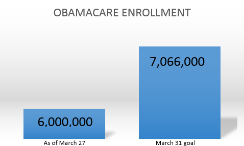
The above graph is clearly trying to make the point that Obamacare enrollment numbers for March 27 are well below the March 31 goal. But, take a closer look at this bar chart. How come the first bar is less than half the size of the second one? This is a common problem with bar charts. Depending on the scale (and in this case, there isn’t one!), the comparison among data points can look very deceiving. If you’re working with data points that are really far or really close together, be sure to pay attention to the scale, so that data is accurately portrayed. If there is no scale, compare the different slices, tiles, bubbles, or bars against each other. Do the numbers match up to these?
2. Pie charts with perplexing slices
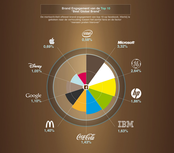
The second example is another one that makes me cringe. Pie charts are great for visualizing how a few components are part of one whole. However, when you bring many factors into the mix that are close together in size or value, you quickly lose the ability to compare values. In addition to these problems, the pie chart or infographic above has several other ones: there are several rings that don’t add to the value of being able to analyze the data, the pie slices don’t have the same radii due to their value differences, but this makes them even more difficult to analyze, and it would have been more helpful if the colors reflected the main colors of the brands. Again, although an infographic like this one may initially seem more interesting, it is actually very difficult to read and glean important information from.
3. Missing legends and mystery colors
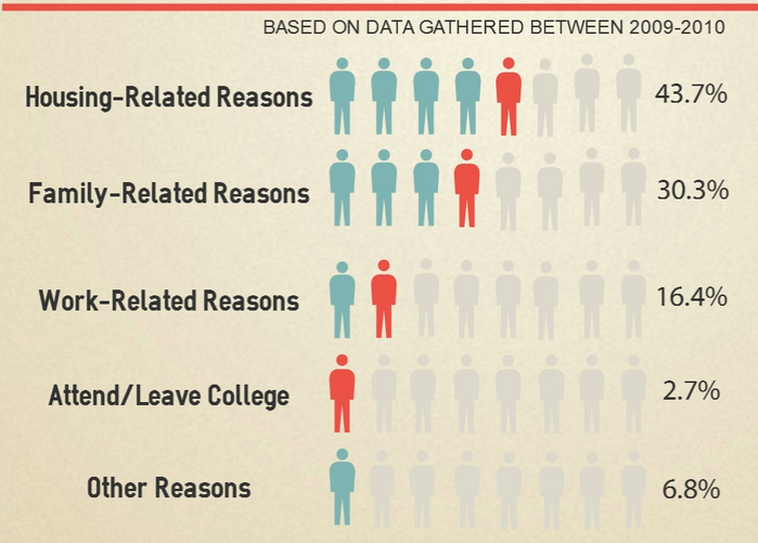
Our third visualization emphasizes the importance of color and scale. Though the example above is not a chart type, the scale should still make sense and the 2.7 percent and 6.8 percent should not be indicated by the same one person image. In addition, we are unclear what the blue vs. red color indicates since there is no legend to go along with the graph. There are many other visualization mistakes to avoid. It’s imperative that before you start working on an infographic, report, or chart, you think through your data and the visualization first:
- Do you have the right data in place?
- What exactly are you trying to reveal?
- What visualizations help you make your point?
- What variables and measures do you need to make the visualizations work?
- Do you need different colors, scales, and axes? What do they mean?
The list goes on.
At SAS, we’re lucky to have SAS Visual Analytics to help us with visualizations. It allows you to explore your data in minutes and can pick the right visualization for the data as well. If you decide you don't like the selected visual, you have the ability to change your visualization in seconds, no matter how much data you’re working with. It’s definitely worth checking out, as much as it is worth going through the check list above. At least this way, you can be sure that you’re affecting what others see in your visualization: something that is accurate, precise, meaningful and effective.
[Images sourced from Pinterest and Tumblr. Click images to see source.]

2 Comments
The color choice for the slice between Google and Disney is curious. I didn't have enough time to figure out which company they intended to be the owner of the slice.
I like to share with my students excerpts from the old classic "How to Lie With Statistics" by Darrell Huff (1954). There are so many ways to present data... some not so good.