The DO Loop
Statistical programming in SAS with an emphasis on SAS/IML programs
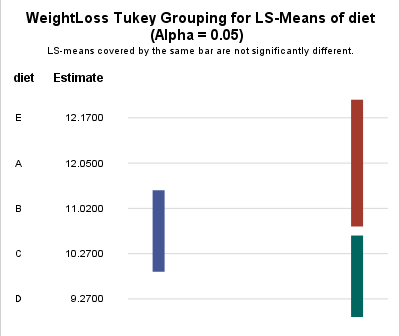
Last week Warren Kuhfeld wrote about a graph called the "lines plot" that is produced by SAS/STAT procedures in SAS 9.4M5. (Notice that the "lines plot" has an 's'; it is not a line plot!) The lines plot is produced as part of an analysis that performs multiple comparisons of

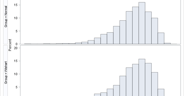
The article "Fisher's transformation of the correlation coefficient" featured a Monte Carlo simulation that generated sample correlations from bivariate normal data. The simulation used three steps: Simulate B samples of size N from a bivariate normal distribution with correlation ρ. Use PROC CORR to compute the sample correlation matrix for

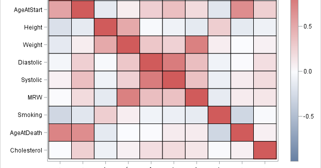
Correlations between variables are typically displayed in a matrix. Because the correlation matrix is determined by the order of the variables, it is difficult to find the largest and smallest correlations, which is why analysts sometimes use colors to visualize the correlation matrix. Another visualization option is the pairwise correlation
