The DO Loop
Statistical programming in SAS with an emphasis on SAS/IML programs
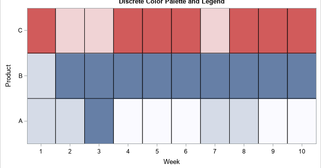
Heat maps have many uses. You can use a heat map to visualize correlation matrices, to visualize longitudinal data ("lasagna plots"), and to visualize counts in any two-dimensional table. As of SAS 9.4m3, you can create heat maps in SAS by using the HEATMAP and HEATMAPPARM statements in PROC SGPLOT.

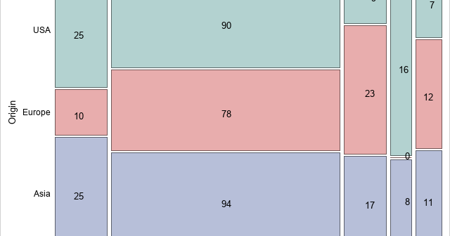
I recently showed how to create an annotation data set that will overlay cell counts or percentages on a mosaic plot. A mosaic plot is a visual representation of a cross-tabulation of observed frequencies for two categorical variables. The mosaic plot with cell counts is shown to the right. The

The mosaic plot is a graphical visualization of a frequency table. In previous articles, I showed how to create a mosaic plot in SAS by using PROC FREQ and how to define a template in the Graph Template Language (GTL) by using the MOSAICPARM statement. This article shows how to
