Get the right information, with visual impact, to the people who need it

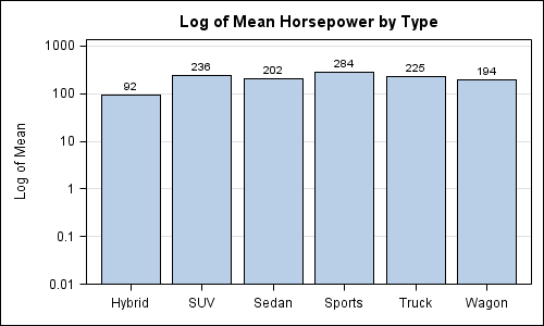
Often we want to display data as a bar chart where a few observations have large values compared to the rest. Comparison between the smaller values becomes hard as the small bars are squeezed by the tall bars. Here is an example data, and a bar chart showing the data. The large values

