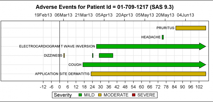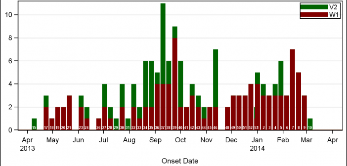
A few weeks back I wrote an article on Grouped Timeline for creating a stacked timeline for onset of different virus. The idea in that article was to display a stacked needle on a time axis using a HighLow plot. Such graphs are also referred to as EPI or Epidemic Curve
Tag: SGPLOT
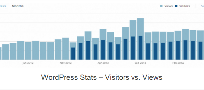
A couple of days back, Rick Wicklin forwarded me a link to an article on the BadHessian Blog on creating a Bar Chart using six different freeware packages in R, Python and Julia. The target bar chart was one produced by the Jetpack stat module with WordPress. The graph is shown below. The unique feature of
Spirals are cool. And useful. We use them every day without thinking about it. Every time the road turns from a straight line to a curve, we go through a transition spiral. Spirals allow us to change curvature in a steady increasing or decreasing fashion. Without a spiral, this
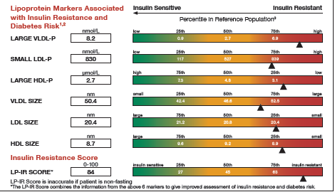
It was almost two weeks ago that I got started making a display for lab tests for a subject, based on a graph I saw on the web for an article on this blog. This graph is a part of a larger panel display of the lab values for a
SG Procedures and GTL provide you with a large set of plot statements, such as BarChart, ScatterPlot, BoxPlot and more. You can use them for the intended purpose, and all is well and good. However, the real fun starts when you leverage a plot to do something that was not
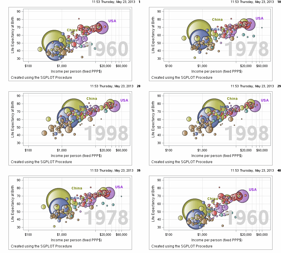
Often we want to visualize the relationship between variables over time. The understanding of such data can be improved by viewing the animated graph over time. With SAS 9.4, you can create animated graphs using the new animation options on the OPTIONS statement and the PRINTER destination. A popular example an
The PharmaSUG 2013 conference in Chicago this week was awesome. From the perspective of graphics, there was great interest in using SG Procedures, Designer and GTL for building clinical graphs. It was nice to see many papers by users on how they are using these tools for creating graphs on a daily
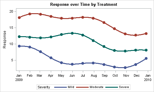
You created a graph of Response over Time by Severity where Severity has three levels, "Severe", "Moderate' and "Mild". How do you ensure that "Severe" is always red in your graph, regardless of the data order? Normally, when creating any graph with a GROUP role, the distinct group values are assigned the style
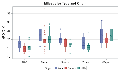
A frequent question we get from users is how to create a box plot with custom whiskers lengths. Some want to plot the 10th and 90th percentile, while other want the 5th and 95th percentiles. The VBOX statement in the SGPLOT procedure does not provide for custom whiskers. Also, unlike GTL,
SG procedures and GTL use a collision avoidance algorithm to position data labels for a scatter or series plot. This is enabled by default. The label is preferably placed at the top right corner of the marker. The label is moved to one of the eight locations around the marker to