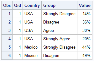
Just this morning I received a request for a brief survey from Apple on my feedback about the new iPhone6+. Yes, I finally got one, dead last in the family. The survey followed the usual format, with a number of questions on what I like or dislike about it, with
English
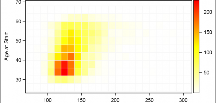
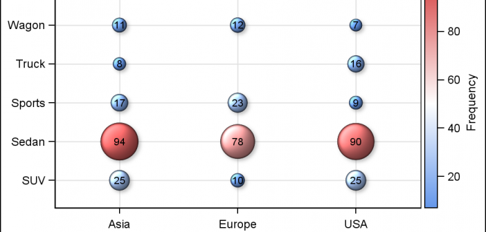
Heat maps are a great way to visualize the bi-variate distribution of data. Traditionally, a heat may may have two numeric variables, placed along the X and Y dimension. Each variable range is sub divided into equal size bins to create a rectangular grid of bins. The number of observations
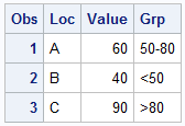
Getting consistent group colors across different data sets for a graph is a common topic of interest. Recently a user wrote in to ask how to ensure that specific groups "values" for a bar chart get specific colors. The group values may arrive in different order, or some may
The Mid-West SAS Users' Group conference in Chicago was a great success, with over 400 attendees and great weather. The conference hotel was in downtown with nice view of the river and a stroll down "Magnificent Mile". The city does a great job with the flower beds down Michigan Ave., along
A HighLow plot is very popular in the financial industry, often used to track the periodic movement of a stock or some instrument or commodity. The CandleStick Chart is one specific type of high low plot, purportedly originating in Japan for tracking of financial instruments in the rice trade. Creating a
Many users of SGPLOT and GTL know how to mix and match various plot statements to create graphs, sometimes in ways not originally intended. You are also aware that you can go a step beyond, and use these systems to create completely non-standard graphs such as the Spiral Plot, the Polar
The Third PharmaSUG-China conference was held in Beijing last week, and I had the pleasure to attend this excellent conference along with a record number of attendees. On Thursday, I presented two 1/2 day seminars on ODS Graphics. One titled "Advanced Topics in GTL" and another titled "Complex Clinical Graphs
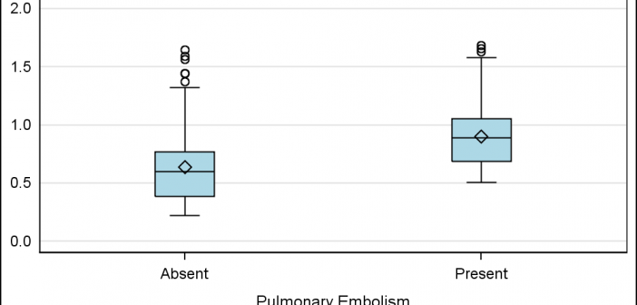
Often we need to plot the response values for binary cases of a classifier. The graph below is created to simulate one seen at http://www.people.vcu.edu/ web site of the shock index for subjects with or without a pulmonary embolism. In this case, the data is simulated for illustration purposes only. There
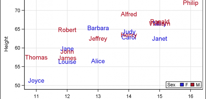
For far too long we have been using the venerable Scatter Plot to do the work of placing text strings in the graph. For far too long we have used the Scatter Plot or the Block Plot to place axis aligned text in the graphs. It is time to
SAS 9.4 maintenance release M2 was released early in August. This release contains some exciting new features in GTL and SG Procedures. In this article, I will describe some of the new options added to the existing plot statements. Note, I will use the SG examples here, but these are