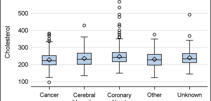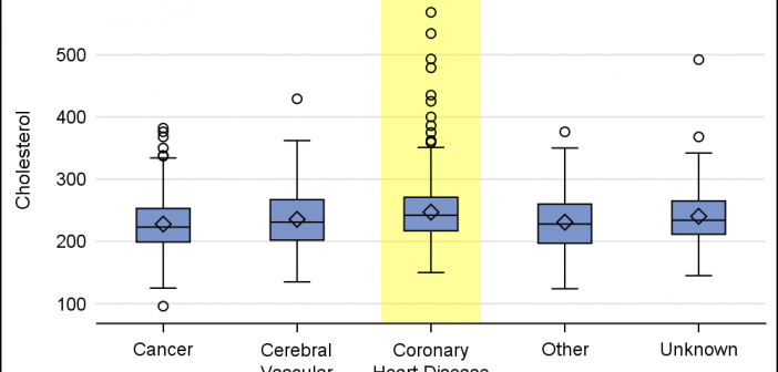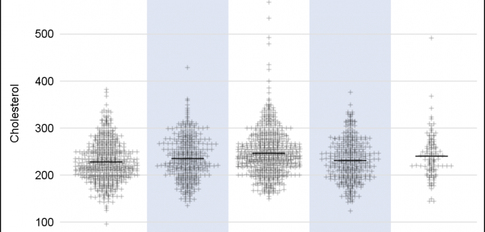
A frequently requested statistical graph is the scatter plot by with discrete categories along with mean value for each category. Searching for a "Scatter with Mean" will return a lot of requests for such a graph in SAS, Stata, R and other statistical software. Such a graph is very easy
English
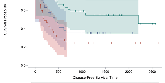
Customizing the Kaplan-Meier plot in assorted ways is so popular that we devote an entire chapter to it in the SAS/STAT documentation.
On a recent trip I met a long time user and early adopter of ODS Graphics who started using GTL with SAS 9.1.3, even before it was released as production with SAS 9.2. This user has presented many papers at SGF on GTL and some hands-on sessions on ODS Graphics Designer.
Did you know that you can make a graph extend across multiple pages? Making a multipage graph poses no problem for ODS Graphics---you simply use a BY variable to create page breaks. Most of the work involves deciding where to break pages and properly labeling continuations.
When the data object that underlies a graph is not quite in the form that you want, you might be able to use GTL expressions to produce precisely the graph that you want.
When presenting information in form of a graph we show the data and let the reader draw the inferences. However, often one may want to draw the attention of the reader towards some aspect of the graph or data. For one such case, a user asked how to highlight one
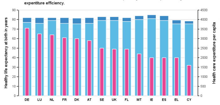
Recently, while browsing health care data, I came across the graph shown below. The graph includes the healthy life expectancy at birth by countries in the EU, along with the associated per capita expenditure. The graph also shows estimate of potential gain in life expectancy by increasing expenditure efficiency. The
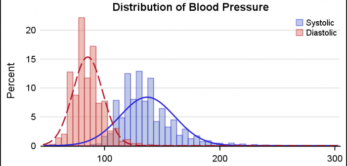
This is the 5th installment of the Getting Started series. The audience is the user who is new to the SG Procedures. Experienced users may also find some useful nuggets of information here. A histogram reveals features of the distribution of the analysis variable, such as its skewness and the peak which
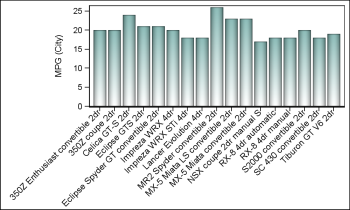
Fitting of long category values on a x-axis is usually a challenge. With SAS 9.4, the SGPLOT procedure tries to fit the values by first splitting the values at white space to see if the values will fit in the space available. This normally works well for a small number
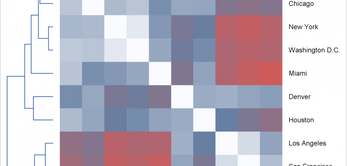
Today, I focus on the steps needed to make a graph that is composed of multiple heterogeneous components (in this case, dendrograms and a heat map).