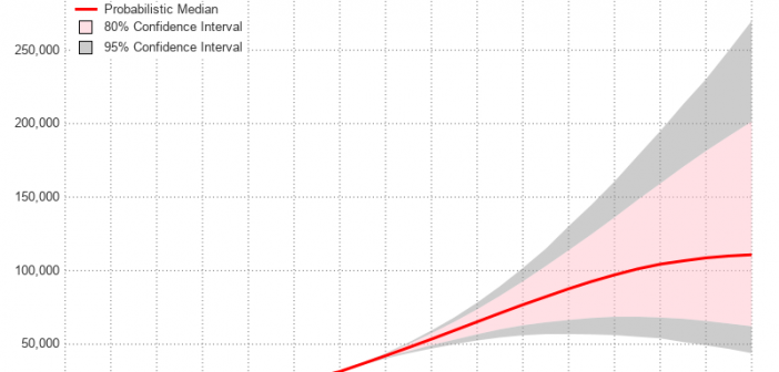
During the year 2020, many countries and areas will be conducting their decennial census, and making projections to estimate what their population will be in the future. Therefore I decided to dust off one of my old SAS/Graph samples based on the 2010 census, and rewrite it using more modern
English
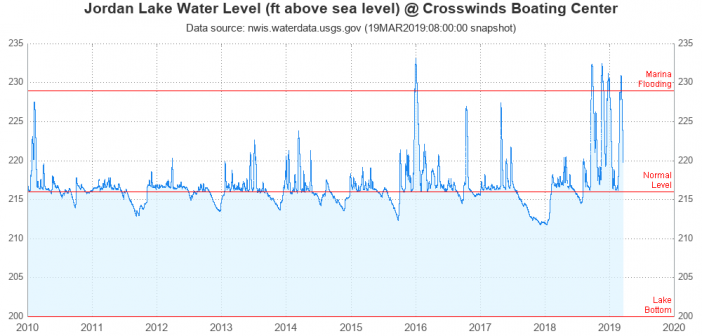
Flooding has been in the news the past few days, and that makes me want to analyze some data! I hang out at Jordan Lake (here in central North Carolina) a lot, so I decided to download the data for that lake, and do a graphical analysis. If you're interested
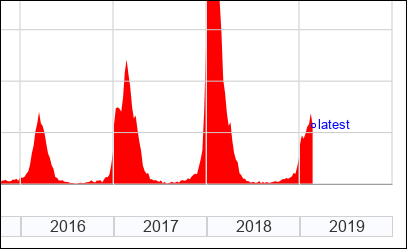
Here in the US, there's a lot of talk about the flu each year. First, people discuss whether or not to get the flu shot. Then there are discussions about whether or not you or your friends have the flu (or something else). Then the discussions about what strain of
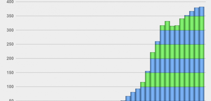
US farmers grow a lot of food ... but did you know some of them also grow fuel for our vehicles? Follow along and you'll learn how much fuel they grow, and also learn some tips about plotting this type of data! These days most gasoline in the US has
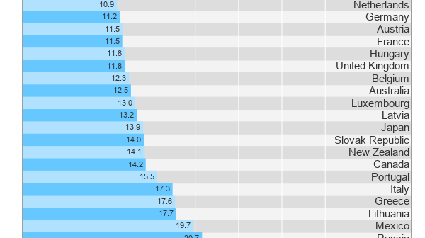
According to the most recent data, the child poverty rate in China is 33.1% - the rate in Denmark is 2.9%. Where do other countries fall in between these two extremes? Let's build a graph and find out! (or, if you're not interested in the code - jump to the
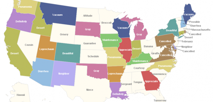
Which words do people have the most trouble spelling? We now have some insight into this question, based on a Google Trends analysis. Let's do a little fun analytics, and plot the results on a map! But before we get started, let's go old-school for a minute. Before the days
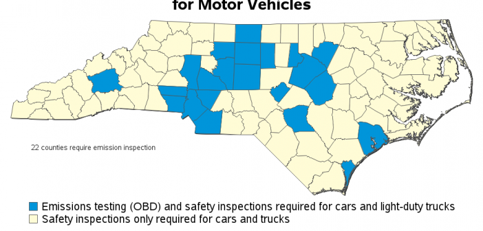
If you live in North Carolina, chances are you have to get your vehicle inspected each year, before you can renew your license plate. The inspection consists of a safety portion, and in some counties an emissions portion. In the past, 48 of NC's 100 counties required the emissions portion
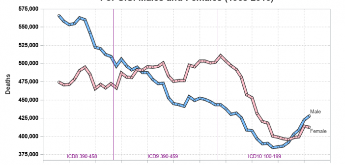
I have written several blog posts about longevity, and here is another one related to that topic. Cardiovascular disease (cvd) is one of the more common causes of death, and I was wondering how those numbers have changed over time. Are fewer people dying from cvd, or are more people
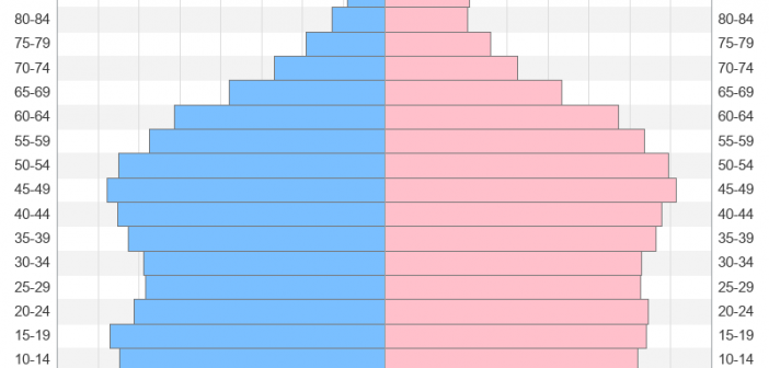
With the US census coming in 2020, I've decided to sharpen my skills at graphing census data. And today I'm working on creating a population pyramid chart to analyze the age and gender distribution. Follow along if you'd like to see how to create such a chart ... or jump
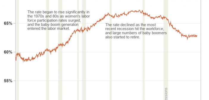
Plotting just your data often helps you gain insight into how it has changed over time. But what if you want to know why it changed? Although correlation does not always imply causation, it is often useful to graph multiple things together, that might logically be related. For example, recessions