Tips and Tricks

Data Visualization
Sanjay Matange 7
Multi-Group Series Plots

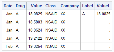
The series plot is a popular way to visualize response data over a continuous axis like date with a group variable like treatment.   Here is some data I made up of a response value by date, treatment, classification and company that makes the drug.  The data is simulated as shown in the attached program

Data Visualization
Sanjay Matange 6
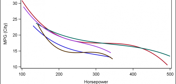
Labeled curves

Often, the topic of an article is motivated by a question from a user.  A satisfactory resolution of the situation is usually a good indication of a topic that may be of interest to other users.  On such question was posed to me by a user this weekend.  He wanted to display fit

Data Visualization
Sanjay Matange 9
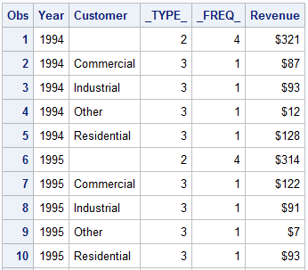
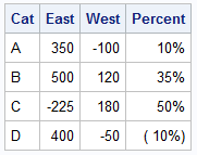
G100 with SGPLOT

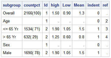
The GCHART procedure has a popular option called G100 to display all the subgroups in % format such that all the subgroup values add up to 100% for each group.   Each subgroup is labeled with its own % values. SGPLOT procedure does not such an option, but with a little bit of

Data Visualization
Sanjay Matange 3
Axes Synchronization

Often we need to plot multiple response variables on Y axes by a common variable on X axis.  When the response variables are very different in magnitudes or format, we prefer to plot the variables on separate Y (Left) and Y2 (Right) axes. Here is some sample data with three response

Data Visualization
Sanjay Matange 6
Layered graphs

Browsing graphs on the web, this graph caught my eye:  The Arctic Sea Ice Volume Graph.   My interest is not so much in the debate on Climate Change or Global Warming.  To me, this graph has some interesting features that can help show the benefits of plot layering to

Data Visualization
Sanjay Matange 3
Sochi Medal Graphs

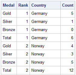
The attention of the world is now on Sochi and the Winter Games.  Gold, Silver and Bronze medals are being earned by these amazing athletes, and everyone has an eye on the tally.  Andre sent me a link to TRinker's R Blog, showing a graph of the current tally.  Andre

Data Visualization
Sanjay Matange 10
Survival Plot

One of the most popular graph amongst clinical and pharmaceutical users is the Survival Plot as created from the LIFETEST Procedure.  This is one graph that users most often want to customize.  See Creating and Customizing the Kaplan-Meier Survival Plot in PROC LIFETEST - Warren F. Kuhfeld and Ying So, SAS Institute

Data Visualization
Sanjay Matange 0
More symbols, you say?

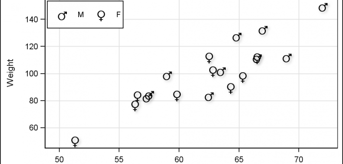
Users have often expressed the need for more marker symbols.  ODS Graphics supports over  30 scalable marker symbols, both filled and empty.  As mentioned in an earlier article, with SAS 9.4, filled markers can now have outlines and fills, and can also have special effects. Also with SAS 9.4, now you

1 21 22 23 24 25 35