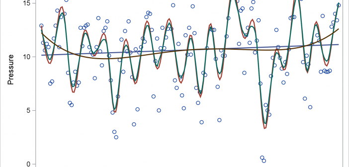
Today's post illustrates the REG, PBSPLINE, LOESS, SERIES, and SPLINE statements in PROC SGPLOT. The GROUP= and BREAK options in the SERIES statement are also discussed.

Today's post illustrates the REG, PBSPLINE, LOESS, SERIES, and SPLINE statements in PROC SGPLOT. The GROUP= and BREAK options in the SERIES statement are also discussed.
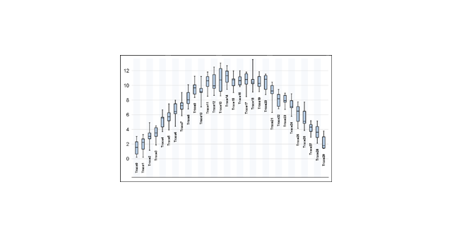
Back in 2013, I wrote a paper for the SAS Global Forum, reviewing the attributes that go towards making a good graph. In this paper, I covered many recommendations from industry thought leaders that can help enhance the effectiveness of graphs to deliver the intended information. One of the aspects that
PROC SGPLOT writes a graph template and uses it to create a graph. You can edit the template and then create a modified graph.
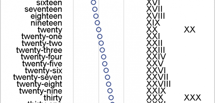
I review some fundamental principles of creating axis tables along with graphs that have TYPE=LINEAR or TYPE=DISCRETE axes.
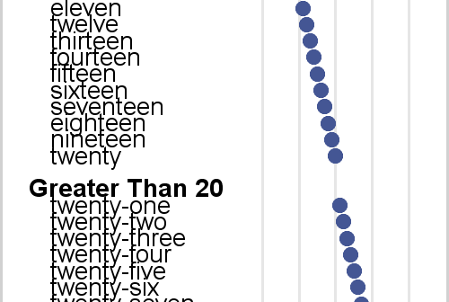
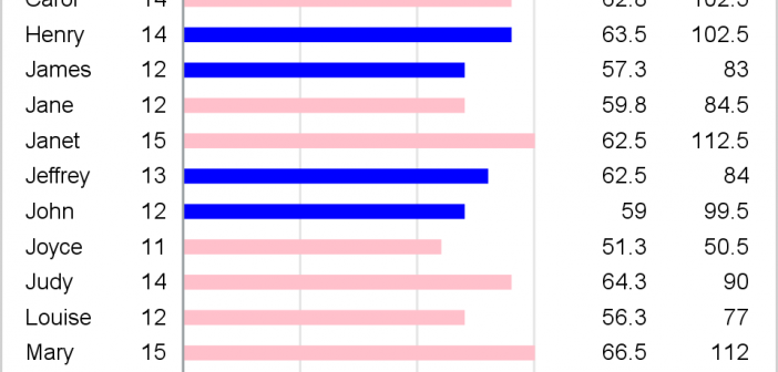
Axis tables enable you to combine tabular and graphical information into a single display. I love axis tables. My involvement with axis tables dates back over 30 years to their ancient predecessor, the table that contains an ASCII bar chart. In the mid 1980s, I created a table in PROC
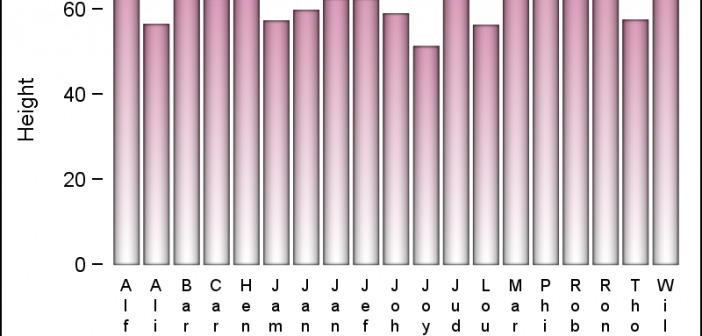
Yesterday, I published an article on Axis values display, where I mentioned the desire expressed by many users to get x-axis tick values in Hotel text orienttion. The name comes from the way many hotel signs are displayed as shown on the right. Such arrangement of text can also be very

Displaying nicely rendered axis values reduces clutter and makes the graph more readable. With SAS 9.4, we added the ability for splitting x-axis tick values on white space to create a nice and readable x-axis as shown in the graph on the right. It is always a challenge to fit
Some observant readers may have noticed a new icon on the right sidebar of this blog announcing the release of the new SAS Press book on the ODS Graphics Designer, written in collaboration with Jeanette Bottitta. Jeanette is a Technical Writer at SAS and has worked on various SAS Graphics products

Browsing on the web, I ran into a simple but visually interesting graph of financial data. Really, it could be any data, but this one showed up under "Financial Graphs". I thought this would give me an opportunity to speak about an interesting new feature added to SERIES plot with
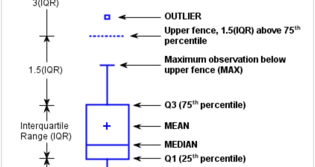
This is the 3rd installment of the Getting Started series, and the audience is the user who is new to the SG Procedures. Experienced users may also find some useful nuggets here. The Tukey box plot is popular among statisticians for viewing the distribution of an analysis variable with or without