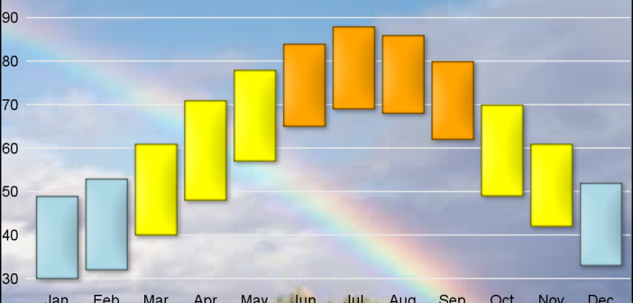
As many of the regular readers of this blog know, SGPLOT and GTL, provide extensive tools to build complex graphs by layering plot statements together. These plots work with axes, legends and attribute maps to create graphs that can scale easily to different data. There are, however, many instances where
Author
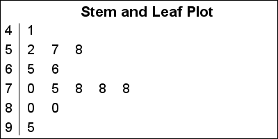
A Stem and Leaf plot is a visual that can help quickly visualize the distribution of the data. This graph was particularly useful before the advent of modern statistical graphs including the Histogram and Box Plot. One nice feature of the plot is it shows the actual values in the
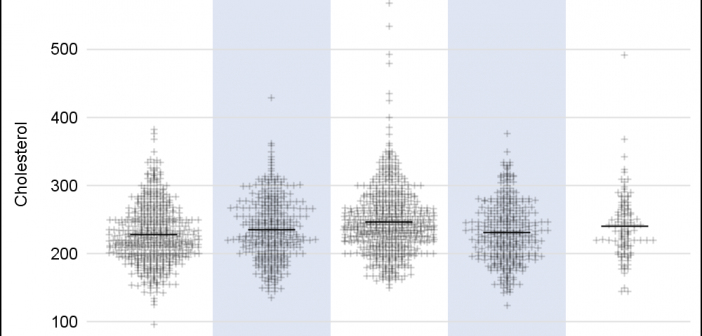
A frequently requested statistical graph is the scatter plot by with discrete categories along with mean value for each category. Searching for a "Scatter with Mean" will return a lot of requests for such a graph in SAS, Stata, R and other statistical software. Such a graph is very easy
On a recent trip I met a long time user and early adopter of ODS Graphics who started using GTL with SAS 9.1.3, even before it was released as production with SAS 9.2. This user has presented many papers at SGF on GTL and some hands-on sessions on ODS Graphics Designer.
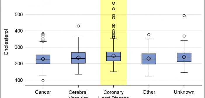
When presenting information in form of a graph we show the data and let the reader draw the inferences. However, often one may want to draw the attention of the reader towards some aspect of the graph or data. For one such case, a user asked how to highlight one
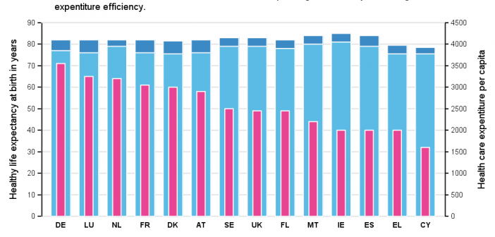
Recently, while browsing health care data, I came across the graph shown below. The graph includes the healthy life expectancy at birth by countries in the EU, along with the associated per capita expenditure. The graph also shows estimate of potential gain in life expectancy by increasing expenditure efficiency. The
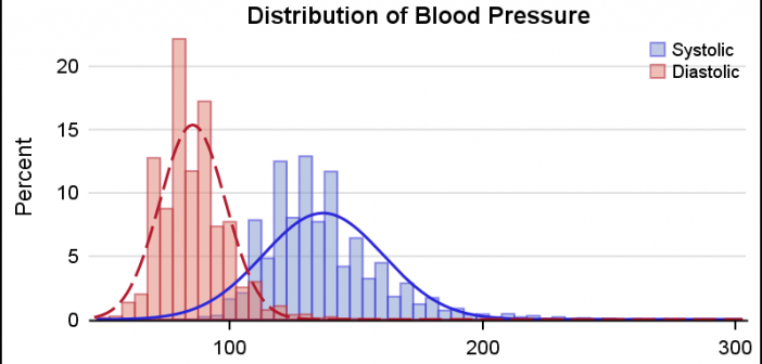
This is the 5th installment of the Getting Started series. The audience is the user who is new to the SG Procedures. Experienced users may also find some useful nuggets of information here. A histogram reveals features of the distribution of the analysis variable, such as its skewness and the peak which
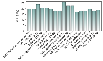
Fitting of long category values on a x-axis is usually a challenge. With SAS 9.4, the SGPLOT procedure tries to fit the values by first splitting the values at white space to see if the values will fit in the space available. This normally works well for a small number
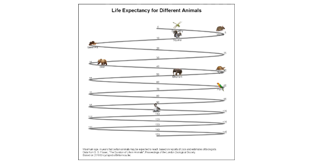
Last week I published an article on creating bar charts with visual category values. The idea was to use visual icons for the category values in a HBAR of age by animal. For the data, I referred to a visual from the 2010 Encyclopedia Britannica Inc. that I found on the
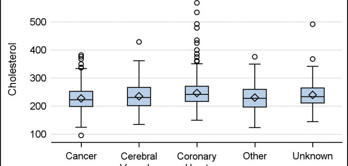
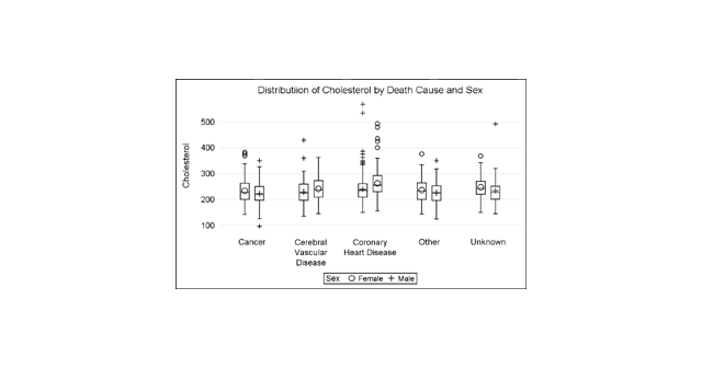
A grouped box plot created by SGPLOT VBOX / HBOX statement or GTL BOXPLOT statement will display groups within categories using group colors and puts the color swatches representing the group values in the legend. This works well for a color graph created as shown below. title 'Distribution of Cholesterol