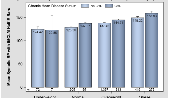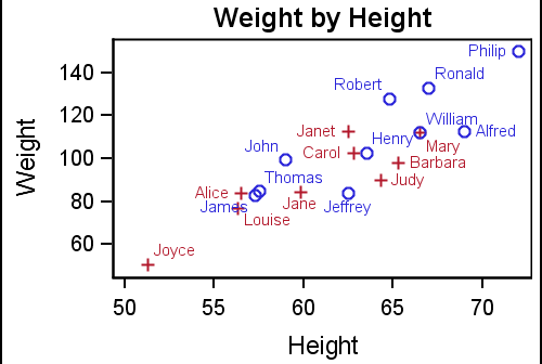
In the first article on Getting Started with GTL, we discussed the basics on how to create a graph using the Graph Template Language. This involved the creation of a "statgraph" template using the TEMPLATE procedure, and then associating data with the template to create the graph using the SGRENDER
Author
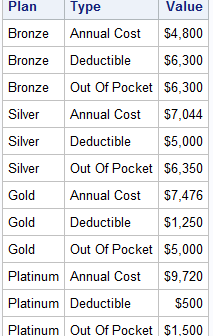
Working at SAS, I consider myself fortunate to have the best employee benefits in the industry. That is one of the factors placing SAS as one of the best companies to work for worldwide, and often THE best company to work for in USA. Given that, I was curious to know the kind
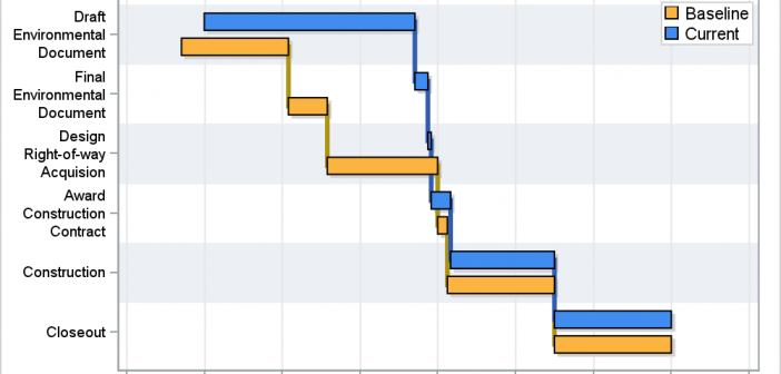
A couple of weeks back I described q way to create a Schedule Chart using the SGPLOT procedure. In that case, I used the HIGHLOW plot to draw bar segments, both for a single and grouped case. A natural extension is to create one with links between each segment. So,
I am happy to report that my new book "Getting Started with the Graph Template Language in SAS" is now shipping. A colleague suggest it would be useful to post some articles with the same theme of "Getting started". I thought that was a great idea, and decided to start a new
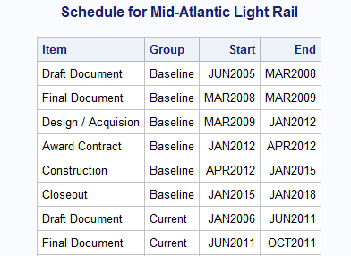
Last week Bruno asked about creating a Schedule Chart using SG Procedures. To me, such projects are very interesting and challenging...How much mileage can we get out of the current set of SGPLOT procedure features to create a visual that was not part of the original requirements? The clear choice for
If you have been reading the articles in this blog, you already know that the Graph Template Language (GTL) forms the underlying foundation for all graphs produced automatically from SAS analytical procedures and custom graphs created with the SG Procedures and the ODS Graphics Designer. SG procedures and Designer provide
Yesterday I read a Christina's blog article on the winners of the Best Presentations honor at MWSUG 2013. Two papers caught my (graphical) eye, both by Perry Watts. Perry has done a marvelous job describing how creatively use GTL to make graphs that may not be obvious at first glance.
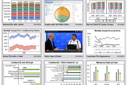
Some of you may have already noticed the small graphical icon on the lower right side of the blog article labeled "Graphically Speaking Index". Yes, it is a link to a visual index for all articles published in this blog. Well, eventually it will have all the articles. So far, I
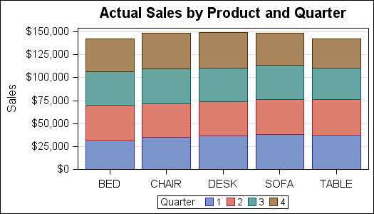
A couple of weeks back we had a question on how to make a bar chart with stacked and clustered groups. User also wanted to display the value for each stacked segment below the bars. The article Bar Charts with Stacked and Cluster Groups shows how to create such a
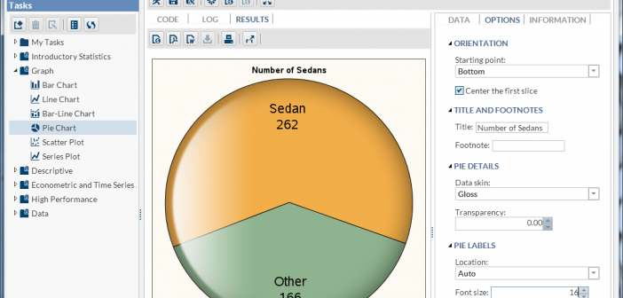
Recently, SAS released SAS Solutions OnDemand for academics. An academic user who is signed up for this can use the SAS Web Editor application to do all their data analysis over the web using a hosted server at SAS. This frees up the user from having to install the software on their own computers,