Search Results: axis tables (36)

Data Visualization
Sanjay Matange 3
Graph Table

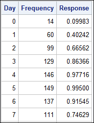
A common scenario is where we have a table of multiple measures over time. Here we have a simple example of Frequency and Response by Day.  The Response is a linear function of the Frequency, as shown in the table on the left below. The  shape of the data is

Data Visualization
Sanjay Matange 10
Survival Plot

One of the most popular graph amongst clinical and pharmaceutical users is the Survival Plot as created from the LIFETEST Procedure.  This is one graph that users most often want to customize.  See Creating and Customizing the Kaplan-Meier Survival Plot in PROC LIFETEST - Warren F. Kuhfeld and Ying So, SAS Institute

Data Visualization
Sanjay Matange 3
Percent VBar

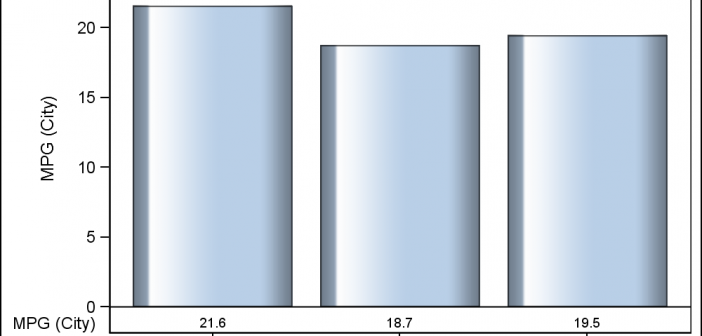
Recently a reader chimed in with a question on the Do Loop article by Rick Wicklin on how to create a bar chart with percent statistics.  Rick used SAS 9.3  and the reader wanted to do the same with SAS 9.2. For the basic (non-grouped) bar chart, the process is the

Data Visualization
Sanjay Matange 3
Just a legend, please

Recently, an interesting question was posed on the previous article on this blog by a reader.  Can we use the new DiscreteAttrMap feature to create just a legend with specific entries, with no graph.  The question was intriguing enough that I did not wait to ask - "Why?".  I just got