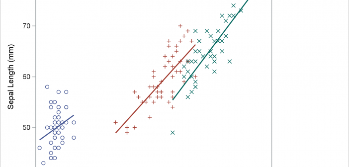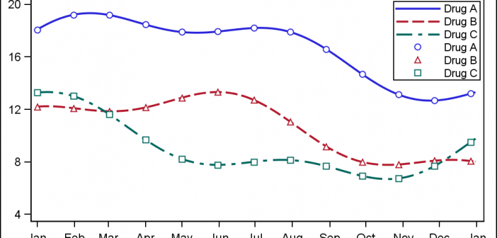
When ODS Graphics was first released with SAS 9.2 in 2008, a conscious effort was made to create graphs that were consistent and aesthetically pleasing out of the box. Features in the graph derive their visual attributes from the active Style. When Group classifications are in effect, the different classification
Search Results: attribute priority (17)
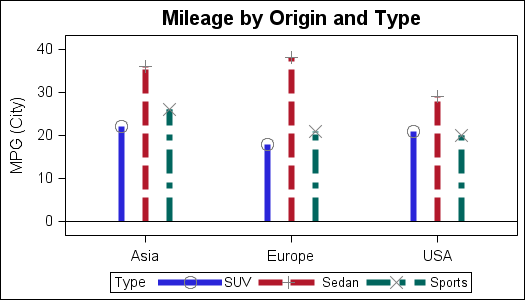
The STYLEATTRS statement in PROC SGPLOT enables you to override colors, markers, line patterns, fill patterns, and axis break patterns in ODS styles, without requiring you to change the ODS style template.
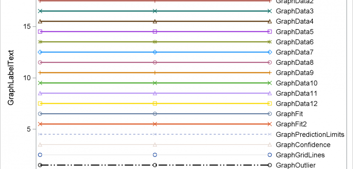
Have you ever wanted to see examples of all of the output styles that SAS provides? You can run a program and look at the resulting file, styles.html. This post explains more about the styles that you will see including a discussion of attribute priority.
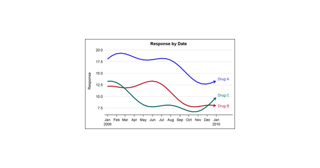
This is the 4th installment of the Getting Started series. The audience is the user who is new to the SG Procedures. Experienced users may also find some useful nuggets of information here. Series plots are frequently used to visualize a numeric response on the y-axis by another numeric variable on
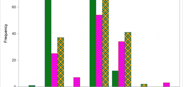
Last week, I presented some highlights of the new features for SG Procedures and GTL in SAS 9.4. Now, let us dig in a bit deeper. For a plot without a GROUP role, setting an attributes was always easy with SG procedures. All you need to do to set bar color
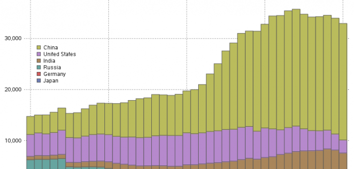
These days, many countries are moving away from coal, and towards natural gas, hydro, wind, and solar as ways to meet their electricity needs. I had heard that some countries still use a lot of coal (especially those countries with large coal deposits), and I was curious which countries use
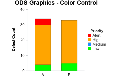
In this 'Rosetta Graph' example, I demonstrate how to control bar chart colors in Gchart and SGplot. But first, here's a little diversion... some artwork in my office here at SAS. There's a *lot* of artwork hanging around at SAS, but this particular painting wasn't created by the SAS artists
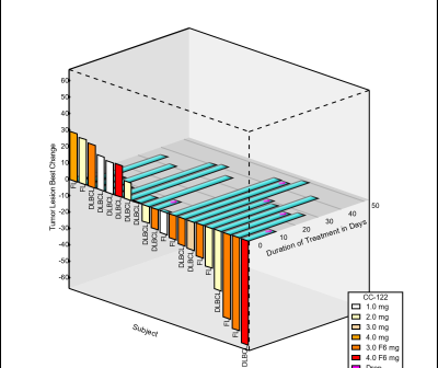
A while back a user requested to create a 3D WaterFall chart as presented by E Castanon Alvarez et. al. in "3D waterfall plots: a better graphical representation of tumor response in oncology" Annals of Oncology, Volume 28, Issue 3, 1 March 2017, Pages 454–456. I posted a blog article titled
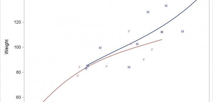
The REG statement fits linear regression models, displays the fit functions, and optionally displays the data values. You can fit a line or a polynomial curve. You can fit a single function or when you have a group variable, fit multiple functions.
PROC SGPLOT looks at the PROC statements, it looks at the data, and it writes a template that might depend on the data. If you want to understand how the graph is created, you need to look at the PROC SGPLOT code, the graph template and data objects that it constructs, and the final graph.