 SG Procedures and GTL provide you with a large set of plot statements, such as BarChart, ScatterPlot, BoxPlot and more. You can use them for the intended purpose, and all is well and good. However, the real fun starts when you leverage a plot to do something that was not obvious. One such plot that is designed to be used in creative and flexible ways is the HIGHLOW plot statement.
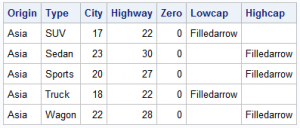
Let us start with the MEANS procedure to compute mean mileage values by Origin and Type. We have added a few columns as shown in the table above.
proc means data=sashelp.cars(where=(type ne 'Hybrid')); class origin type; var mpg_city mpg_highway; output out=carmeans(where=(_type_ > 2)) mean(mpg_city mpg_highway) = City Highway; run; |
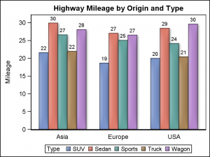 We now have what we call as "Chart Ready" data. We can create a bar chart using the SGPLOT procedure. I used the VBARPARM statement since the data is already summarized. The graph shows the mean highway mileage by Origin and Type. The mileage value of each bar is displayed on top. Click on the graph for a high resolution image.
SGPLOT using VBARPARM:
proc sgplot data=carmeans; vbarparm category=origin response=highway / group=type datalabel outlineattrs=graphoutlines dataskin=matte; xaxis display=(nolabel noticks); run; |
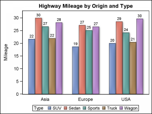 Exactly the same graph can be created using the HIGHLOW plot statement, introduced in both SGPLOT and GTL in SAS 9.3. This statement can be used with one of these two syntax specifications for the SGPLOT procedure.
HIGHLOW X=<var> High=<num-var> Low=<num-var> / <options>;
HIGHLOW Y=<var> High=<num-var> Low=<num-var> / <options>;
In the first case, vertical bar segments are drawn from Low value to the High value for each value of X . In the second case horizontal bar segments are drawn from Low value to the High value for each value of Y .
SGPLOT using HIGHLOW Plot:
proc sgplot data=carmeans; highlow x=origin high=highway low=zero / group=type type=bar groupdisplay=cluster highlabel=highway lineattrs=graphoutlines dataskin=matte; xaxis display=(nolabel noticks); yaxis offsetmin=0; run; |
Note in the program above, we have used the following required parameters:
HighLow X=Origin High=Highway Low=Zero / Type=Bar GroupDisplay=Cluster
highlabel=high; |
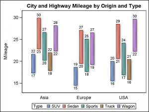 Setting LOW=zero makes sure all bar segments are drawn to the baseline in the graph shown above. Using Low=City and High=Highway allows us to draw floating bar segments depicting the mileage range by Origin and Type. We can use both the LowLabel and HighLabel to display both the low (City) and high (Highway) value for each bar.
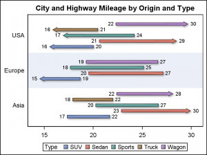
Using the parameter Y instead of X, allows us to create horizontal bar segments as shown on the right. In this case, we have enabled the drawing of horizontal bands to help visually cluster the groups within each category.
Another useful feature of the HighLow plot is the display of caps at the end of each bar. This can be useful to indicate certain characteristics for each bar such as direction (increasing or decreasing) or a continuation of an event in either direction.
The graph on the right displays a horizontal HighLow plot with caps. The columns LOWCAP and HIGHCAP from the data set are used to display the caps. The values are set in the columns when certain conditions are met.
In this case, a low cap is drawn for observations where City mileage is < 18 and a high cap is drawn when Highway mileage > 27.
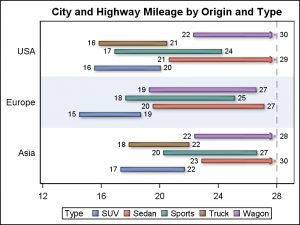
Another interesting feature is drawing of a "Clip Cap". This feature automatically draws a cap to indicate the bar is clipped when the bar value exceeds the min or max value of the axis.
In the example on the right, x axis Max is set to 28. We have used the option CLIPCAP which draws a special cap at the end of any bar segment that is clipped by the axis min or max value. Here, we have drawn a reference line at x=28 to display the max setting.
SGPLOT code with Clip Caps:
proc sgplot data=carmeans; highlow y=origin high=highway low=city / group=type type=bar groupdisplay=cluster lowlabel=city highlabel=highway clipcap barwidth=1 clusterwidth=0.8 lineattrs=graphoutlines dataskin=matte; refline 28 / axis=x lineattrs=(pattern=dash); xaxis display=(nolabel) max=28 values=(12 to 30 by 4); yaxis display=(nolabel noticks) colorbands=even colorbandsattrs=(transparency=0.5); run; |
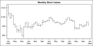 So far we have seen the use of the HIGHLOW plot with TYPE=BAR. This plot statement also supports TYPE=LINE (default). This plot type is useful to display a stock plot and can also be used to display four response values per line. The example on the right displays monthly stock values, showing the high, low, open and close values.
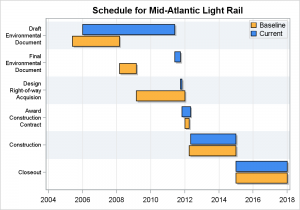
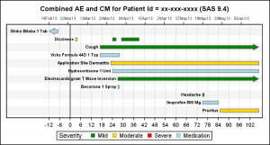
The HighLow plot can be used where ever you want to display some events of certain duration, such as a Schedule Plot or an Adverse Event Plot. These examples are shown below.
Full SAS 9.4 Program for High Low Plots: HighLow



1 Comment
Pingback: CandleStick Chart - Graphically Speaking