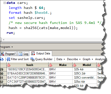
SHA256 and other hashing functions in SAS

SHA256 and other hash functions are supported in SAS 9.4 and SAS Viya. It's better than MD5 as a cryptographic hash!
SHA256 and other hash functions are supported in SAS 9.4 and SAS Viya. It's better than MD5 as a cryptographic hash!
Watching the news recently it occurred to me that many of the stories involved data in some way. Many of the reports from the recent Consumer Electronics Show showcased products to enable users to create and use ever-growing personal collections of data. Want data on how well you sleep? No

Late last month, while many of us were sipping eggnog and decking halls with boughs of holly, SAS released the 13.1 version of its analytical products. Readers of Maura Stokes' newsletter, SAS Statistics and Operations Research News (Nov 2013), have already been alerted to new features in products such as

