Uncategorized

Rick Wicklin 0
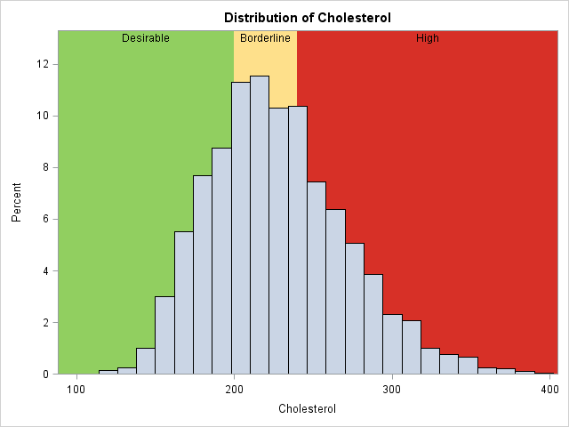
Overlay categories on a histogram

Recently Sanjay Matange blogged about how to color the bars of a histogram according to a gradient color ramp. Using the fact that bar charts and histograms look similar, he showed how to use PROC SGPLOT in SAS to plot a bar chart in which each bar is colored according

Data Management
David Loshin 0
Big data integration as a service

I've seen a number of articles and webinars recently that discuss data integration as a cloud-based service. So I thought it was worth exploring what this really means in the context of big data – specifically when the objective is to exploit many sources of streaming data for analytics. My initial reaction