Tips and Tricks
Getting started with SGPLOT - Part 10 - Regression Plot

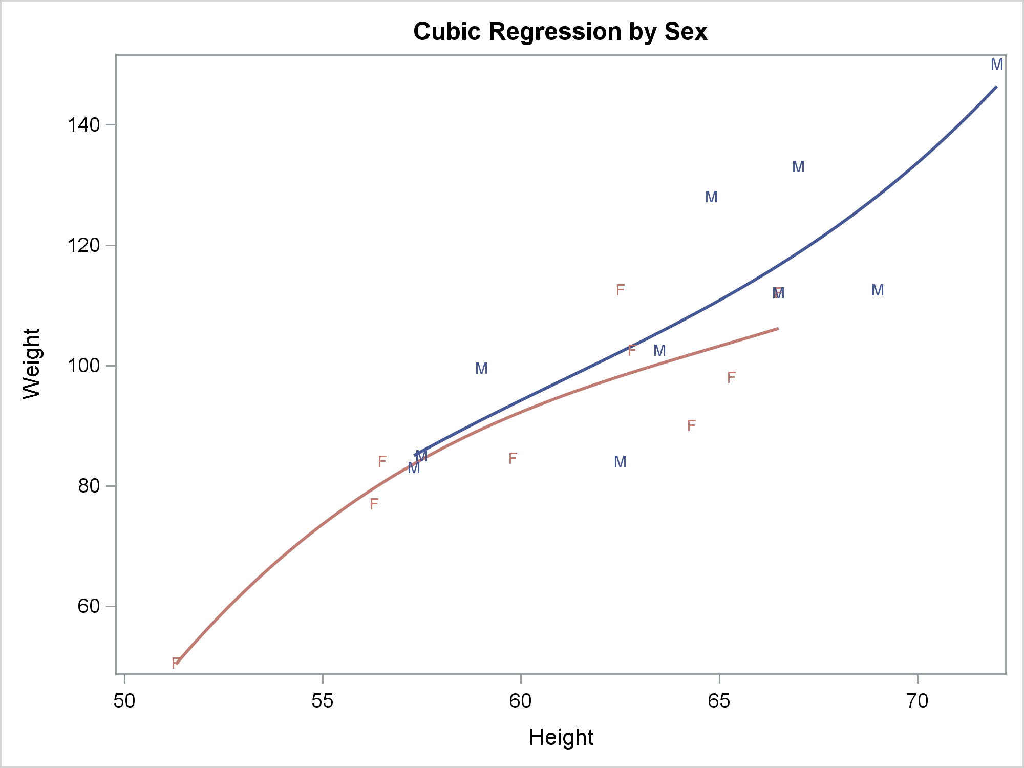
The REG statement fits linear regression models, displays the fit functions, and optionally displays the data values. You can fit a line or a polynomial curve. You can fit a single function or when you have a group variable, fit multiple functions.