All Posts

Here is the promised follow up on the Dashboard graph. In the previous article, I posted the code to create a panel of bullet KPIs displaying three different metrics. For each KPI, I used 5 columns of data which resulted in a wide and inconvenient structure. A more convenient data structure is
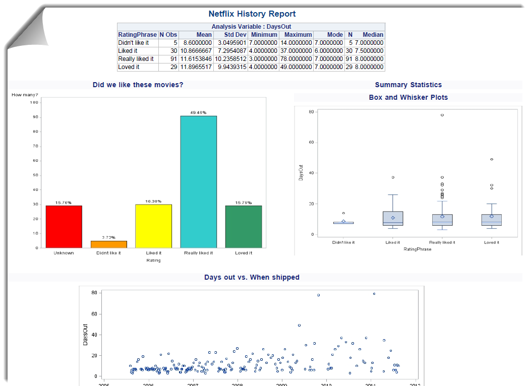

Do you want your report to look good on the web, or to look good when you print it? Pick one. Before the SAS Report file format, that was the choice that you faced. HTML is perfect for the web browser. It's easy to scroll through tables, to apply an
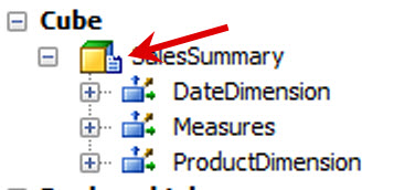

Unlike BASE SAS tables, OLAP cubes must exist in within the metadata in order to access from any of the OLAP Viewers. In addition to having some metadata OLAP cubes have a physical file structure presence (at least for MOLAP/HOLAP because it's a different story for ROLAP). When you refresh


TO: SAS Global Users Group FROM: Chair, Nominations Committee of the SAS Global Users Group Executive Board SUBJECT: Conference Chair SAS Global Forum 2015


I recently blogged about Mahalanobis distance and what it means geometrically. I also previously showed how Mahalanobis distance can be used to compute outliers in multivariate data. But how do you compute Mahalanobis distance in SAS? Computing Mahalanobis distance with built-in SAS procedures and functions There are several ways to


The smallest aircraft I’ve ever flown on was the one I took from Raleigh to Hilton Head, South Carolina to attend my first PharmaSUG – the Pharmaceutical Industry SAS Users Group. That was in 1997, and it’s been my pleasure to work with this great group of volunteer SAS leaders
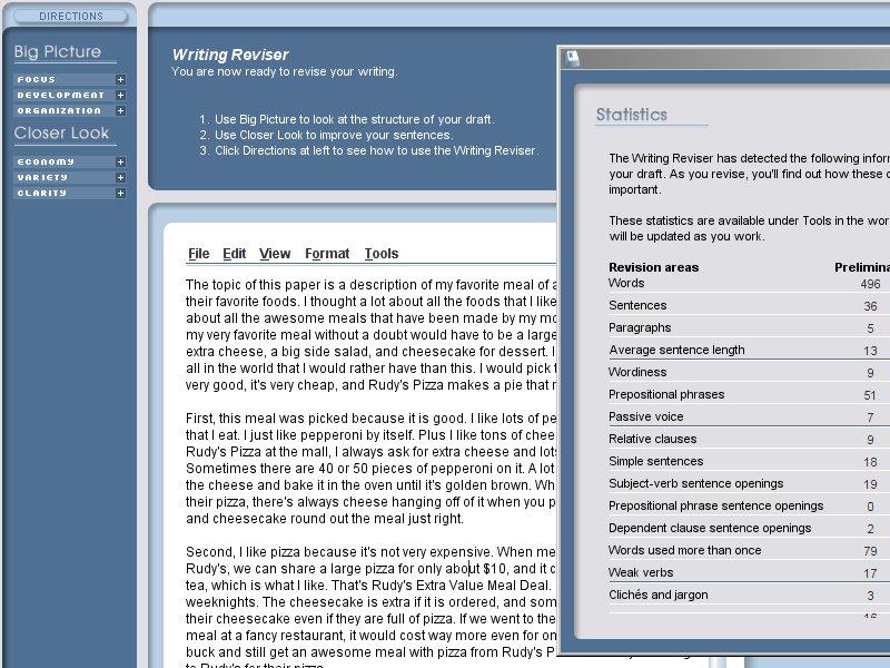

Teachers have more than enough to juggle each day, lacking the time to search for, and find, high-quality curricular resources online. When I would search for lesson plan supplements, I would often get lost in Google's abyss of results, spending far too much precious time sifting through mediocre materials. Until


What're you wearing? I get that question all of the time …. OK, let me re-phrase that. In regards to events, I am often asked, “What are you going to wear?” It’s always hard to answer as the standard for events, including SAS Global Forum, is business casual.
In this blog we have been discussing graphs useful for analysis of data for many domains such as clinical research, forecasting and more. SG Procedures and GTL are particularly suited for these use cases. So, when I came upon a dashboard image from Steven Few's Visual Business Intelligence blog, showing the
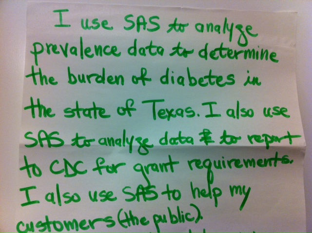

When I read the way that this user is working with SAS, I took a look around support.sas.com to find examples to allow you to work with your own data. (Take a look at this.) If this example isn't quite right for you, plug in your own key words.
The graph showing the distribution of the maximum liver function test values by treatment for all participants in a study is commonly used for the analysis of safety data in clinical trials. The data is often structured in multiple columns (one per treatment) as below on the left, or grouped by
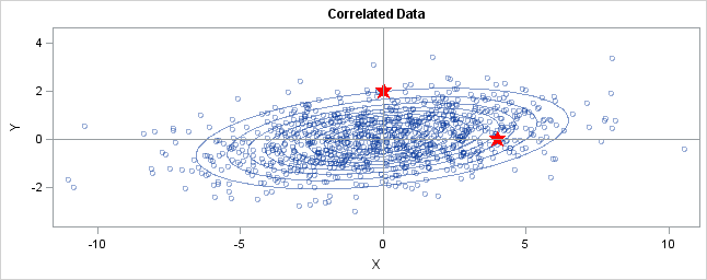
I previously described how to use Mahalanobis distance to find outliers in multivariate data. This article takes a closer look at Mahalanobis distance. A subsequent article will describe how you can compute Mahalanobis distance. Distance in standard units In statistics, we sometimes measure "nearness" or "farness" in terms of the

So, there’s a lot of talk about staying for the magic of Disney World after SAS Global Forum. What about arriving early for some SAS magic? A selection of some of the most popular SAS training courses is being offered Wednesday – Friday, April 18-20 prior to the conference. Here’s
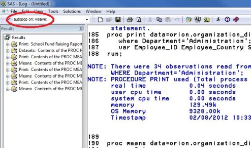

How we love shortcuts. Our life seems more efficient with them. I try to take the earlier train for a good parking spot that lets me exit early. Actually change that to any spot (my train station has tons of commuters with FEW parking spaces so getting up early is the
The Walt Disney World Swan and Dolphin Resort (the headquarters hotel) is offering a great rate to SAS Global Forum attendees. This amazing facility is where all of the action is. No cars to rent, no gas tanks to fill. No parking to find and pay for – which means no searching